
Decoding Growth: Crazy Egg Unveils Granular Time-Series Visualization for Web Analytics
In the fast-paced world of digital marketing, understanding the "what" of your website traffic is no longer sufficient. To achieve true optimization, marketers must master the "when." Today, Crazy Egg has announced a significant evolution to its Web Analytics platform, introducing high-resolution time-series charting for every individual traffic segment. This update promises to bridge the gap between static data tables and actionable trend analysis, providing users with a clearer, more rhythmic understanding of their audience’s behavior.
The Shift Toward Temporal Data Intelligence
For years, web analytics tools have struggled with a common limitation: they provide snapshots of data that often mask the volatility of user behavior. While aggregated data can tell you how many people visited your site over a month, it rarely clarifies the "why" behind sudden spikes or the gradual decay of a specific campaign.
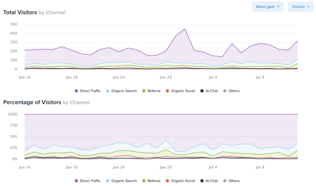
Crazy Egg’s latest update moves beyond the summary view. By integrating time-series charts directly into the segmented views of their Web Analytics dashboard, the company is enabling users to visualize daily performance fluctuations. This is a critical leap forward for growth marketers, UX researchers, and e-commerce managers who need to identify exactly when a marketing push began to yield returns or when a technical issue caused a dip in engagement.
Chronology of the Update: Bridging the Analytics Gap
The rollout of this feature follows a series of internal requests from power users who found themselves manually exporting data into spreadsheets just to plot basic trend lines.
- The Problem: Previously, segmenting traffic allowed users to filter by channel, device, or campaign, but the output was confined to a static data table. To visualize trends, users had to perform time-consuming data extraction.
- The Development Phase: Throughout the first half of 2026, the Crazy Egg engineering team focused on creating a seamless UI integration that would allow for real-time charting without compromising page performance.
- The Deployment: As of mid-July 2026, the feature has been pushed to the production environment, available to all tiers of Crazy Egg users at no additional cost.
This chronological development highlights a shift in industry philosophy: the belief that advanced analytics should be intuitive enough for a generalist but powerful enough for a data scientist.
Deep Dive: How to Leverage the New Visualization Tools
The implementation of these charts is designed for immediate accessibility. Users navigating to their Web Analytics dashboard will find that the interface has been subtly refined to prioritize visual storytelling.
Accessing the Data
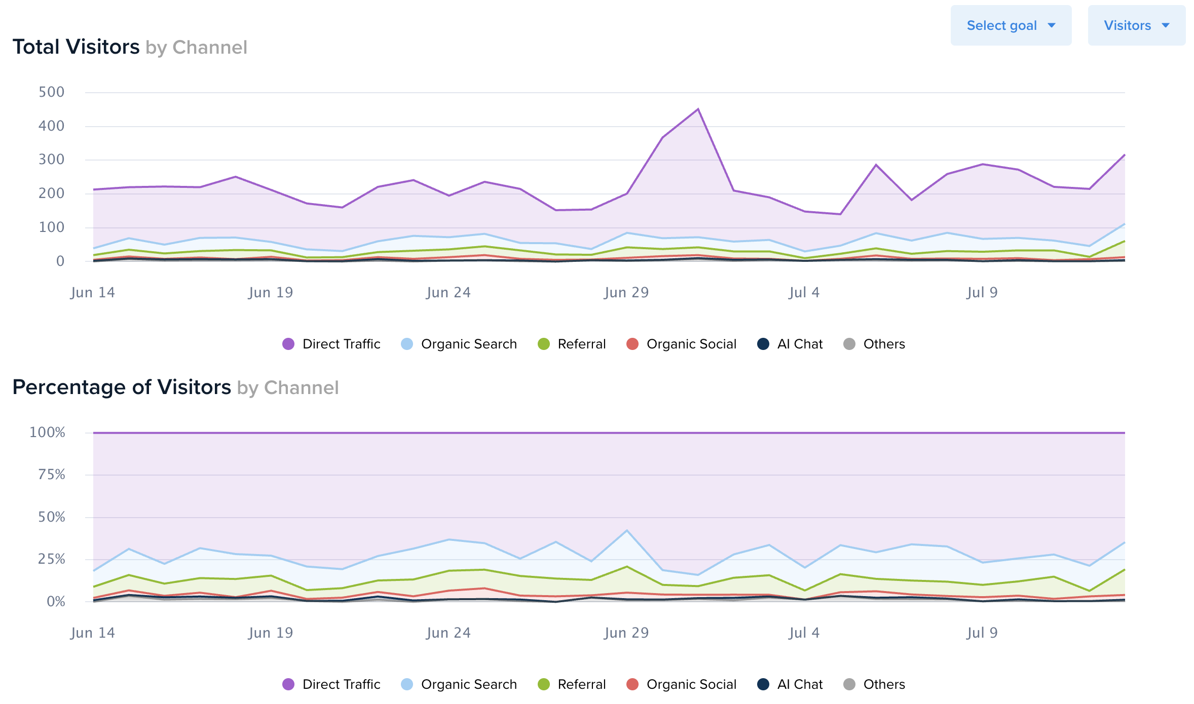
To access these new insights, users need only select a date range of at least two days. Once a segment is selected via the “>” button, the interface expands to reveal a dual-chart visualization positioned directly above the legacy data table.
Customizing the View
Flexibility is the cornerstone of this update. Through a dropdown menu in the top-right corner of the charts, users can toggle between:
- Visitors: Understanding unique user acquisition trends.
- Sessions: Analyzing the frequency and duration of user engagement.
- Pageviews: Measuring content consumption depth.
Layering Conversion Goals
Perhaps the most powerful element of this update is the ability to overlay Conversion Goals. By selecting a specific goal—such as a newsletter signup, a "buy now" click, or a form submission—the system automatically maps conversion trends against the traffic metrics. The secondary Y-axis on the right allows for a comparative analysis, enabling users to see if a spike in traffic actually correlated with a spike in revenue-generating actions, or if the traffic was merely "vanity" volume.
Supporting Data: Why Time-Series Matters
Why does time-series data matter more than aggregated totals? In the context of digital marketing, context is everything.
Consider a scenario where a marketing team runs a Facebook ad campaign. If the team only looks at the total conversions at the end of the month, they might conclude the campaign was a success. However, by looking at a time-series chart, they might discover that 80% of those conversions occurred in the first 48 hours, followed by a sharp decline. This insight suggests "ad fatigue"—a piece of intelligence that would be invisible in a non-temporal data table.
Furthermore, the ability to export this data—now available in .xlsx format directly from the dashboard—allows teams to perform advanced longitudinal studies. By downloading daily metrics, analysts can import the data into BI tools to correlate external factors, such as seasonal weather changes, industry news, or competitor activity, against their internal traffic flow.
Official Commentary: Empowering the User
In a brief statement regarding the update, the product development team at Crazy Egg emphasized that the core objective was "democratizing data analysis."
"We believe that the best decisions are made when the data tells a story," the spokesperson noted. "By adding time-series functionality to every segment, we aren’t just giving our users more charts; we are giving them the narrative arc of their customer journey. We’ve heard the feedback regarding the difficulty of identifying trends within static tables, and we are confident that this visualization will empower our users to make faster, more informed decisions about where to allocate their marketing budget."
Implications for Digital Strategy
The implications of this update for the broader digital landscape are threefold:
1. Increased Campaign Precision
Marketers can now perform "surgical" analysis of their campaigns. By isolating specific channels and viewing their performance over time, companies can identify the precise moment a campaign starts to lose its efficacy, allowing for real-time pivots rather than reactive post-mortems.
2. Improved Resource Allocation
With a clearer view of which channels are declining versus which are growing, businesses can reallocate their budgets toward the highest-performing segments more effectively. The reduction of "blind spots" in the reporting process minimizes wasted spend and maximizes the ROI of digital efforts.
3. Enhanced Collaboration
The intuitive nature of these charts means that data is now more shareable. Whether it is a marketing manager presenting to a CMO or an SEO specialist reporting to a client, the visual representation of growth trends is far more compelling and easier to interpret than a complex spreadsheet of daily figures.
A Future-Proofed Analytics Stack
As the digital marketing ecosystem becomes increasingly complex, the tools we use must adapt to provide clarity amidst the noise. Crazy Egg’s commitment to integrating these features into all plans—from entry-level to enterprise—is a testament to their mission of making optimization accessible.
By providing these time-series charts, Crazy Egg is positioning its platform not just as a tool for heatmapping or simple traffic counting, but as a comprehensive intelligence suite. The ability to see when things happen is the final piece of the puzzle for many teams looking to transition from reactive management to proactive strategy.
Conclusion
The introduction of segmented time-series charting is more than just a UI refresh; it is a fundamental enhancement of the user’s ability to interpret reality. In a data-saturated world, the tools that thrive are those that provide immediate, actionable insight. With this update, Crazy Egg has successfully turned complex daily traffic fluctuations into a clear, navigable roadmap for growth.
Users are encouraged to log into their Web Analytics dashboard today to explore these new visual capabilities. Whether you are tracking a small blog or a large-scale e-commerce storefront, the data you need to make your next big decision is now just a few clicks away.
