
The Strategic Guide to Website Sidebars: Enhancing Navigation and Driving Conversions
In the ever-evolving landscape of web design, the website sidebar remains one of the most debated elements of the user interface. Often dismissed by minimalist designers as a relic of the early 2000s, the sidebar—when executed with precision—is a powerful tool for site architecture, user engagement, and conversion optimization.
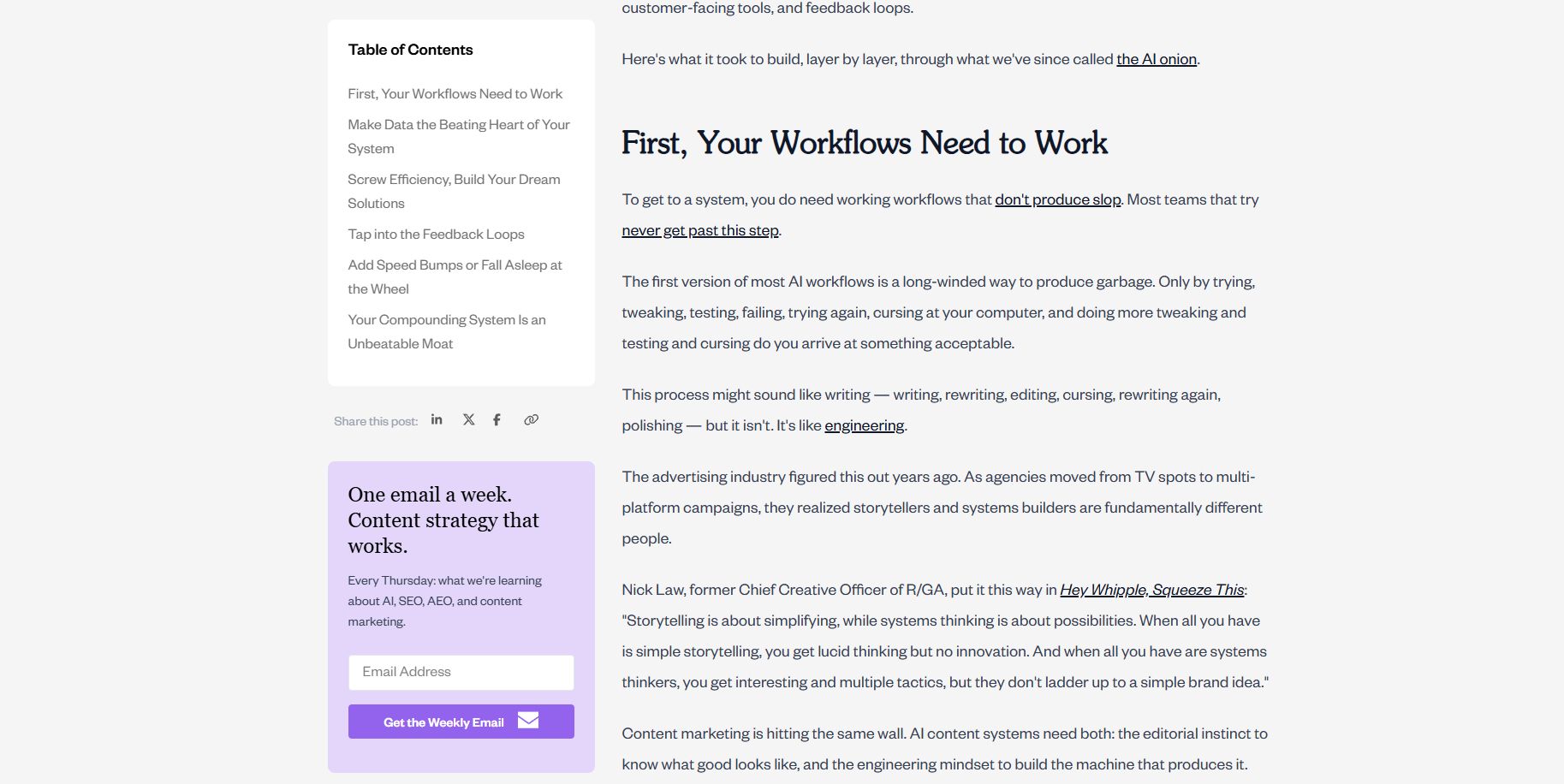
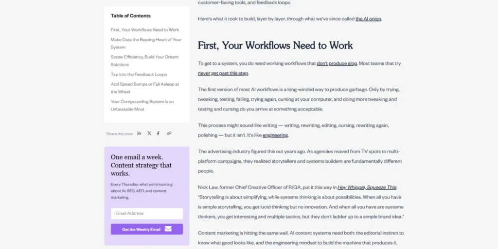
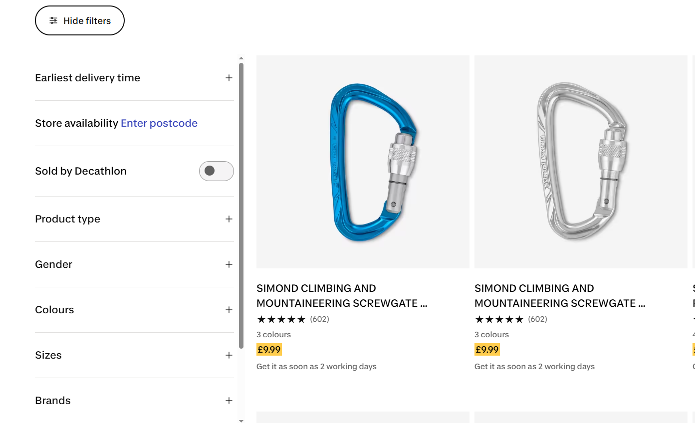
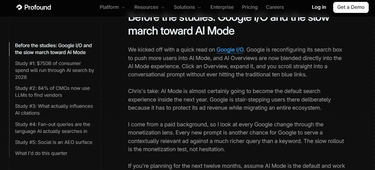
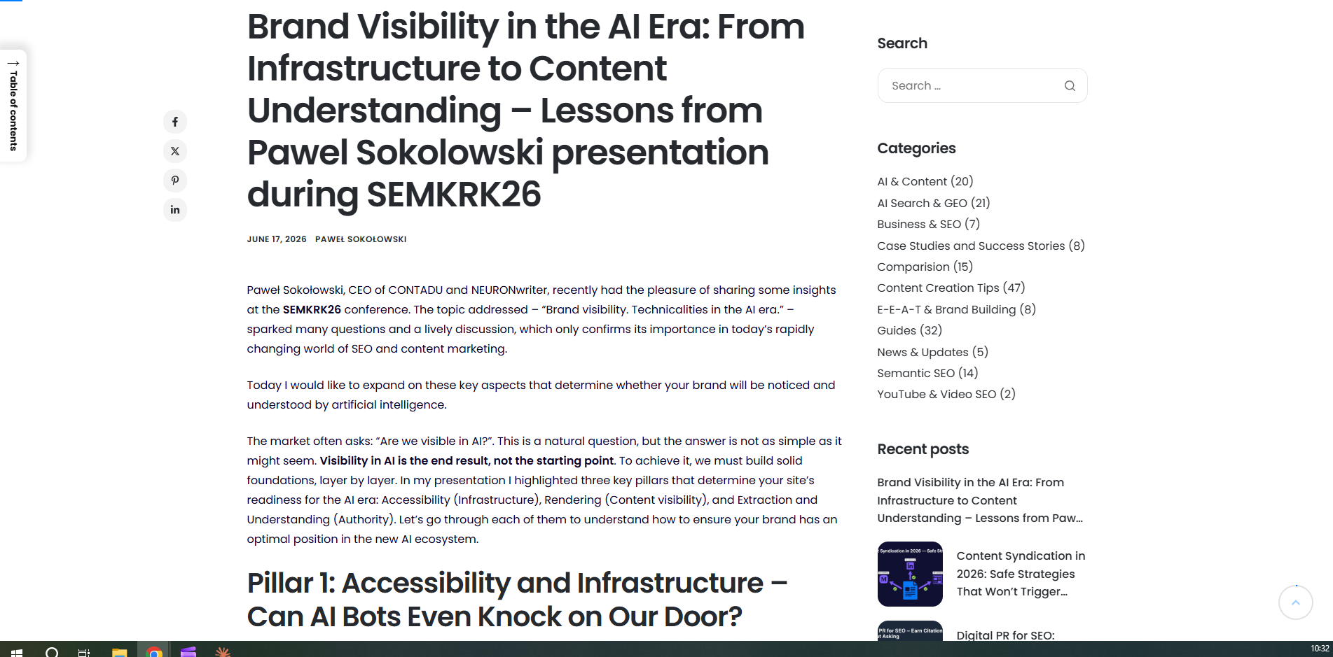
A website sidebar is a vertical column positioned adjacent to the main content area. It functions as a secondary hub for navigation, supporting information, and conversion-focused calls-to-action (CTAs). While its presence can clutter simple landing pages, it is an essential companion for content-rich environments like blogs, documentation hubs, and extensive e-commerce catalogs.
Understanding the Anatomy of a Sidebar
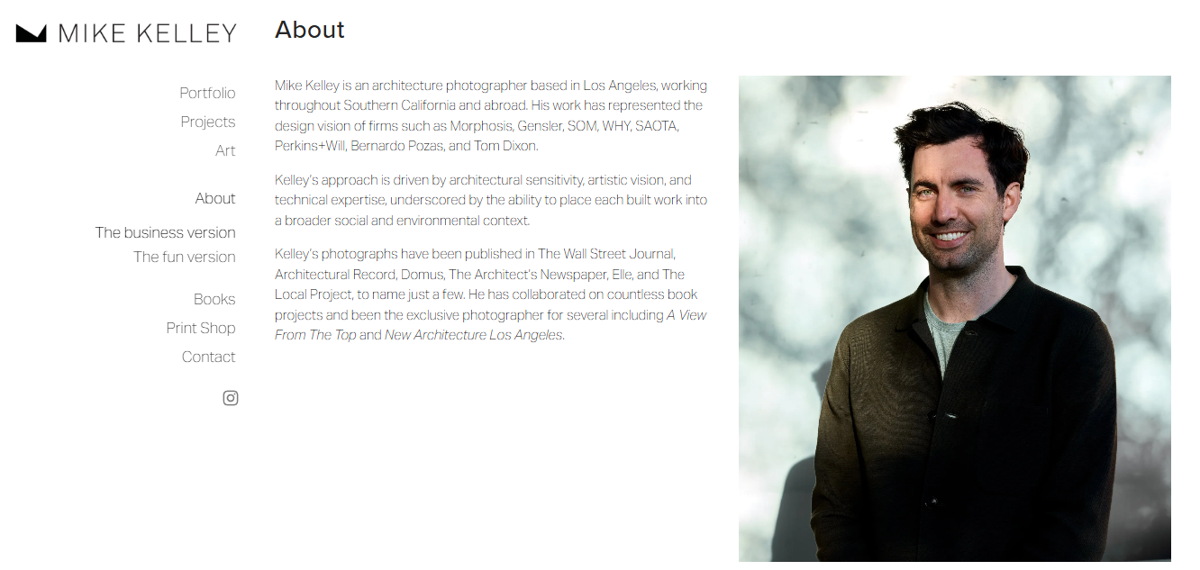
To design an effective sidebar, one must first distinguish it from a side panel. A sidebar is a fixed, architectural component of a page layout, designed to remain in the reader’s peripheral vision as they consume primary content. In contrast, a side panel—often found in SaaS applications or complex web tools—is usually an interactive, togglable drawer that appears on command.

For the average content-heavy website, the sidebar serves three primary functions:
- Navigational Clarity: Helping users find related sections or deep-dive into categories.
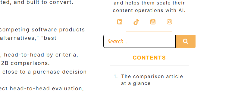
- Supplementary Value: Providing context, such as author bios, "most-viewed" lists, or social proof.
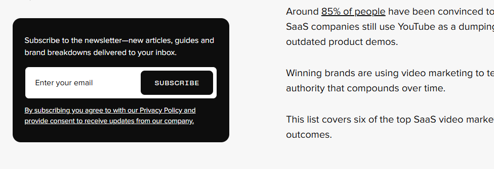
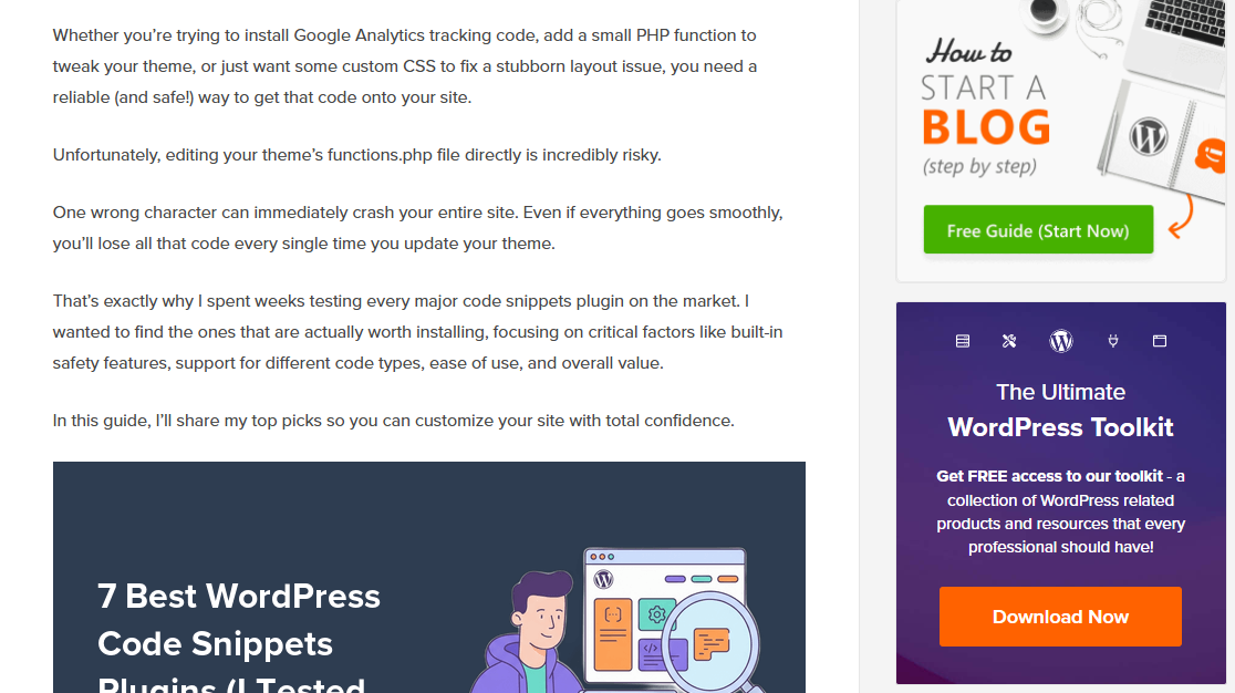
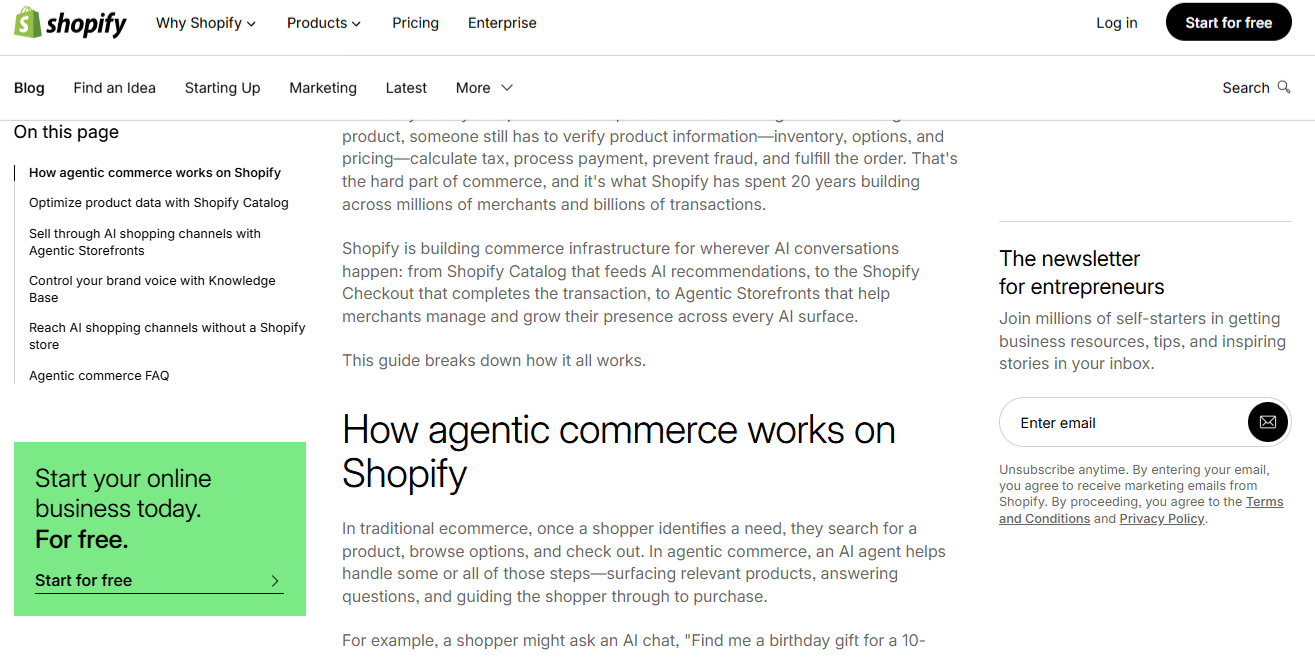
- Conversion Drivers: Hosting newsletter signups, lead magnets, or promotional banners.
The Evolution and Strategic Use of Sidebars
Historically, the sidebar was the "everything drawer" of the internet, often packed with unrelated widgets that diluted the user’s focus. Today, the design philosophy has shifted toward intentionality.
When to Utilize a Sidebar
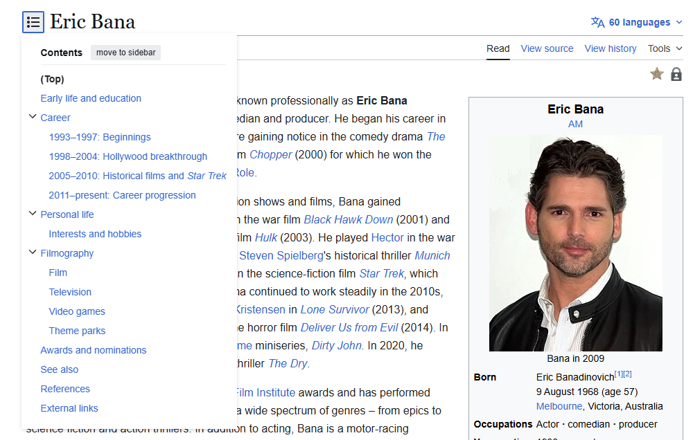
A sidebar is most effective on pages where the user is in an "exploration" phase. For instance, on a news site or a technical blog, a sidebar provides the necessary scaffolding to keep the user engaged. By offering "Related Articles" or a "Table of Contents," you reduce the bounce rate by providing a clear path forward.

When to Abandon the Sidebar
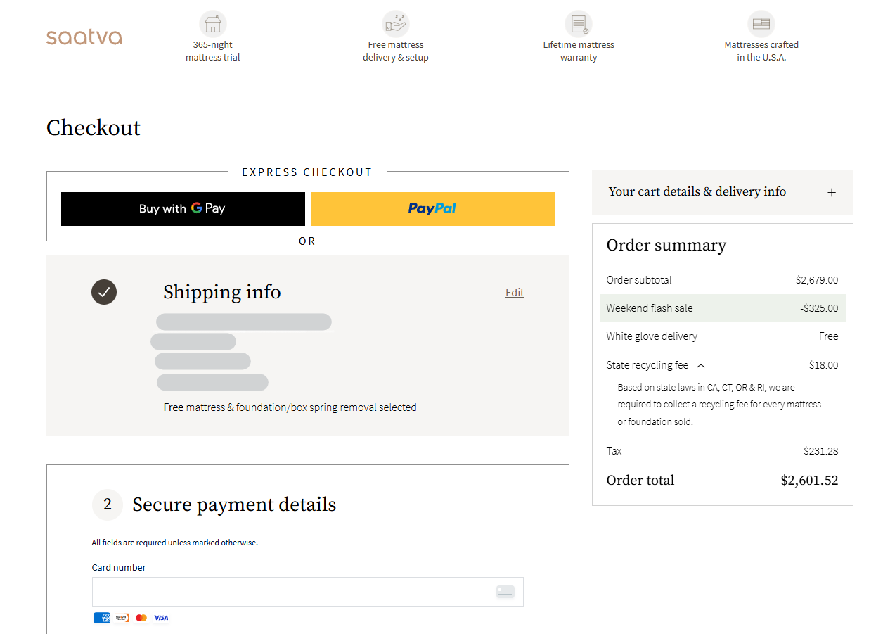
Conversely, there are moments where the sidebar is a hindrance. On high-intent conversion pages—such as dedicated landing pages, checkout flows, or lead-capture forms—the goal is to isolate the user’s focus. If a user is on a checkout page, a sidebar containing blog categories or social media links is a distraction that pulls the visitor away from the "buy" or "submit" button. In these instances, the "less is more" approach is the gold standard for conversion optimization.
Design Best Practices: Integrating Function with Form
The effectiveness of a sidebar is predicated on its integration into the overall design. A common pitfall is the "ad-look," where a sidebar appears so visually distinct from the main content that users develop "banner blindness"—a psychological phenomenon where visitors automatically ignore any element that resembles an advertisement.
1. Stylistic Consistency
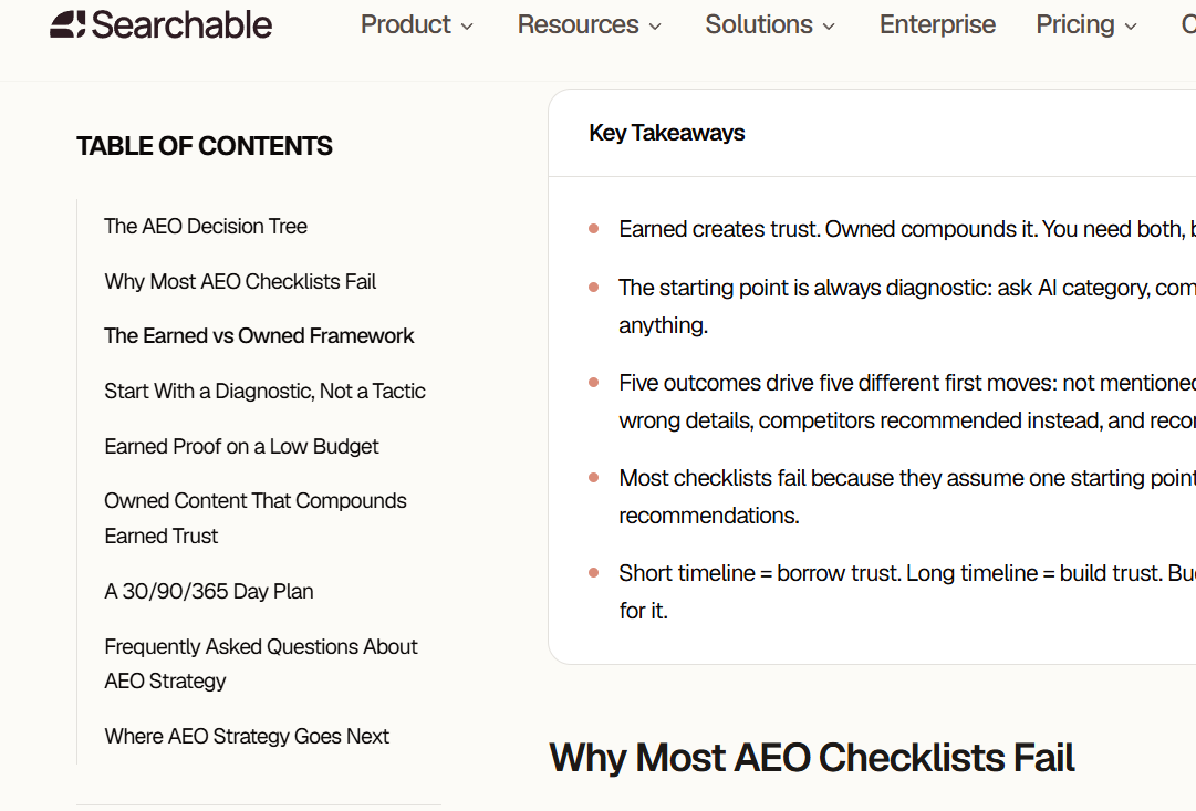
Typography, color palettes, and whitespace in your sidebar should mirror the main content area. If your article uses a specific font and margin size, the sidebar should follow suit. It should feel like a natural extension of the document, not an intrusive billboard.
2. The Golden Ratio of Width
According to research from the Baymard Institute, the optimal reading experience for text occurs at 55–75 characters per line. To maintain this "sweet spot," your sidebar should generally occupy between 240 and 320 pixels on desktop screens. This ensures the main content remains the star of the show while the sidebar acts as a supporting actor.
3. The Power of "Sticky" Elements
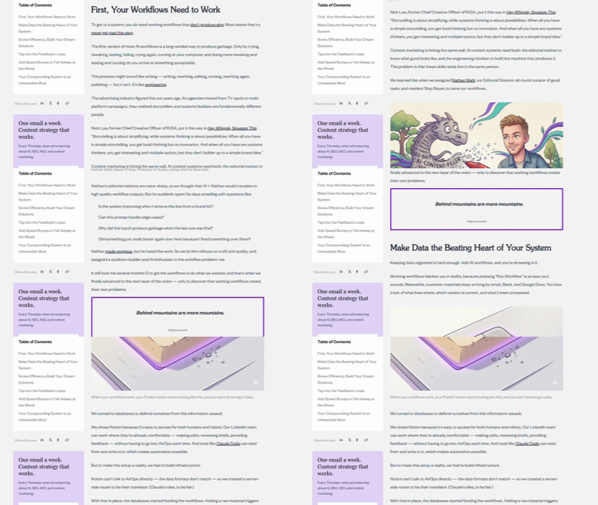
Modern UX design often utilizes a "sticky" or persistent sidebar. As a user scrolls down a long-form article, the primary navigation or a critical CTA remains fixed at the top of the viewport. This keeps the most important conversion point in front of the user without requiring them to scroll back to the top of the page. Case studies from firms like GrowthRock have demonstrated that sticky "Add to Cart" buttons can increase conversion rates by nearly 8%, proving that accessibility of action leads to better results.
Data-Driven Optimization
Designing by intuition is a gamble; designing by data is a strategy. To ensure your sidebar is serving its purpose, you must rely on behavioral analytics.

Heatmaps and Scroll Maps
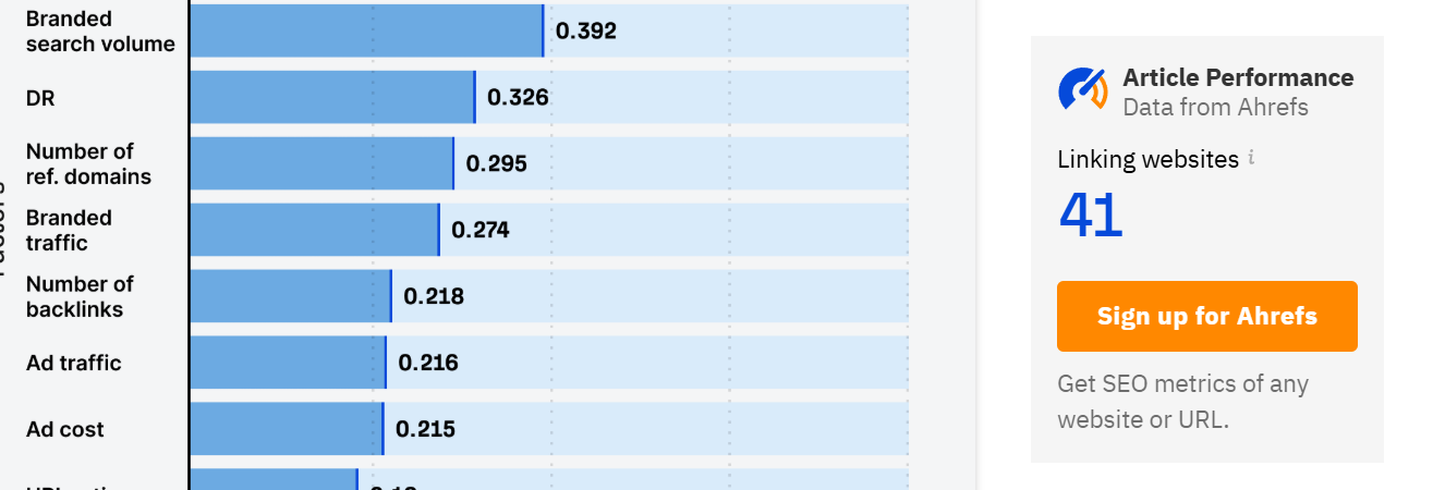
Heatmaps provide a visual representation of where users are clicking and how far they are scrolling. If your sidebar is packed with links but your heatmap shows zero interaction, it is time to prune the content. Similarly, scroll maps reveal if users are even reaching the depth where your sidebar widgets are located.
Session Recordings
While heatmaps show you "what," session recordings show you "why." By watching actual user sessions, you can observe friction points. Do users repeatedly click on an element expecting it to be a link? Do they scroll frantically, searching for a navigation menu that isn’t there? These insights are invaluable for iterative design.

A/B Testing
The only objective way to determine the optimal sidebar layout is through A/B testing. By splitting traffic between two versions—for example, one with a "Newsletter Signup" at the top and one with a "Recent Posts" list at the top—you can quantify the impact of your design choices on your conversion rates.

Mobile Considerations: The "Drop" Strategy
On mobile devices, the traditional multi-column layout is rarely feasible. Attempting to force a sidebar onto a mobile screen often results in a crushed, unreadable layout. The industry-standard approach is to "drop" the sidebar content below the main text or consolidate it into a hidden, touch-friendly menu.
Prioritize what is essential. A "Contact Us" link might be vital, but a list of 50 blog tags is not. Mobile design requires you to be ruthless in your curation.

Implications for SEO and User Experience
A common question among site owners is whether sidebars impact SEO. From a technical standpoint, search engines prioritize the main body content, so a sidebar will not directly harm your rankings. However, the indirect impact is significant.

If your sidebar is poorly organized, uses intrusive pop-ups, or creates a cluttered experience, your "dwell time" may drop. High bounce rates and low engagement are interpreted by search engines as signs of a poor user experience. Therefore, a clean, helpful sidebar is, in fact, an SEO asset. It facilitates longer sessions and encourages internal linking, both of which are positive signals for search algorithms.
Frequently Asked Questions (FAQ)
Should I use a sidebar or a top navigation bar?
A top navigation bar is standard for primary, high-level pages (Home, Pricing, Contact). Sidebar menus are superior for deep-content sites, such as documentation or resource libraries, where you have nested categories that would look chaotic in a top menu.
Does a sidebar increase bounce rates?
Not inherently. If the sidebar provides relevant, helpful links, it encourages the user to stay on the site longer. If it contains irrelevant, spammy, or distracting elements, it can certainly contribute to a higher bounce rate.
What is the best way to handle sidebar navigation?
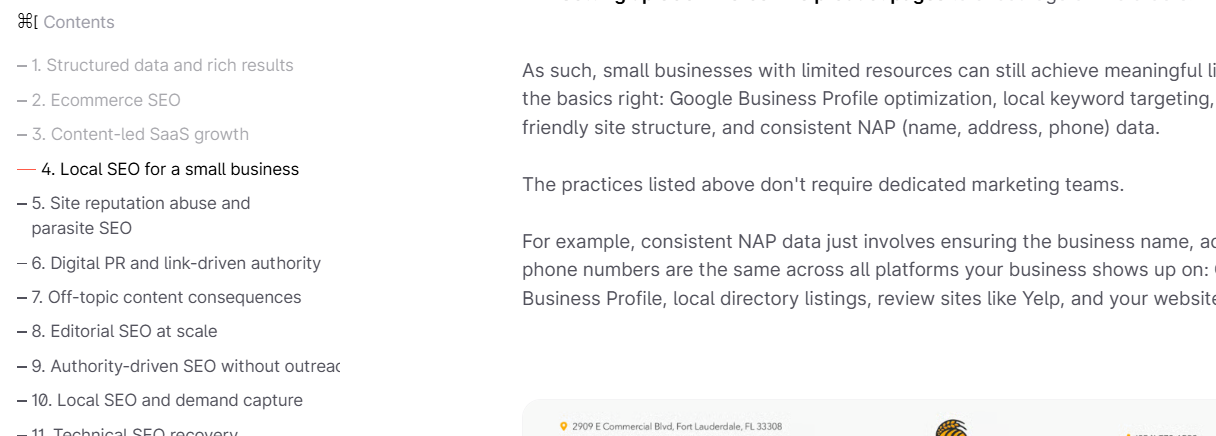
Always include an "active state" indicator. If a user is on the "SEO" page, that link should be highlighted in the sidebar. Without this visual cue, users often feel lost in the site hierarchy, leading to frustration and site abandonment.
Are sidebars necessary for mobile?
No. On mobile, the sidebar should be removed or collapsed into a menu. The focus must be on the primary content and the primary call to action.
Final Thoughts
The website sidebar is not a dead design element; it is a tool for organization. When designed with the user’s intent in mind, it provides the structure necessary to navigate vast amounts of information while quietly guiding the user toward your conversion goals. By grounding your design choices in data—using heatmaps, recordings, and A/B tests—you can transform your sidebar from a cluttered afterthought into a high-performing engine for engagement.
As digital spaces become more complex, the ability to provide clear, accessible, and helpful navigation will remain a defining trait of successful websites. Whether you choose a sticky sidebar, a dynamic menu, or a clean, minimalist layout, remember that the goal is always to reduce friction and add value for the reader.
