
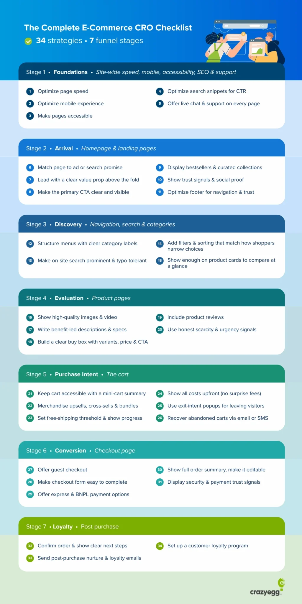
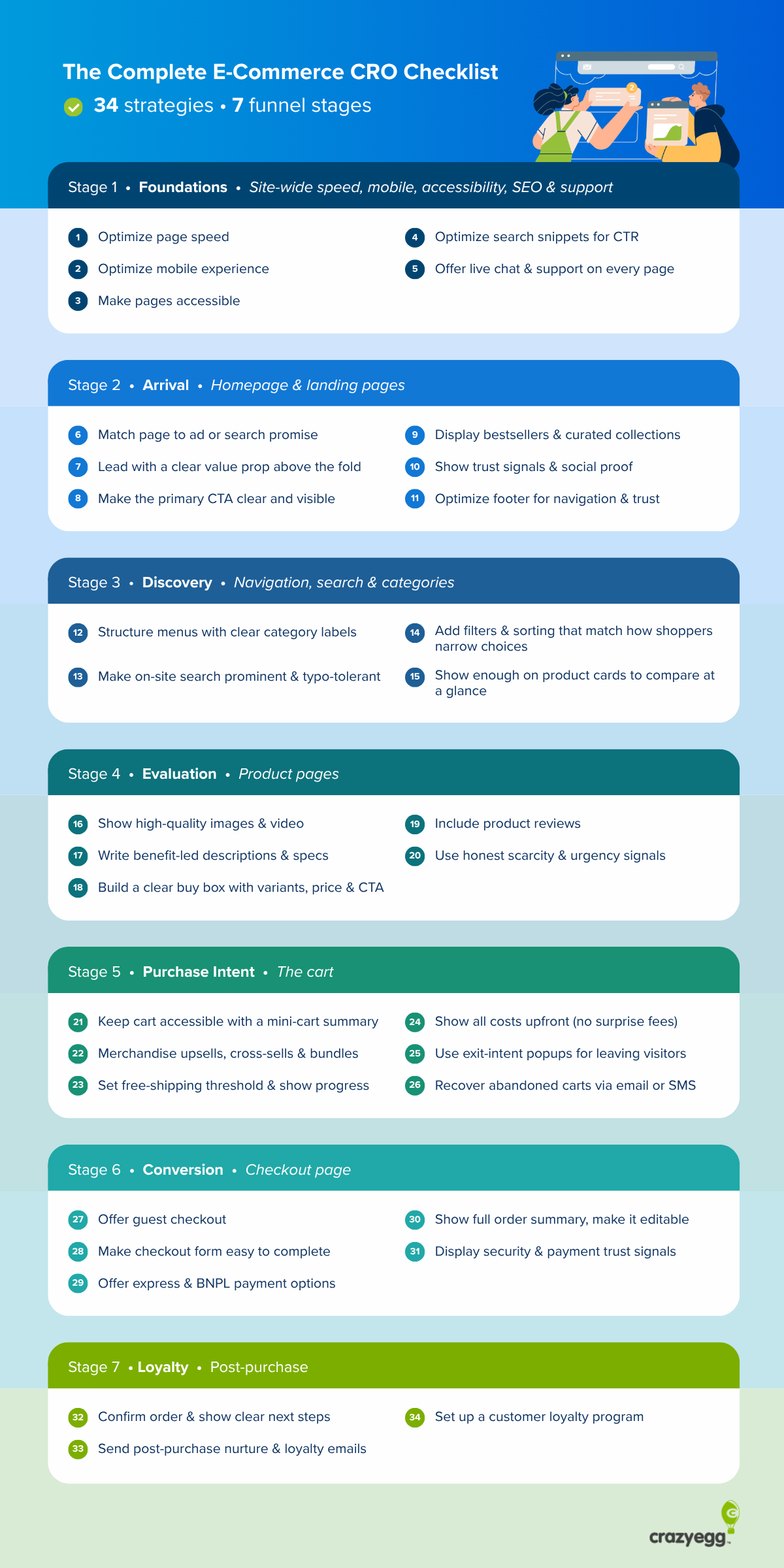
The Ultimate Blueprint: 34 Strategic Pillars for E-Commerce Conversion Rate Optimization
In the hyper-competitive landscape of digital retail, traffic is a vanity metric; conversion is the only reality that sustains a business. As customer acquisition costs (CAC) continue to climb across major advertising platforms, e-commerce leaders are shifting their focus from "growth at all costs" to the efficiency of their existing funnels. Conversion Rate Optimization (CRO) has evolved from a series of minor aesthetic tweaks into a sophisticated, data-driven discipline capable of transforming a stagnant storefront into a high-performance revenue engine.
This comprehensive guide breaks down over 30 evidence-backed strategies designed to eliminate friction, build trust, and maximize the lifetime value of every visitor.
The Strategic Imperative: Why CRO Now?
The math behind CRO is irrefutable. If your store currently converts at 2.2%, a minor improvement to 2.3% yields a 4.3% revenue lift without spending an additional cent on advertising. When acquisition is expensive, fixing the "leaky bucket" of your sales funnel is the most profitable lever an e-commerce manager can pull.
The Seven Stages of the Customer Journey
To effectively optimize a store, one must view the user experience through a chronological lens, moving from the initial "Foundation" to the "Post-Purchase" loyalty phase.
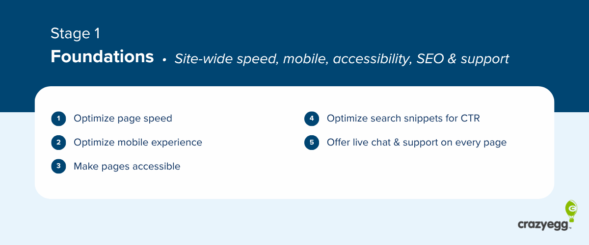
Stage 1: The Foundation (Site Speed, Mobile, and Accessibility)
Before focusing on persuasive copy or high-converting CTAs, you must ensure your digital infrastructure is bulletproof.
1. The 2.5-Second Threshold
Modern consumers are impatient. Research consistently shows that load times exceeding 3 seconds lead to exponential bounce rates. To optimize, prioritize the "Critical Rendering Path." Compress all imagery, leverage lazy-loading for non-essential assets, and utilize a Content Delivery Network (CDN) to ensure that your site serves content rapidly regardless of the user’s geographic location.
2. Mobile-First Optimization
Mobile devices often account for the majority of traffic, yet they remain the most common point of friction. A mobile-first design is no longer optional. Ensure that buttons are thumb-friendly, navigation menus are collapsible, and checkout flows are streamlined to remove unnecessary input fields.
3. Accessibility as a Driver of Revenue
Accessibility isn’t just a legal or moral imperative—it’s good business. By implementing clear screen-reader compatibility and descriptive alt-text for every product image, you widen your addressable market. If your store is difficult to navigate for someone using assistive technology, you are effectively turning away potential revenue.

Stage 2: Arrival (Homepage and Landing Pages)
The first few seconds after a user clicks an ad or a search result determine whether they stay or bounce.
Matching Intent to Experience
The most common conversion killer is a disconnect between the "promise" of an ad and the "reality" of the landing page. If a Facebook ad promotes a 20% discount on summer footwear, the landing page must immediately feature that specific collection. Sending traffic to a generic homepage forces the user to do the work of finding the product, which is where drop-offs occur.
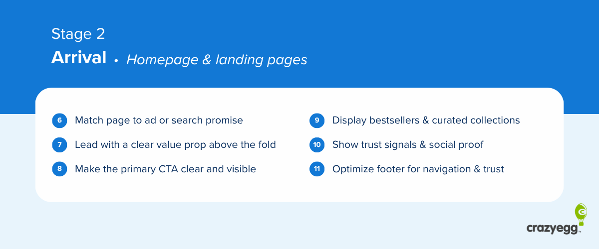
The Value Proposition
Your hero section must answer three questions within three seconds:
- What do you sell?
- Who is it for?
- Why are you the best choice?
Avoid generic fluff. Use specific, benefit-led language that speaks directly to the customer’s pain points.
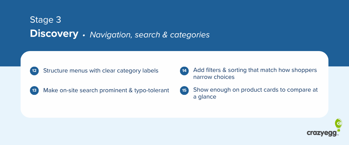
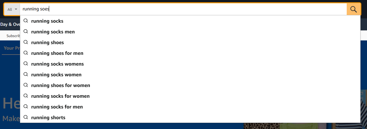
Stage 3: Discovery (Navigation and Search)
If a user cannot find a product, they cannot buy it.
The Power of Search
Constructor’s 2024 benchmarks indicate that while searchers represent only 24% of site visitors, they drive 44% of revenue and convert at 2.5 times the rate of non-searchers. Your on-site search should be typo-tolerant, lightning-fast, and equipped with autocomplete suggestions. Implementing robust filtering—by price, rating, color, and category-specific attributes—is essential for shoppers to narrow down their choices without mental fatigue.
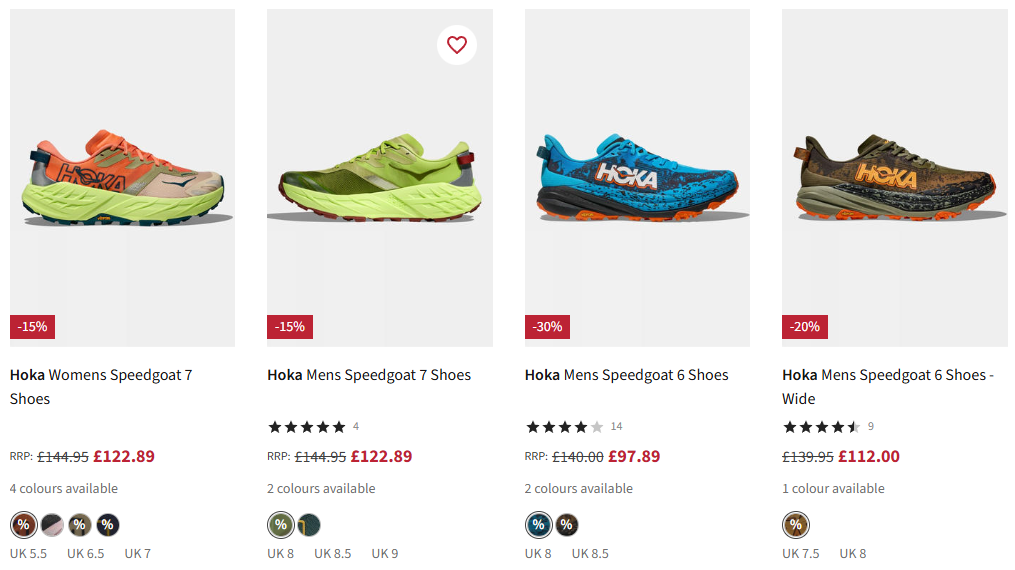
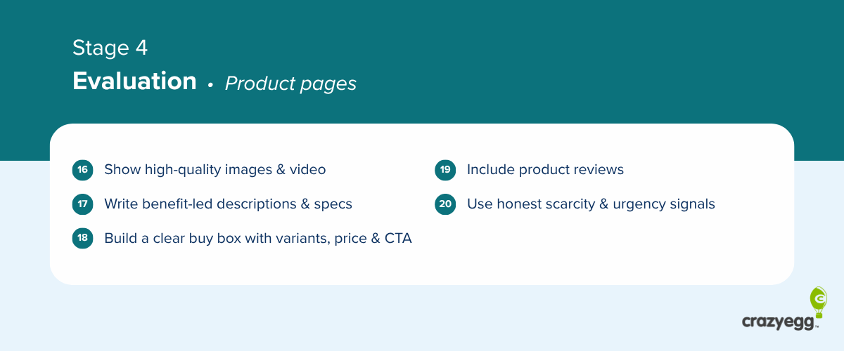
Stage 4: Evaluation (The Product Page)
This is where the decision to buy is solidified.

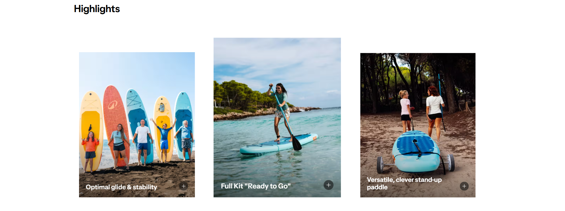
Visuals as a Proxy for Inspection
Because online shoppers cannot touch the merchandise, your imagery must act as a digital surrogate. High-resolution photos, 360-degree views, and video demonstrations of the product in use are critical. These assets reduce uncertainty and, by extension, reduce returns.
The "Buy Box" Psychology
A well-structured product page centers on the "Buy Box"—the area containing the price, variant selection (size/color), and the Add-to-Cart CTA. This element must be dominant, clear, and persistent.
Stage 5: Purchase Intent (The Cart)
The cart is the final checkpoint before the transaction. Optimization here focuses on reducing anxiety.
Transparency is Key
Surprise shipping fees are the number one cause of cart abandonment. Display all costs—taxes, shipping, and service fees—as early as possible. Implementing a "Free Shipping Progress Bar" (e.g., "You are $12 away from free shipping") has been proven to increase Average Order Value (AOV) by incentivizing customers to add one more item to their cart.
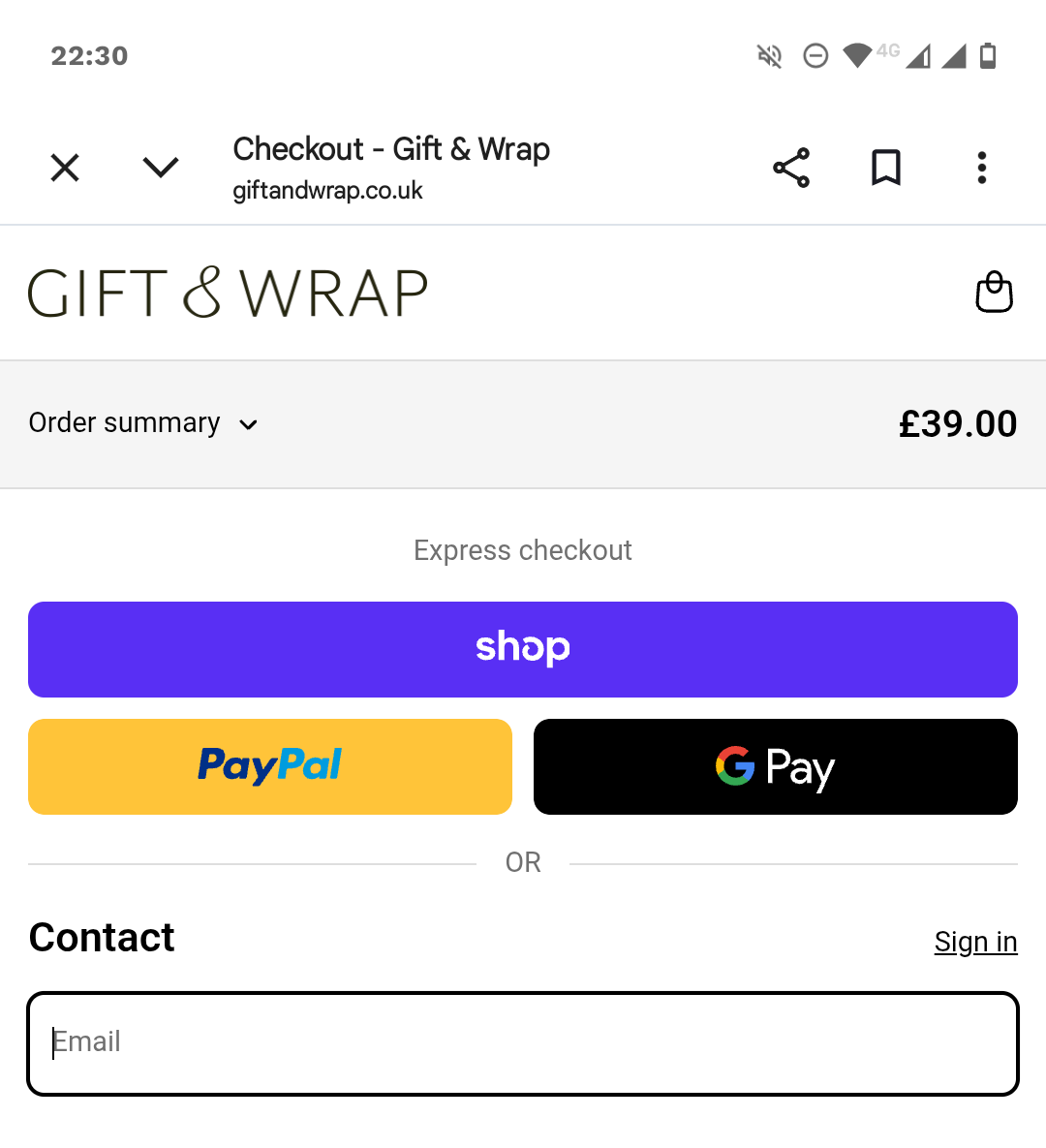
Stage 6: The Checkout Experience
Every extra form field is a potential exit point.
Simplifying the Flow
Limit your checkout form to 7–8 fields. Offer guest checkout as the default, and never force account creation before the sale is complete. Integrate express payment options like Apple Pay, Google Pay, and PayPal to allow users to bypass manual form entry entirely.
Security Signals
Distrust of data handling causes nearly 20% of cart abandonment. Place security badges, lock icons, and payment logos prominently near the "Complete Purchase" button to reassure the user that their financial information is secure.
Stage 7: Loyalty (Post-Purchase)
The sale is not the end; it is the beginning of a relationship.
Nurturing for Retention
Post-purchase emails should provide utility—tracking updates, usage guides, and care instructions. By building a loyalty program that rewards repeat purchases, you convert one-time buyers into lifetime customers.
Implications for E-Commerce Strategy
The implementation of these 34 strategies should not be treated as a one-time project, but as a continuous cycle. Once the "quick wins" from this checklist are achieved, the next phase of your CRO program should involve rigorous A/B testing and user behavior analysis.
Tools like heatmaps and session recordings (such as those provided by Crazy Egg) allow you to watch where your users get stuck, providing the qualitative data needed to fuel further iterations.
Final Thoughts
In the current economic climate, CRO is the most cost-effective way to scale. By systematically removing friction, providing social proof, and clarifying the path to purchase, brands can significantly improve their conversion rates. Whether you are an emerging boutique or an established enterprise, the principles of clear navigation, transparent pricing, and mobile-first design remain the bedrock of sustainable e-commerce success.
Remember: Audit your own store today. Walk the path your customer takes. Fix the broken links, clear the visual clutter, and ensure that every element on your page serves a singular purpose: helping the customer reach the "thank you" page with confidence.
