
The Strategic Art of the E-commerce Landing Page: A Comprehensive Guide to Conversion
In the high-stakes world of digital retail, the landing page serves as the ultimate "point of no return." Unlike a standard homepage, which acts as a digital storefront window for casual browsing, or a product detail page (PDP) that provides encyclopedic specifications, a landing page is a surgical instrument. It is a standalone, dedicated environment designed for one specific goal, one specific audience, and one singular conversion.
Whether a visitor arrives via a high-intent Google search, a compelling paid social ad, or a targeted marketing email, the landing page is the bridge between interest and transaction. To master the craft of e-commerce, one must understand how these pages function as the primary engine of the modern sales funnel.
Anatomy of a High-Converting Landing Page
The most effective landing pages are not built on guesswork; they are constructed using a proven framework. While creative flair is important, technical optimization is the heartbeat of conversion.
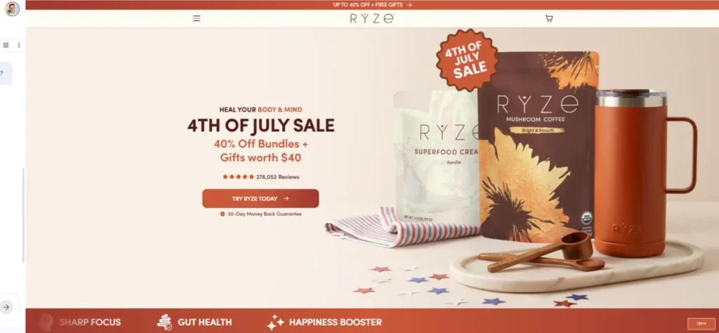
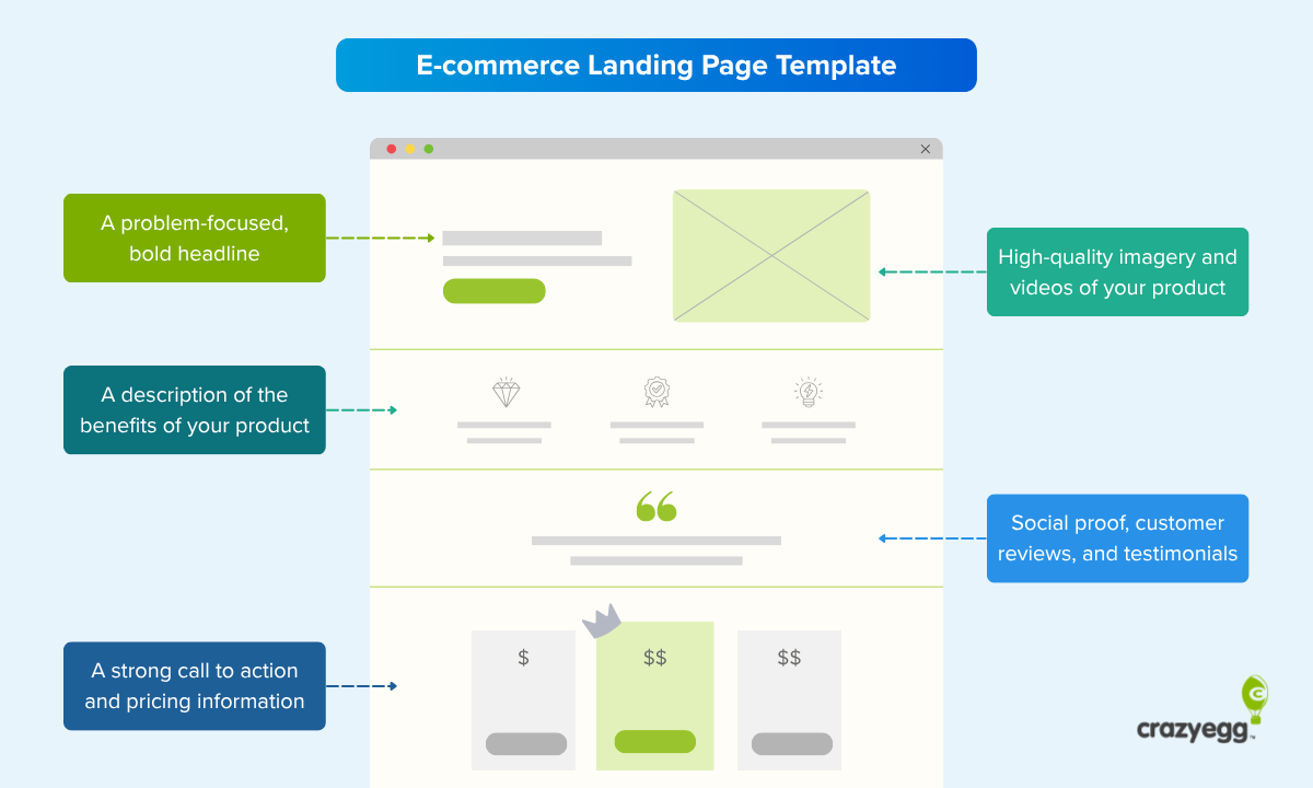
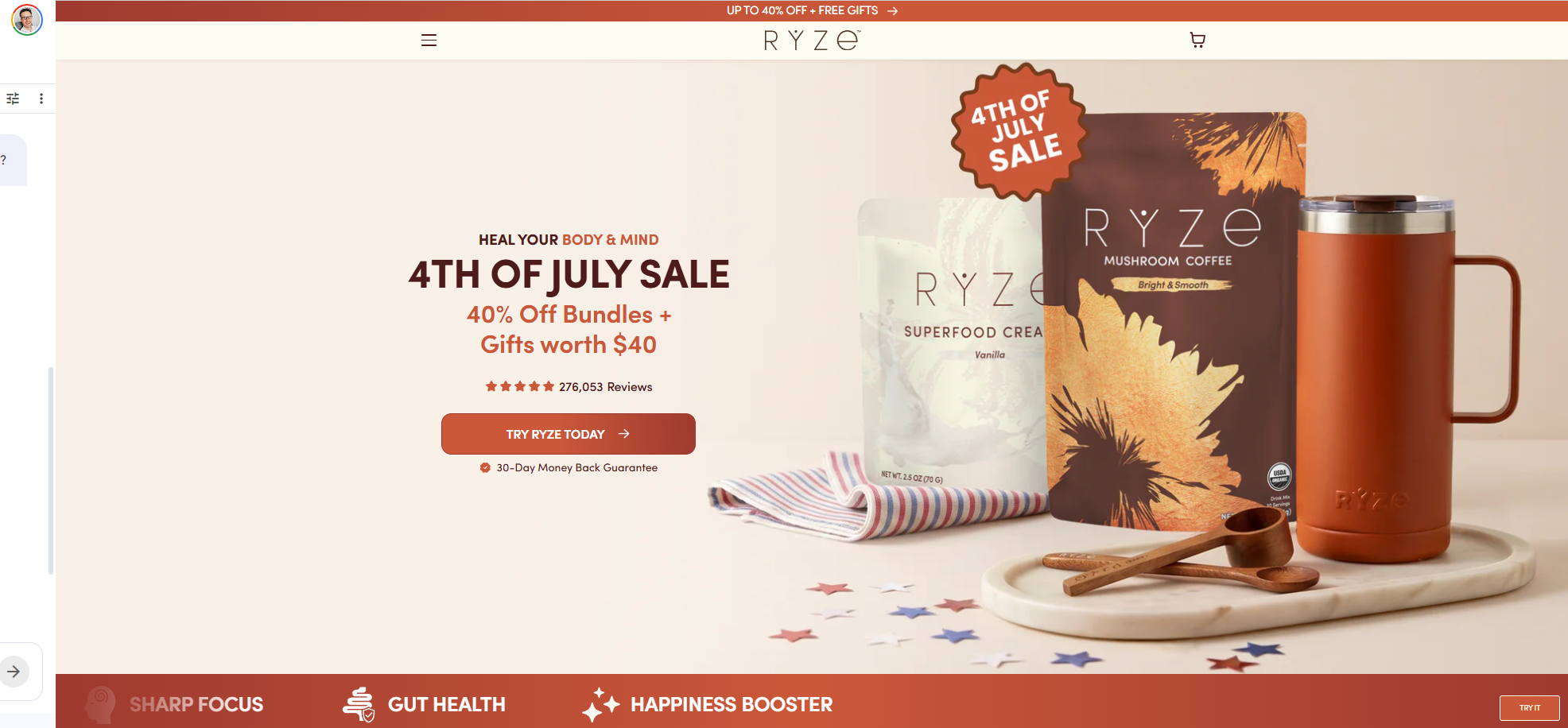
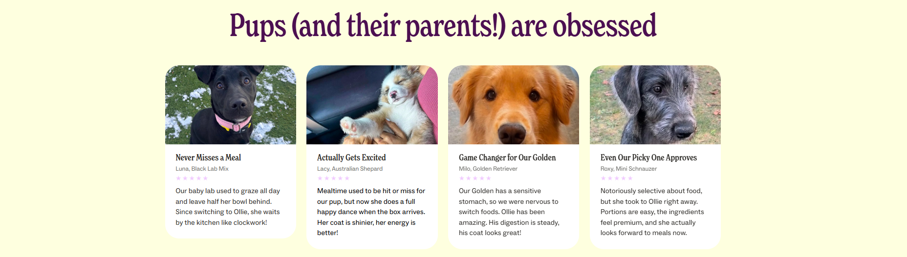
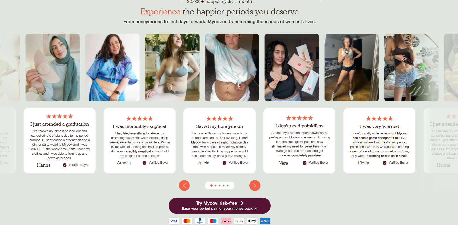
A high-converting landing page typically consists of a cohesive ecosystem of elements: a singular, irresistible offer; a clear and singular Call to Action (CTA); persuasive copy that mirrors the messaging of the ad that brought the visitor there; social proof to establish immediate credibility; and high-quality, high-velocity visuals that showcase the product in a real-world context.
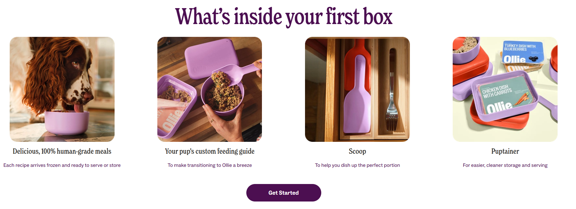
When a brand successfully harmonizes these elements, they reduce the "cognitive load" on the visitor, guiding them naturally toward the checkout process without the distractions of secondary navigation or competing menu items.
The Funnel Perspective: Why Context Matters
Not all visitors are ready to buy immediately. Brands must tailor their landing pages to the customer’s position in the marketing funnel:

- Top-of-Funnel (ToFu): These pages are designed for awareness. They educate potential customers who are just beginning their journey, focusing on pain points and solutions rather than hard-sell tactics.
- Mid-Funnel (MoFu): These pages target the consideration phase. They compare products, provide social proof, and address specific objections.
- Bottom-of-Funnel (BoFu): Here, the goal is the conversion. These pages are designed to close the sale, often incorporating urgency, scarcity, or exclusive offers to push the visitor over the line.
- Post-Purchase: These pages nurture long-term relationships, driving cross-sells and upsells to increase the lifetime value of the customer.
Case Studies: Excellence in Design
By examining real-world examples, we can see how top-tier brands utilize these principles to drive results.
Myoovi: Leveraging Risk Reversal
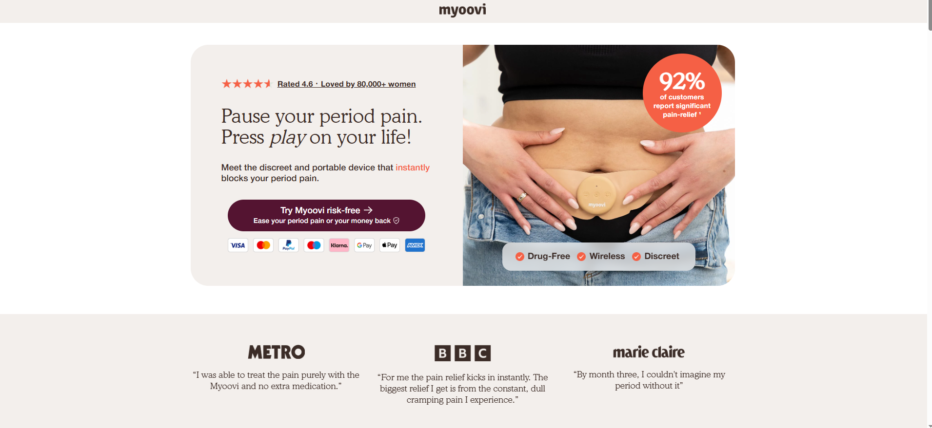
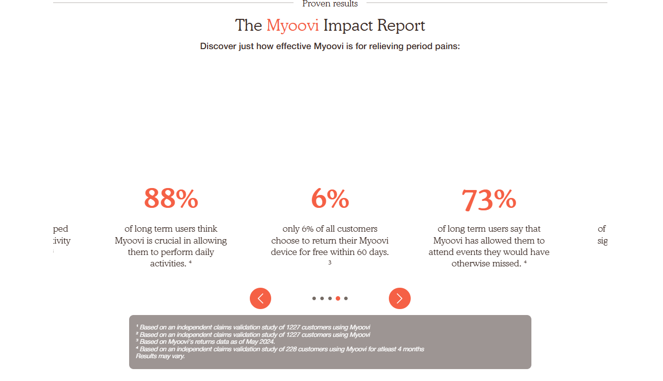
Myoovi, a brand specializing in period-pain TENS devices, masters the art of building trust. By layering a 60-day money-back guarantee with a "no-questions-asked" return policy, they effectively remove the fear of the unknown. Their CTA, "Try Myoovi risk-free," is a masterclass in psychological safety.
Magic Spoon: The Power of Data
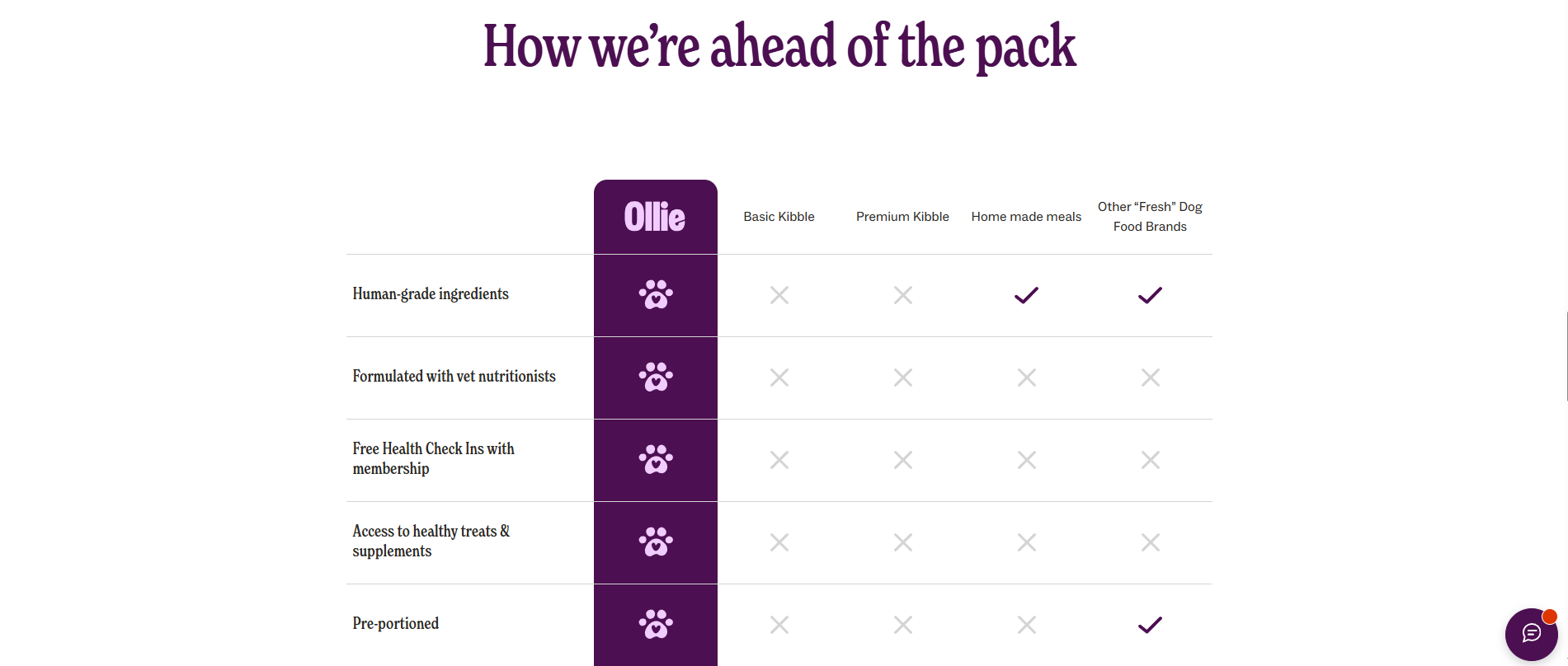
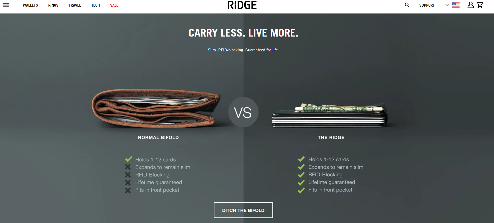
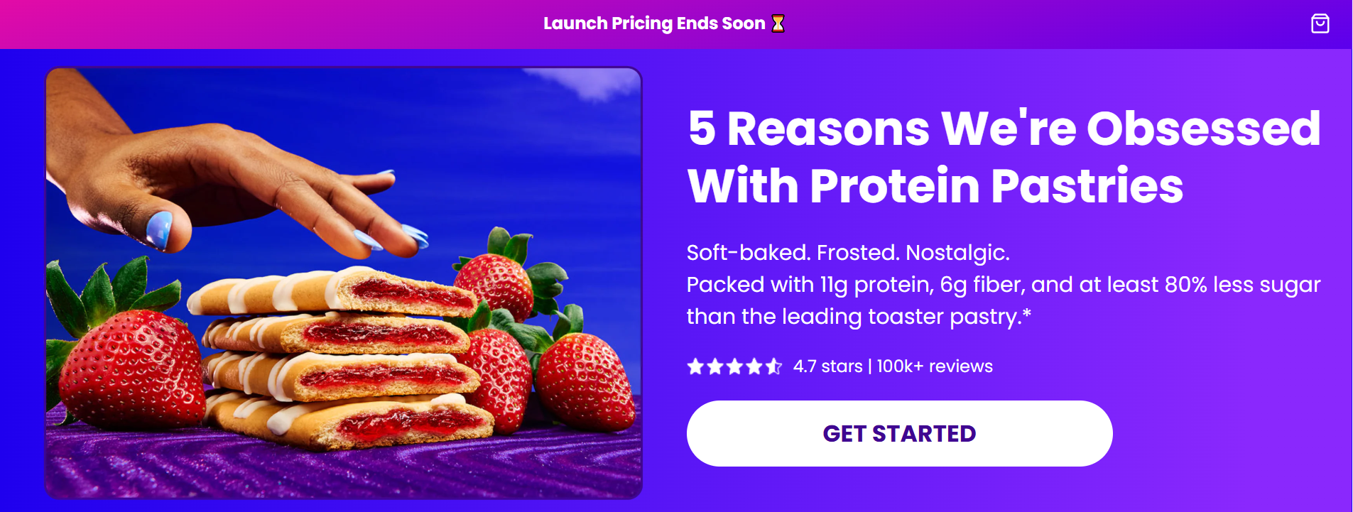
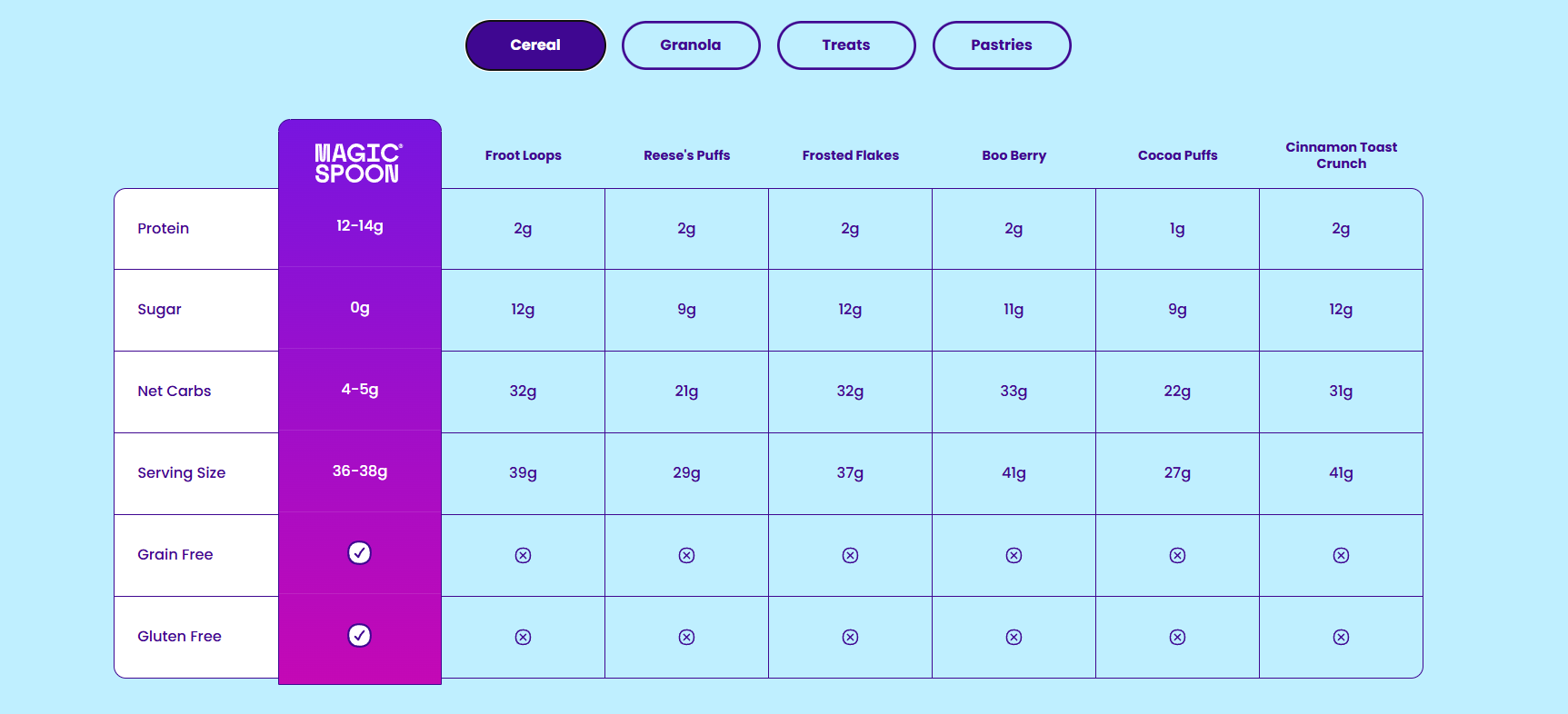
Magic Spoon utilizes educational content to convert skeptics. Their landing page for protein-pastries functions as a listicle, systematically answering "why" the product is a better choice. By utilizing a side-by-side comparison table against industry giants, they validate their value proposition with cold, hard data.
Eight Sleep: Interactive Credibility
Eight Sleep stands out for its interactive "hotspot explorer," which allows users to click through specific product features. This interactivity gamifies the learning process, turning a passive reading experience into an active, engaging discovery.
Maelys: Gamification as a Conversion Tool
Maelys employs a five-step product-finder quiz. This strategy serves two purposes: it creates a personalized experience for the shopper and acts as a sophisticated lead-capture tool. By the time the user reaches the end of the quiz, they have invested time and effort, making them significantly more likely to provide their email to see the results.
Best Practices for Building Your Landing Page
If you are looking to optimize your conversion rates, follow these eight industry-standard best practices:
- Alignment with the Ad: If your ad promises 30% off, your landing page must prominently display that 30% discount. Discontinuity between the ad and the page is the fastest way to lose a visitor’s trust.
- Hero-Level Value Proposition: Your unique value proposition must be visible within the first three seconds of the page loading.
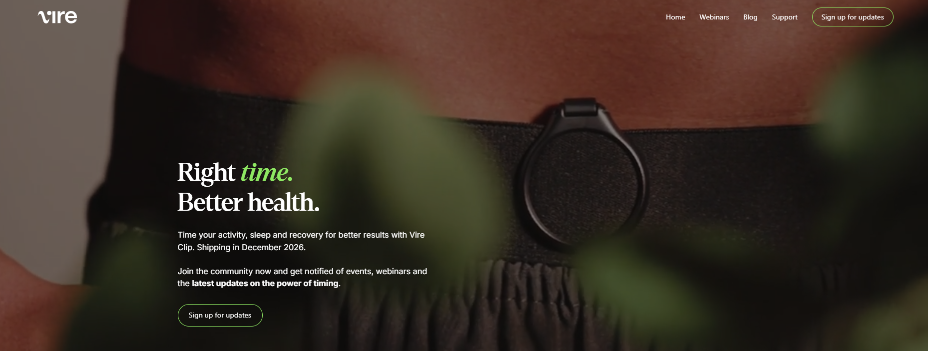
- Above-the-Fold Optimization: Ensure that your headline, hero image, and primary CTA are visible without the need for scrolling, particularly on mobile devices.
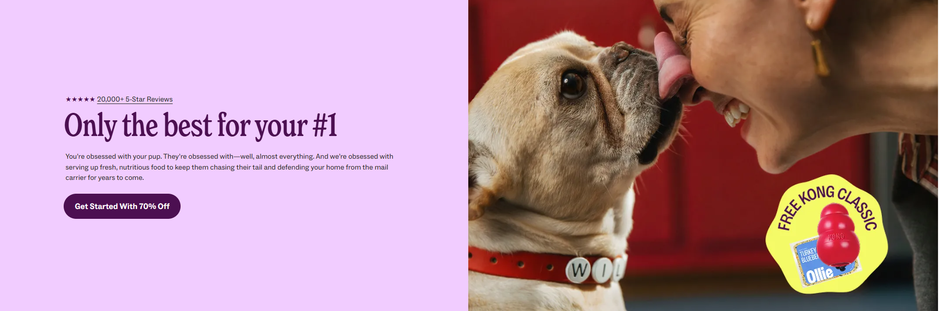
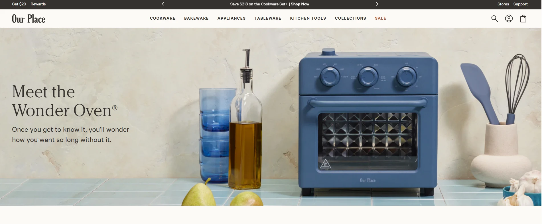
- Product in Action: Do not just show the product in a studio setting. Show it being used, worn, or installed in a real-life environment.
- Strategic Social Proof: Sprinkle testimonials, star ratings, and professional endorsements (like vet or doctor approvals) throughout the page, not just at the bottom.
- Action-Oriented CTAs: Use descriptive language in your buttons. Instead of "Submit," use "Claim my discount" or "Start my transformation."
- Remove Friction: Strip the navigation bar. If a user can click away to your "About Us" page, you have lost the focus required for a conversion.
- Authentic Urgency: If you run a promotion, use real deadlines. Faux countdown timers that reset every time the page refreshes are transparently deceptive and damage brand equity.
The Role of Data: Analytics and Optimization
Designing the page is only the first step. To ensure sustained success, you must utilize tools like Crazy Egg to track performance.
- Heatmaps: These allow you to visualize where users are clicking—and more importantly, where they are ignoring—on your page.
- Session Recordings: By watching how users navigate your site, you can identify "friction points" where they get stuck or confused.
- A/B Testing: Never assume your first version is your best. By testing different headlines, button colors, or image placements, you can iterate your way to higher conversion rates based on objective data rather than intuition.
Frequently Asked Questions
Do I need a landing page if I only sell one product?
Yes. A landing page allows you to test different marketing angles for your single product. You can create different pages for different traffic sources—for example, one focusing on "gift-ability" for holiday shoppers and another focusing on "problem-solving" for pain-point searchers.
Will a dedicated landing page hurt my SEO?
Only if you allow it to compete with your primary site for the same keywords. The standard industry approach is to set paid-traffic landing pages to noindex and ensure they target long-tail keywords that your primary pages are not optimized for.
How long should an e-commerce landing page be?
Length is determined by the "consideration cost" of the product. A $20 impulse buy requires a short, snappy page. A $500 piece of technology requires a longer, more detailed page that provides technical specifications, extensive social proof, and comprehensive objection handling.
Conclusion
The e-commerce landing page is a living document. It requires constant monitoring, testing, and refinement. By focusing on the user’s intent, removing barriers to conversion, and backing your design choices with robust analytics, you transform your website from a passive digital brochure into a powerful, automated sales engine. In the modern retail landscape, the ability to turn a click into a customer is the single most important competitive advantage a brand can possess.
