
The Science of Conversion: Mastering the E-commerce Landing Page
In the hyper-competitive digital marketplace, the difference between a window shopper and a lifelong customer often boils down to a single, focused experience. While a brand’s homepage serves as a digital lobby for general exploration and product pages act as encyclopedic references for specific items, the e-commerce landing page is the tactical strike force of your marketing strategy.
A landing page is a standalone, purpose-built destination designed for one specific audience and one specific conversion goal. Whether a visitor arrives via a high-intent Google search, a compelling Instagram ad, or a targeted email blast, the landing page must seamlessly continue the narrative started by that link. To understand why some pages drive explosive growth while others languish, we must dissect the mechanics of high-performing designs and the psychological triggers that turn traffic into revenue.
The Anatomy of a High-Converting Landing Page
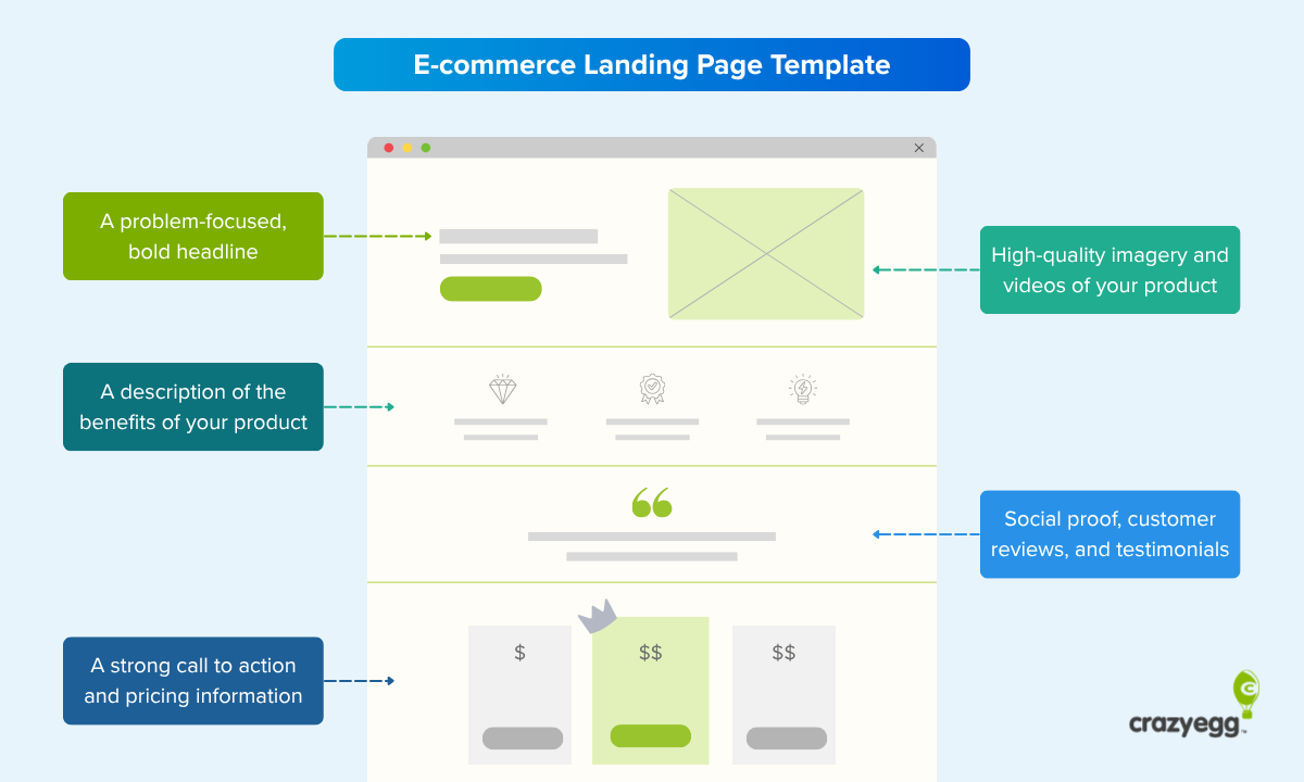
The most effective landing pages are not built on guesswork; they are engineered based on a rigid set of design principles. At their core, high-converting pages share four non-negotiable elements: a singular offer with a single Call-to-Action (CTA), a persuasive message that aligns perfectly with the referring ad, irrefutable social proof, and high-fidelity visuals.
1. Message-to-Market Match
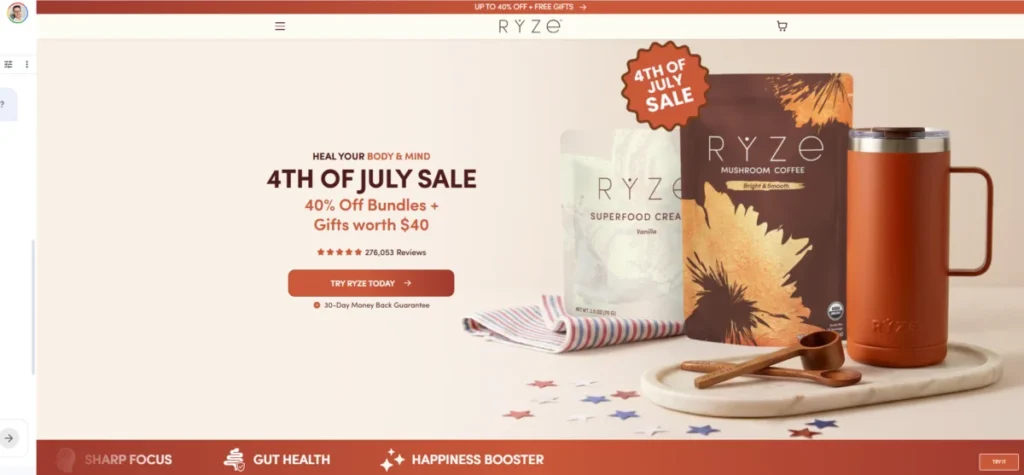
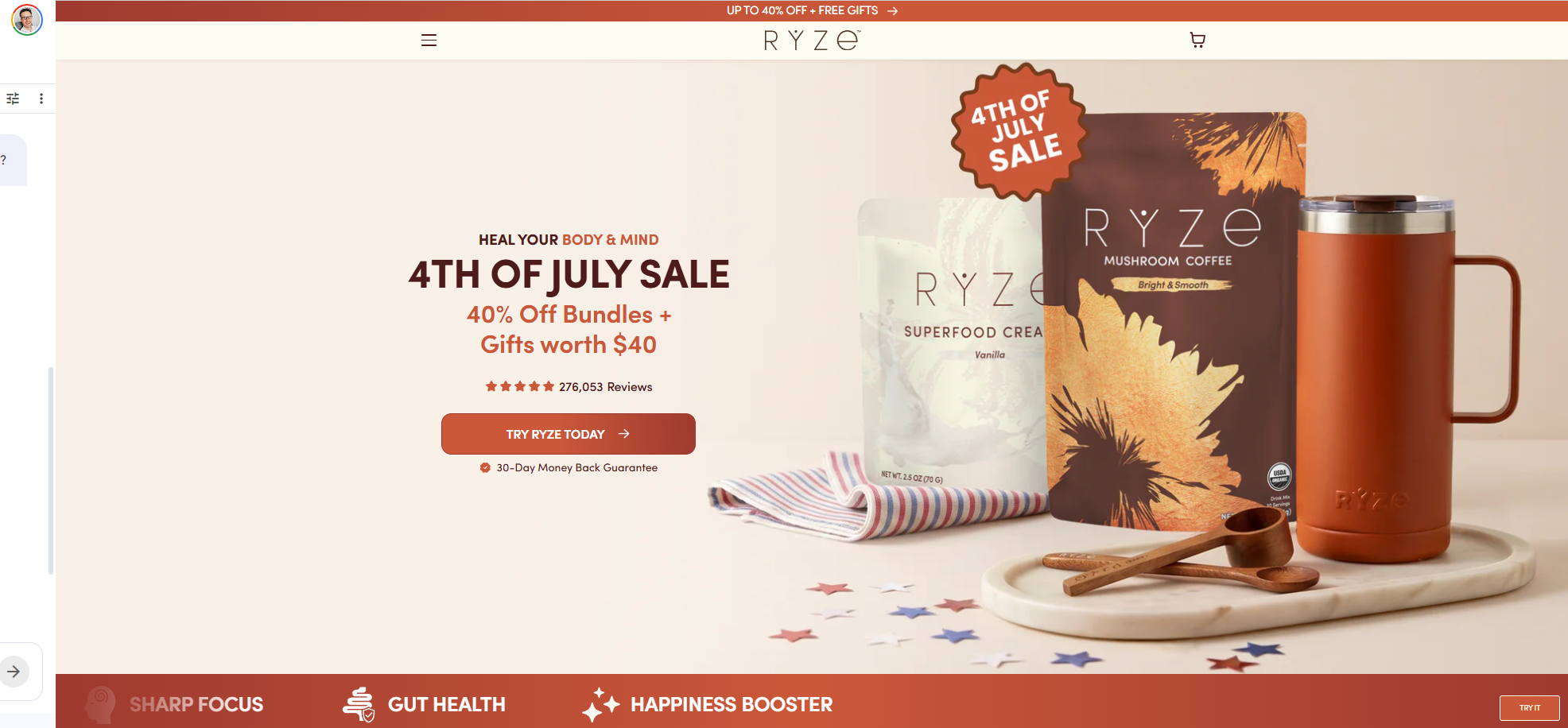
The most common point of failure is "ad-to-page friction." If your advertisement promises a "40% discount on summer essentials," but the landing page greets the user with a generic hero image and no mention of the discount, you have created a cognitive break. The visitor will immediately question if they have arrived at the right place. Top-tier brands ensure that the copy, tone, and imagery of the landing page mirror the ad that brought the visitor there, creating a sense of continuity that builds subconscious trust.
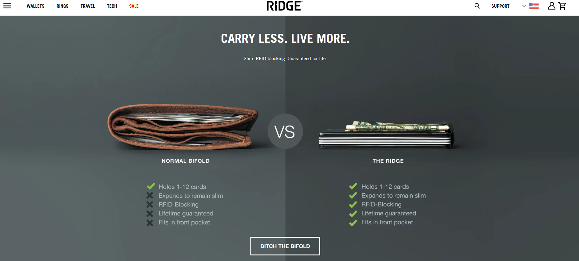
2. The Power of One
A landing page should have exactly one goal. By stripping away global navigation bars, secondary links, and distractions, you effectively "funnel" the user toward the conversion. Every element on the page—from the header to the footer—should exist solely to support that one primary CTA.
3. Visual Storytelling and Utility
Modern shoppers process visual information significantly faster than text. Using annotated images, product-in-use videos, and interactive elements allows customers to visualize the product’s value. When a brand like Flex showcases its "Stack Pack" storage system, they don’t just use a product photo; they use a video of the product in a rugged job-site environment, proving its durability while simultaneously demonstrating its utility.

Types of Landing Pages Across the Funnel
Not all traffic is created equal. Your landing page strategy must adapt based on where the visitor sits in the buying funnel.
- Top-of-Funnel (ToFu): These pages are designed to educate and capture interest from cold traffic that may not yet know your brand. These pages prioritize value-driven content and soft conversions, such as newsletter signups.
- Mid-Funnel (MoFu): These pages focus on consideration. They often feature comparison tables, educational lists, or quizzes that help the user solve a specific problem, gently guiding them toward a product solution.
- Bottom-of-Funnel (BoFu): These are the closer pages. Here, the focus shifts to risk reversal—money-back guarantees, free returns, and clear, authoritative CTAs—designed to eliminate the final barriers to purchase.
- Post-Purchase: Often overlooked, these pages nurture long-term relationships by providing setup guides, community access, or cross-sell recommendations that turn a one-time buyer into a repeat customer.
Case Studies: Learning from the Leaders
To understand what works in the real world, we can examine eight brands that have mastered the art of the landing page.
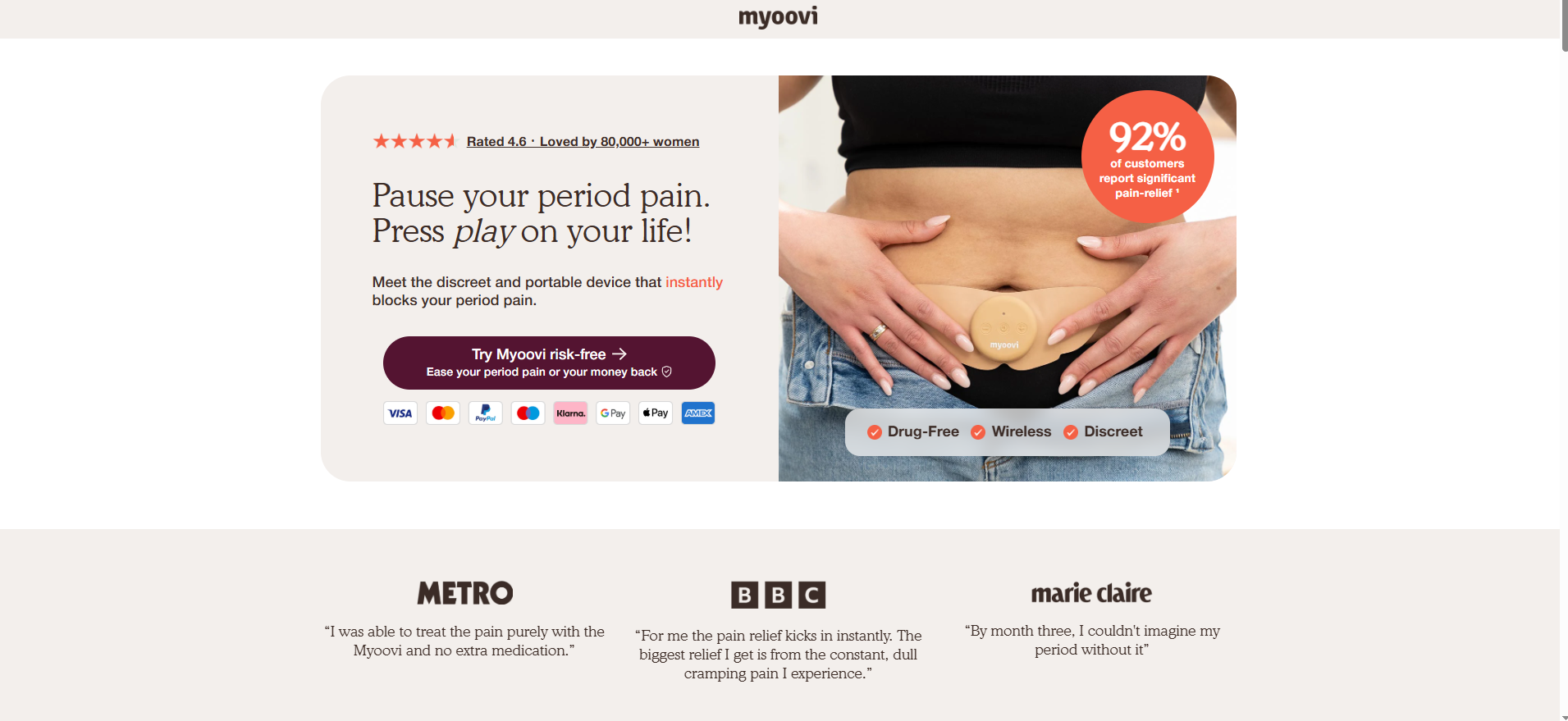
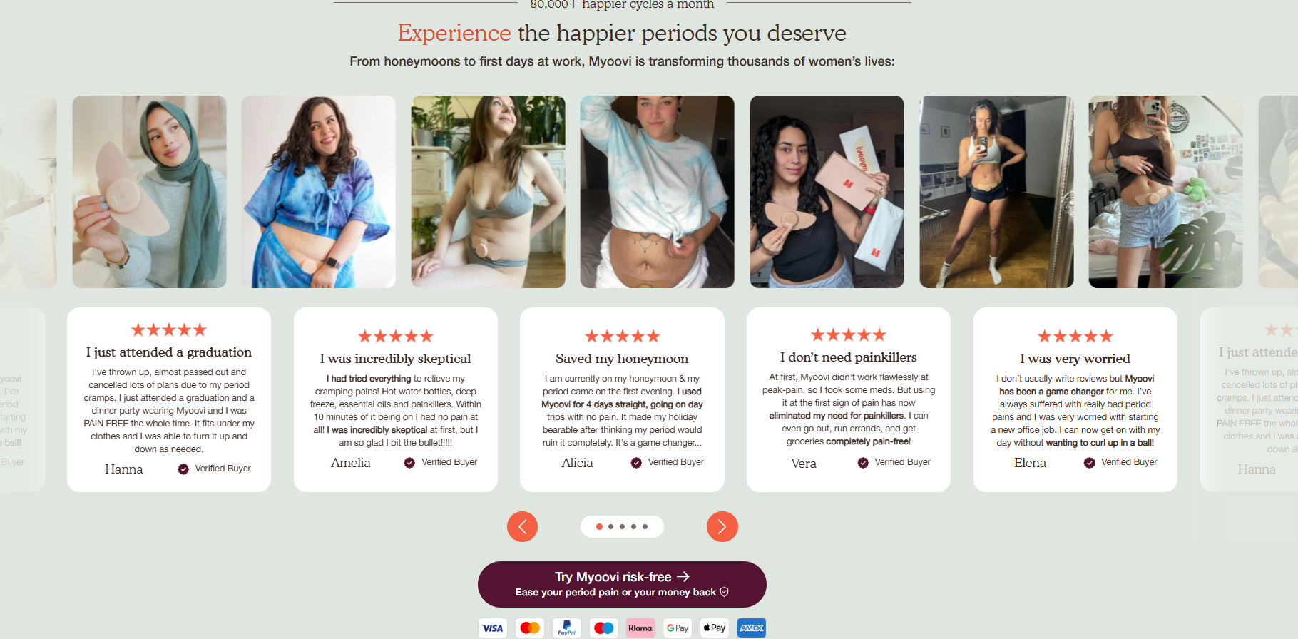
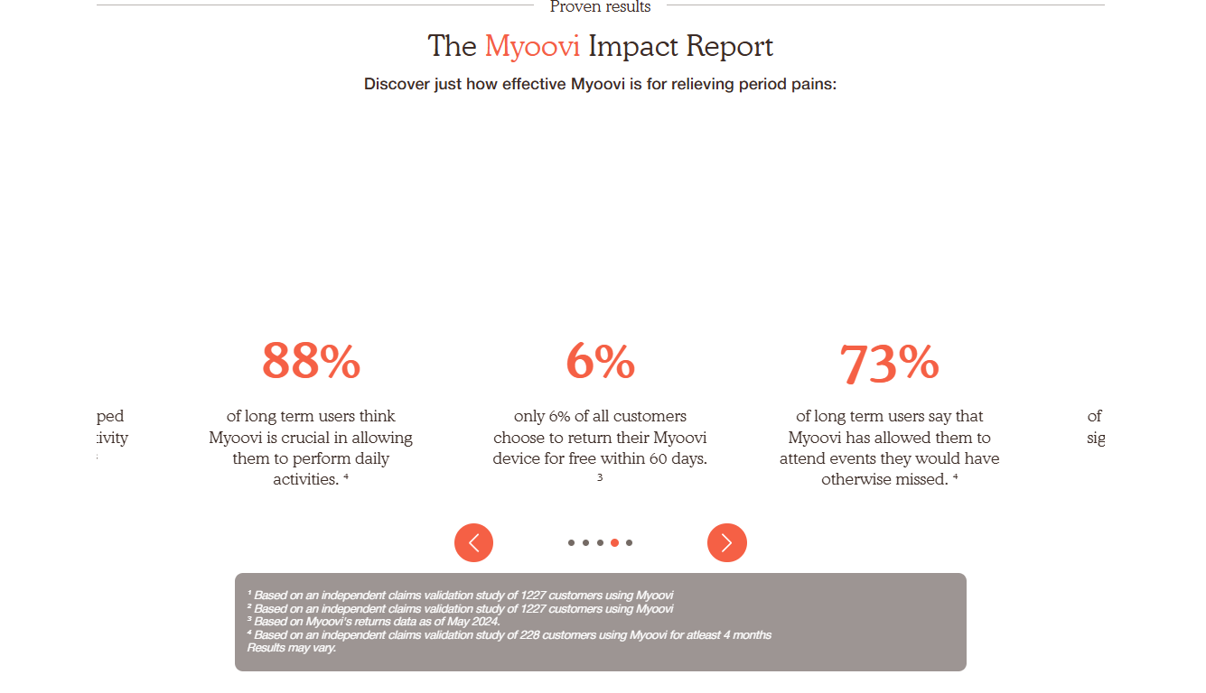
Myoovi: The Art of Risk Reversal
Myoovi, a provider of period-pain relief devices, understands that health-related purchases require high trust. They layer social proof—such as 92% efficacy statistics and five-star review grids—throughout the page. By offering a 60-day money-back guarantee and repeating it in the CTA, they remove the financial risk for the customer, making the decision to "press play on their life" easier.
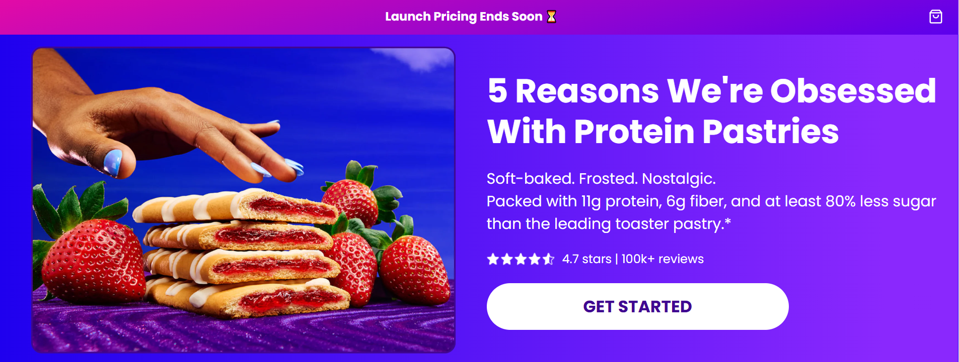
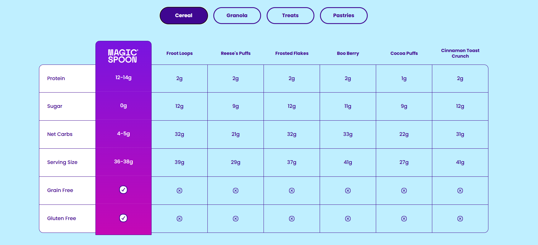
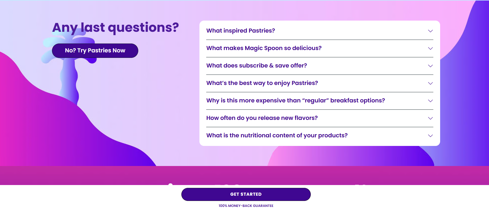
Magic Spoon: Data-Driven Education
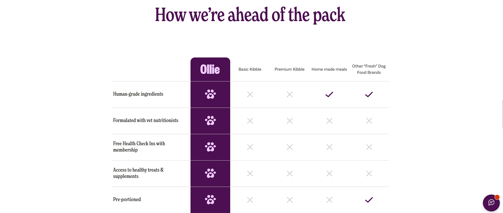
Magic Spoon uses its landing page to address the "nutrition gap." By pitting its protein-pastry product against established, sugar-laden competitors in a direct comparison table, they turn a technical argument into a clear, visual win. They anticipate objections in a robust FAQ section, ensuring that price-sensitive customers understand the value proposition before they reach the cart.
Eight Sleep: Interactive Engagement
Eight Sleep elevates the landing page experience with an interactive "hotspot explorer." By allowing users to click through different features of their smart mattress cover, they engage the user’s curiosity. This interactive component, coupled with a "celebrity wall" of high-profile users, builds an aura of innovation and credibility that static images simply cannot match.
Maelys: Gamification as a Lead Generator
Maelys employs a five-step skincare quiz. By gamifying the experience, they don’t just collect data; they create an investment loop. As the user completes each step, their commitment to the process grows. When the email capture gate appears at the end, the user is significantly more likely to provide their contact information because they have already invested time in the "personalized" results.
Best Practices for Design and Implementation
If you are looking to audit your own pages, start with these eight foundational rules:
- Match the Ad: Ensure the promise made in the ad is the first thing the user sees on the landing page.
- Hero Value Proposition: Your headline should clearly state the "why." Why should I buy this, and why now?
- Above-the-Fold Priority: The user should know exactly what the page is about and what they need to do without scrolling.
- Show, Don’t Just Tell: Use video and high-resolution imagery to show the product in action.
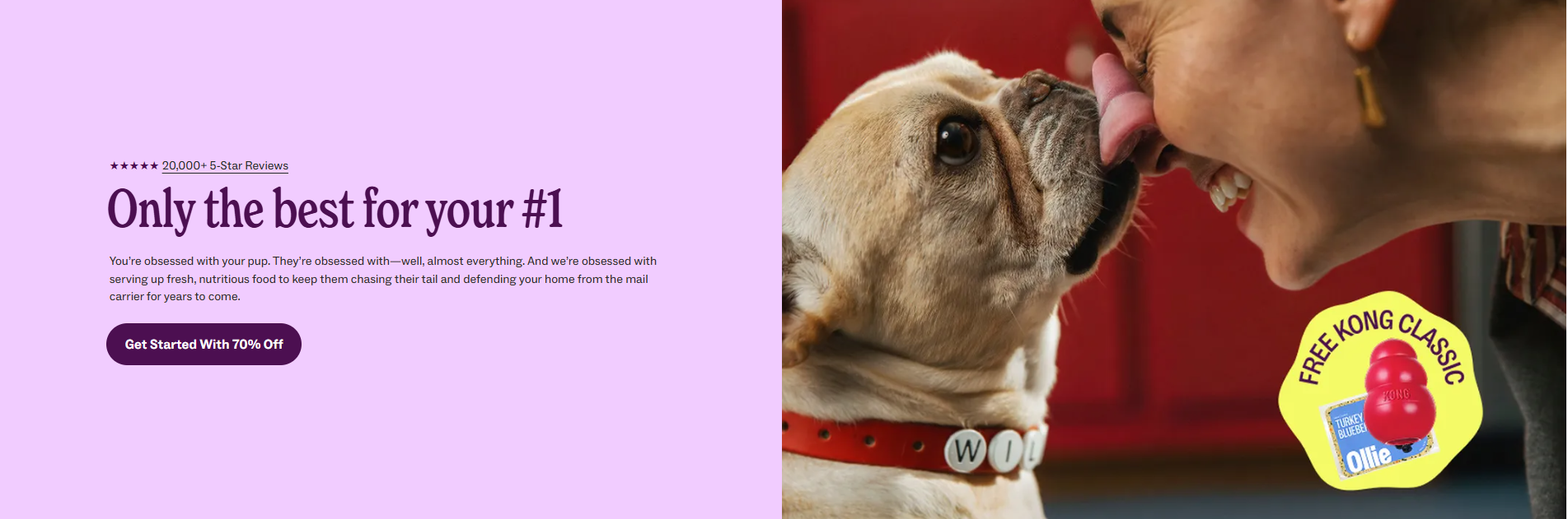
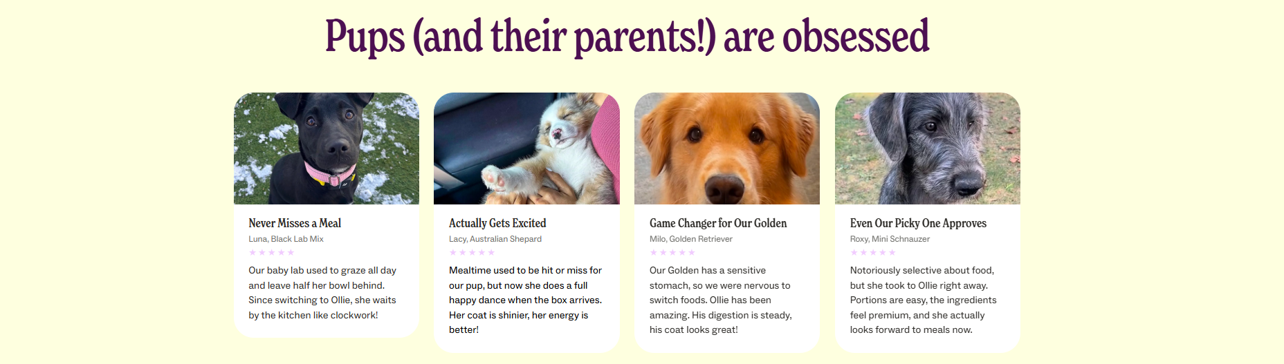
- Aggregated Social Proof: Don’t just hide reviews in a tab; display aggregate ratings in the hero and use testimonials to address specific pain points.
- Action-Oriented CTAs: Use copy that describes the benefit, such as "Claim My 30% Off," rather than generic labels like "Submit."
- Exit Elimination: Remove all unnecessary navigation. If a visitor can leave, they will.
- Urgency and Scarcity: Use specific, real-world deadlines. If a sale ends on July 6th, say that. Vague "ends soon" messaging is rarely effective.
Analytical Optimization: The Role of Data
Building the page is only the first step. The true power of a landing page lies in its ability to be optimized through rigorous testing. Tools like Crazy Egg allow marketers to view heatmaps and session recordings, revealing exactly where users are clicking, where they are getting stuck, and where they are abandoning the funnel.
For example, if a heatmap reveals that 80% of your users never scroll past the second screen, you know your most critical information—your USP and CTA—must be moved higher. If session recordings show users clicking on non-clickable elements, it’s a sign that your design is confusing the visitor’s intent.
Implications for Future E-commerce Growth
The landscape of e-commerce is shifting toward higher personalization. As we move into an era of AI-driven marketing, landing pages will likely become dynamic, changing their content in real-time based on the specific traffic source or user persona.
However, the fundamentals will remain the same: clarity, trust, and focus. Whether you are selling a $20 bag of coffee or a $2,000 smart bed, the landing page must always serve as a frictionless bridge between a customer’s need and your solution. By removing the noise and focusing on the conversion, brands can significantly lower their customer acquisition costs and increase the lifetime value of every visitor who lands on their site.
Frequently Asked Questions
Do I need a landing page if I only sell one product?
Yes. Even with a single product, your traffic comes from different intents. Someone searching for "best back pain solutions" needs a different landing page than someone searching for "Myoovi discount code." Dedicated pages allow you to tailor the message to that specific search intent.
How many landing pages should I have?
A general rule of thumb is to have one landing page per primary marketing campaign. If you are running three different promotional offers, you should have three distinct landing pages.
Will a dedicated landing page hurt my SEO?
It only hurts your SEO if you let it "cannibalize" your organic pages. Use the noindex tag for paid-traffic landing pages to ensure Google focuses its ranking efforts on your core product and category pages.
How long should an e-commerce landing page be?
Length is determined by the "consideration time" of the product. Low-cost, impulse items can convert on a three-screen page. High-ticket, complex items require more space to build trust, handle objections, and explain the technology. Let the product complexity dictate the length, not an arbitrary rule.
