
The Architecture of Conversion: Choosing the Right Website Format for Your Business
In the digital landscape, a website is far more than a collection of pixels and code; it is a strategic business asset. However, many entrepreneurs and marketing teams fall into the trap of prioritizing aesthetic trends over structural logic. They choose themes based on visual appeal, only to find that their conversion rates remain stagnant.
The secret to a high-performing website lies in its format. A website format is the foundational skeleton—the specific arrangement and hierarchy of sections designed to guide a visitor toward a singular, intended action. While design is the "skin" of the site, format is its "bones." Understanding the seven core website formats is essential for any business leader looking to align their online presence with their bottom-line objectives.
Main Facts: Understanding Website Formats
At its core, a website format dictates the user journey. It is not about the color palette or the typeface; it is about the structural flow. While every website requires a header, a hero section, a body, and a footer, the content sandwiched between the hero and the footer determines the site’s efficacy.
Format vs. Layout vs. Template
To master web strategy, one must distinguish between three commonly confused terms:
- Format: The structural blueprint (e.g., the order of sections).
- Layout: The visual arrangement (e.g., grid vs. list, white space usage).
- Template: A pre-packaged, installable asset that contains a specific layout and design.
A common failure in web development is selecting a template solely for its visual flair without verifying if its underlying format supports the business’s conversion goals.
The 7 Essential Website Formats
Every online business, from a local hardware store to a multinational SaaS provider, fits into one of seven primary categories. Selecting the right one is the first step toward optimization.
1. The Brochure Site
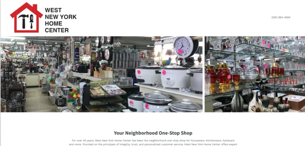
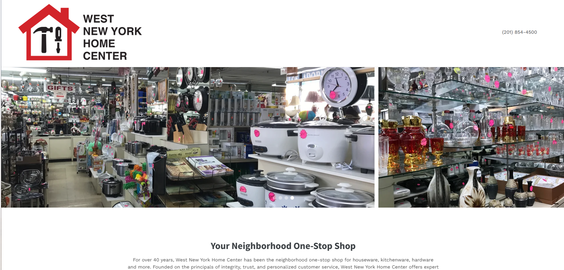
Designed for businesses where the ultimate goal is a physical visit—such as restaurants, salons, or retail outlets—the brochure site acts as a digital business card.
- Key Sections: Business identity, location, hours of operation, and contact information.
- Strategy: Minimize friction. The site should provide immediate clarity on what the business offers and exactly where to find it.
2. The Local Service Site
For tradespeople, law firms, and medical practices, the goal is a phone call or a quote request.
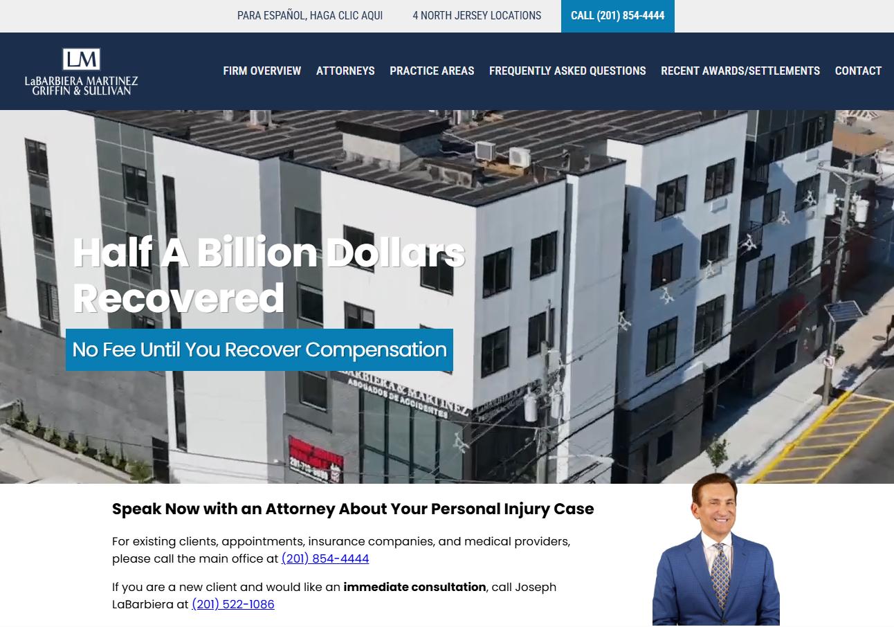
- Key Sections: Hero CTA (Call to Action), clear service area definitions, and social proof (reviews/testimonials).
- Strategy: Build local authority. Visitors need to know you serve their specific geography and that you are a trusted entity.
3. The Online Store
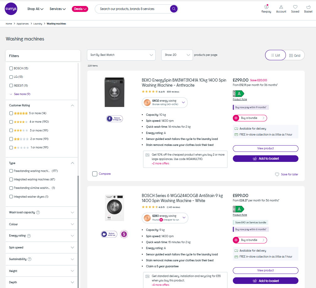
The primary objective here is transactional. Whether you are a boutique or a mass-market retailer, the format must prioritize product discovery and checkout efficiency.
- Key Sections: High-impact product entry points, clear navigation, and a frictionless path to the cart.
- Strategy: Eliminate "choice paralysis" through intuitive category filtering and ensure the checkout process is devoid of unnecessary steps.
4. The Online Service (SaaS)
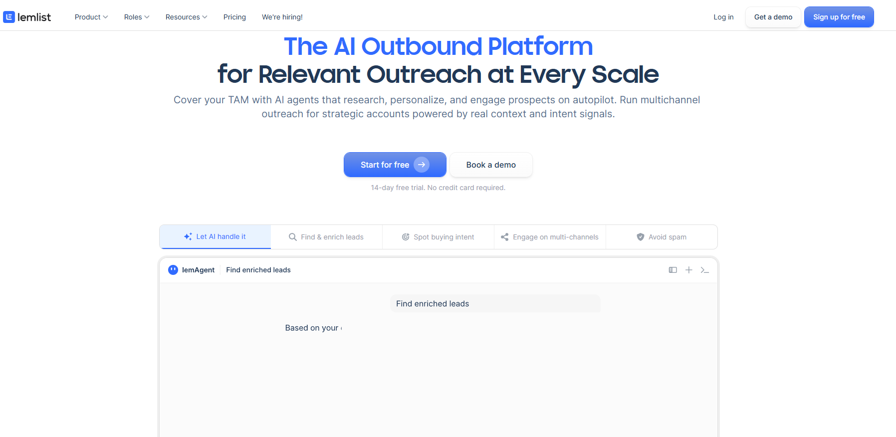
Subscription-based businesses rely on the "Online Service" format to convert traffic into trial signups or demo bookings.
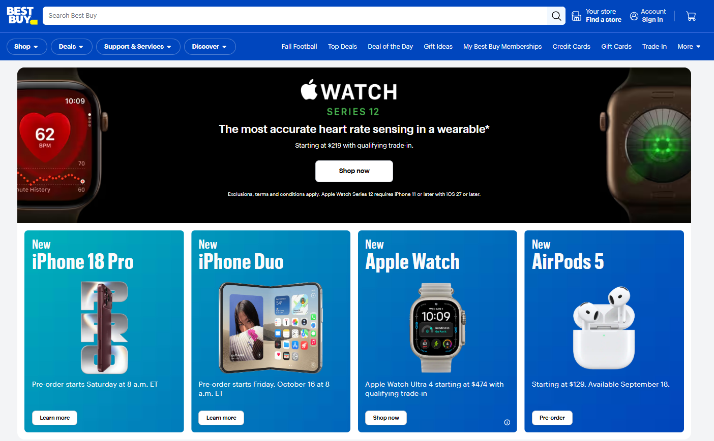
- Key Sections: Value-proposition-heavy hero section, feature breakdown, social proof, and a clear, repetitive sign-up CTA.
- Strategy: Education. Because SaaS products are often complex, the page must guide the user from "problem awareness" to "solution adoption."
5. The Consultative Site
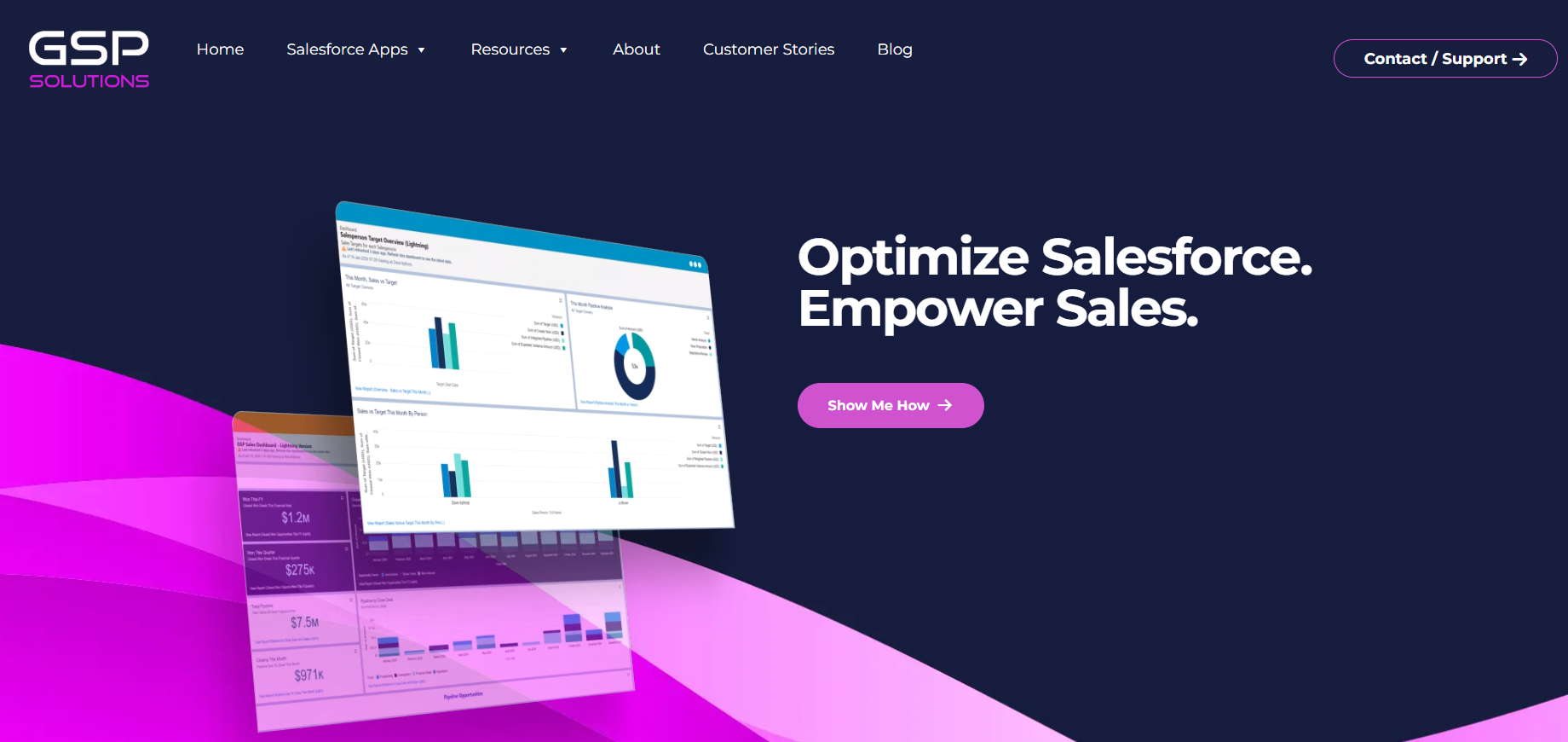
For B2B firms with long sales cycles, the website serves as an educational bridge.
- Key Sections: Case studies, white papers, and expert content.
- Strategy: Trust-building. Since the "sale" often happens over months, the site must function as a nurture engine, capturing emails or facilitating direct consultations.
6. The Publication Site
Media companies, blogs, and content platforms earn revenue through attention.
- Key Sections: Infinite scroll or related-article widgets, prominent search bars, and newsletter signup blocks.
- Strategy: Engagement. The format must keep the user within the ecosystem by providing a clear, compelling path to the "next read."
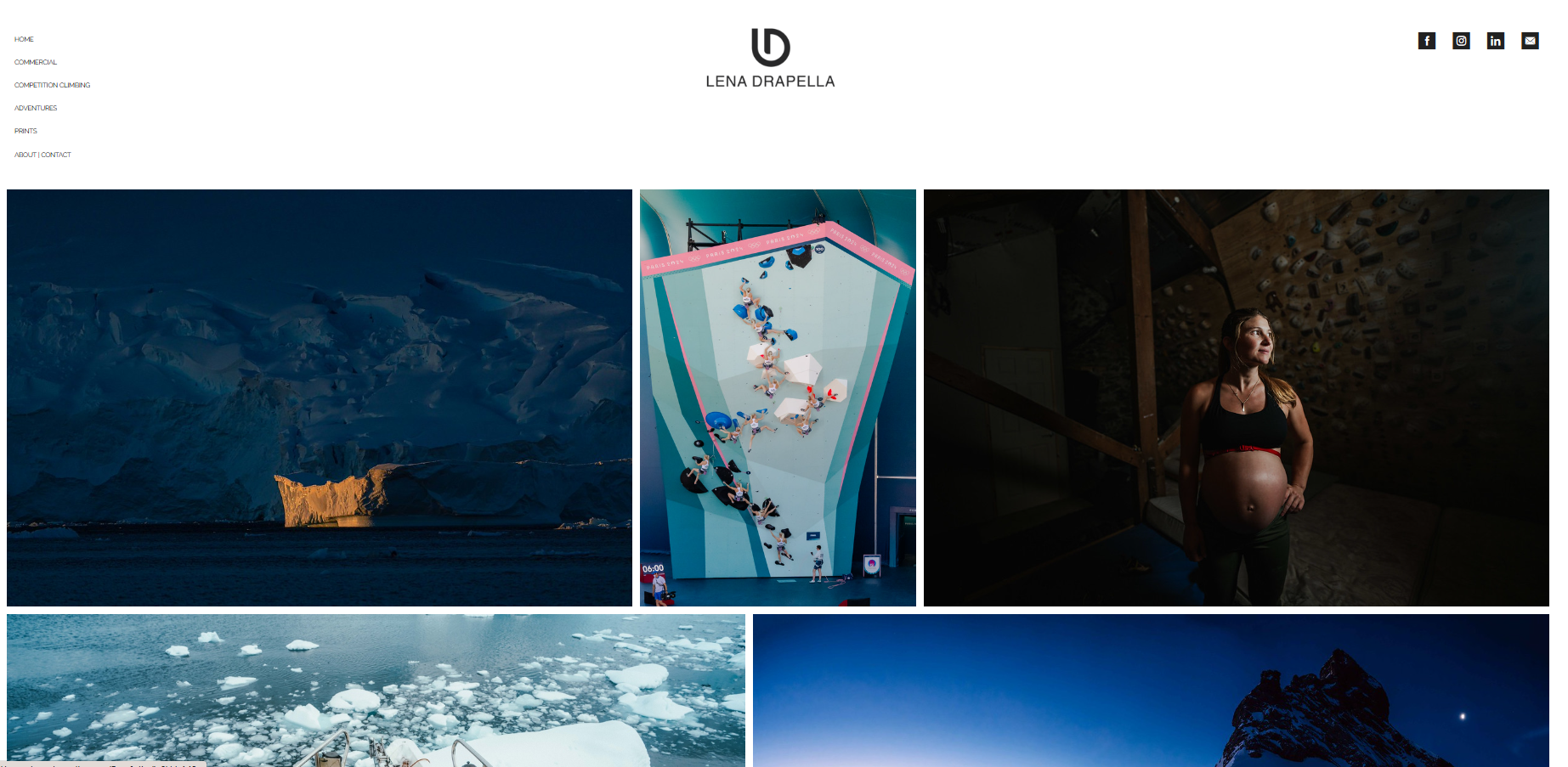
7. The Portfolio Site
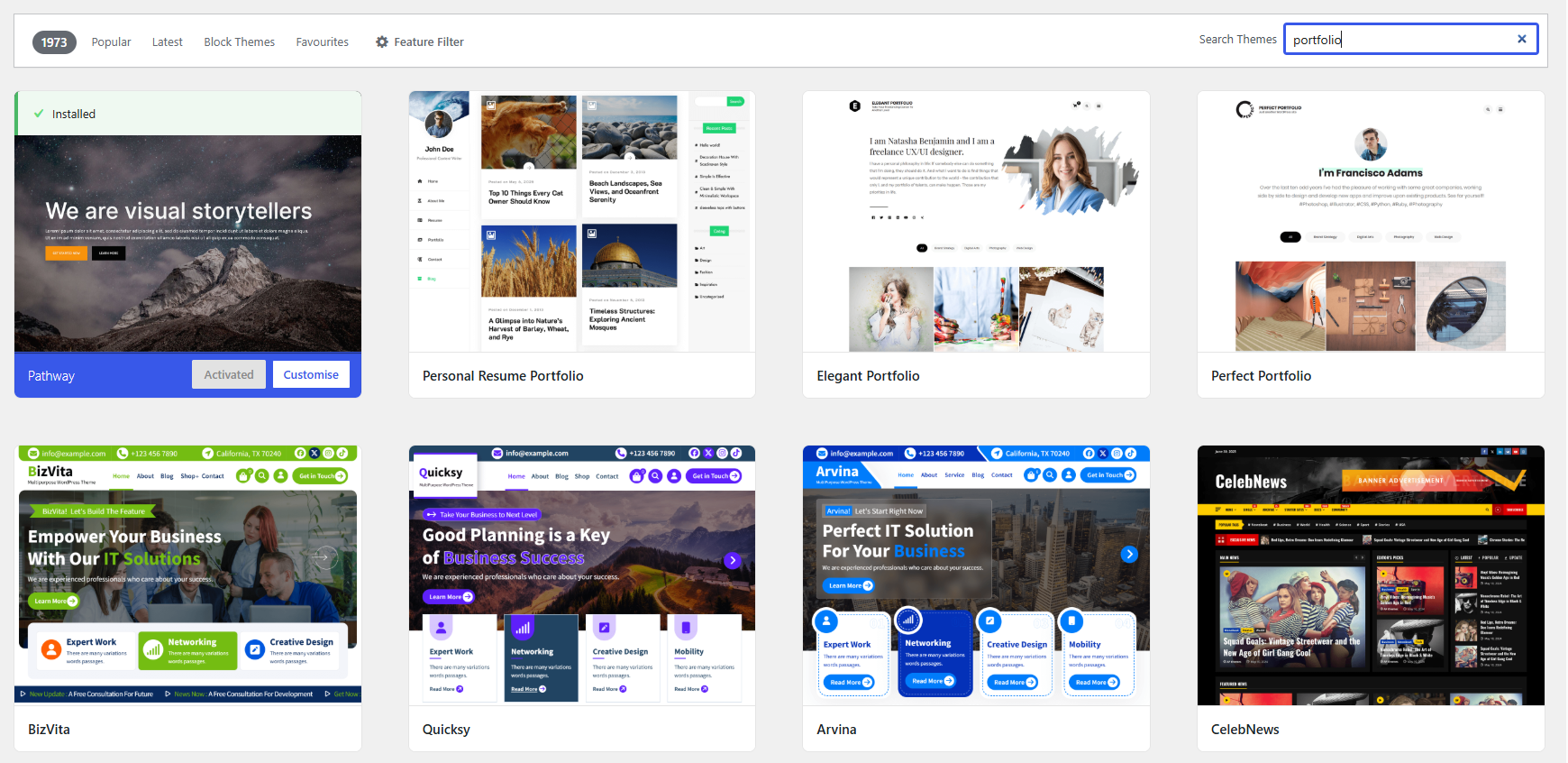
Creatives—designers, photographers, and architects—need to showcase work without distraction.
- Key Sections: High-resolution work samples and a simple contact path.
- Strategy: Minimalist impact. The work should speak for itself, with the site structure acting merely as a frame.
Chronology: Aligning Strategy with Goals
Choosing a format is not a one-time decision; it should evolve with your business objectives.
- Define the Primary Action: Ask yourself, "What is the single most important action a visitor can take?" If it’s a purchase, go with the store format. If it’s a phone call, use the service format.
- Audit the Secondary Goals: Many sites attempt to do too much. If you are a restaurant (Brochure) that also sells merchandise (Store), do not clutter the homepage. Use the Brochure format for the main landing page and create dedicated, siloed pages for the product catalog.
- Monitor and Iterate: Once the site is live, treat the format as a hypothesis. If users aren’t clicking, the structure might be at fault.
Supporting Data: Analyzing Effectiveness
Conversions are a lagging indicator. They tell you if you succeeded, but they don’t tell you why you failed. To truly understand if your format is working, you must utilize behavioral analytics.
- Heatmaps: These visual overlays reveal exactly where users click, scroll, and ignore. If your primary CTA is located in a "cold" zone, your format is failing the user.
- Session Recordings: By watching real-time navigation, you can identify "friction points"—the exact moment a user becomes confused or frustrated and abandons the page.
- Form Analytics: If you are a service-based business, are users dropping off at the phone number or the contact form? This data helps you determine if the issue is the offer or the format.
Official Perspective: The Role of UX
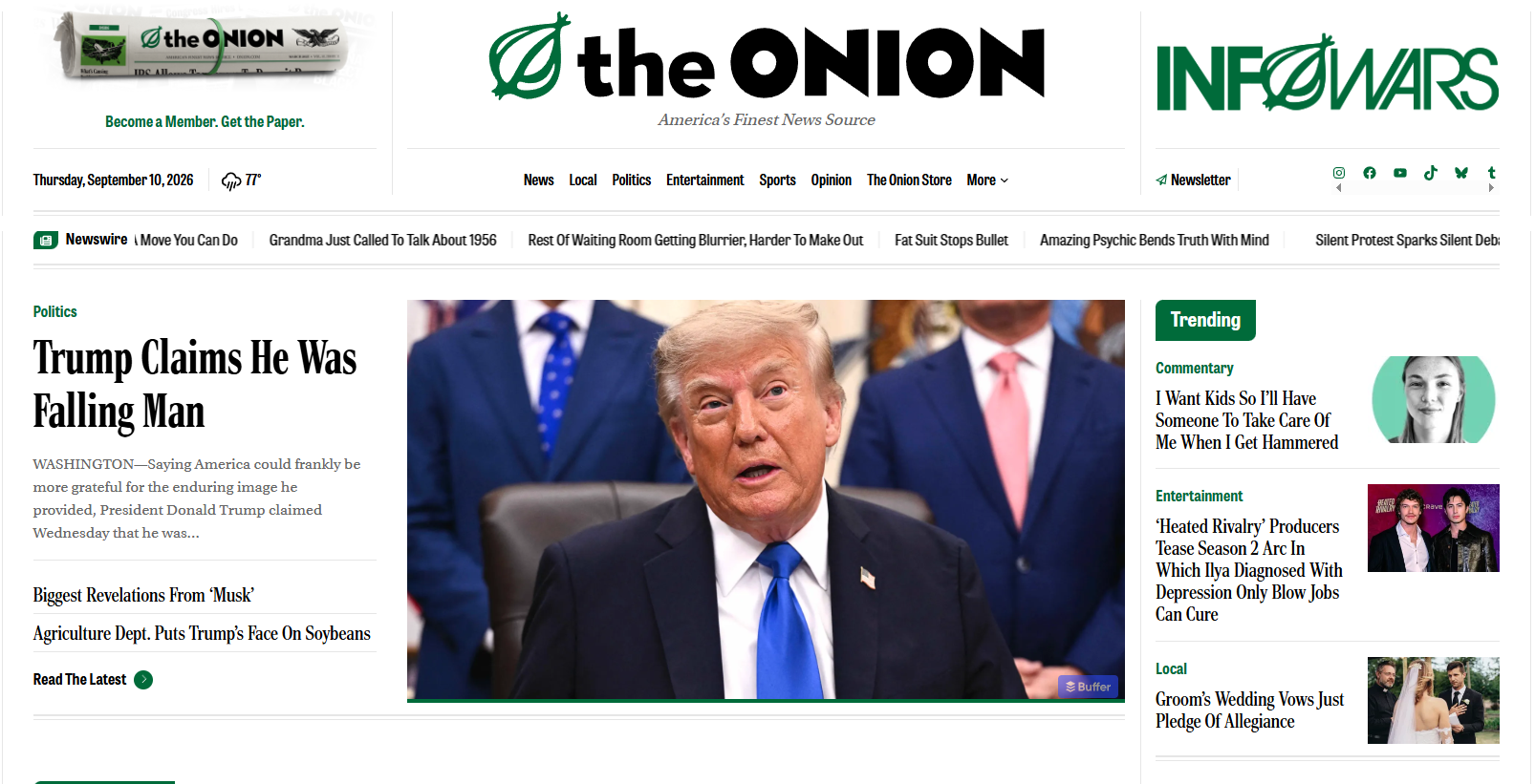
Industry experts maintain that the most successful websites are those that respect the user’s mental model. When a user lands on a site, they have subconscious expectations based on their previous experiences. For example, a user expects a search bar on a publication site and an "Add to Cart" button on a store. When a business deviates from these established formats, they create "cognitive load."
High-performing companies do not experiment with the format of their checkout process; they experiment with the color of their buttons. By adhering to proven structural norms, businesses can focus their innovation on the value they provide, rather than forcing the user to learn a new way to navigate the web.
Implications: The Bottom Line
The implication of choosing the wrong website format is significant: lost revenue, higher bounce rates, and wasted marketing spend. When your structure does not match your business model, you are essentially asking your customers to navigate an obstacle course rather than a clear path to purchase.
By auditing your site against these seven formats, you can identify gaps in your user journey. Are you running a consultative B2B business but using a brochure-style site? You are likely losing leads who need more educational content to trust you. Are you an e-commerce brand with a cluttered, publication-style homepage? You are likely distracting customers from the checkout.
Conclusion
Your website format is the foundation of your digital presence. Before you invest in new design elements or expensive ad campaigns, ensure that your "bones" are set correctly. Once the structure is sound, your design can shine, your analytics will become actionable, and your business will be positioned to turn casual visitors into loyal, paying customers.
