
The Strategic Anatomy of a Website Sidebar: Balancing Navigation, Conversion, and User Experience
In the high-stakes world of web design, every pixel competes for a visitor’s limited attention. While modern design trends often lean toward minimalist, full-width layouts, the humble website sidebar remains a powerhouse for information architecture and conversion optimization. When implemented correctly, it serves as a digital lighthouse, guiding users through deep content catalogs and nudging them toward critical actions. When implemented poorly, it becomes a source of "banner blindness" and cognitive friction.
Understanding how to leverage this vertical real estate is essential for any content-heavy blog, documentation site, or e-commerce storefront.
The Role of the Sidebar in Modern Web Architecture
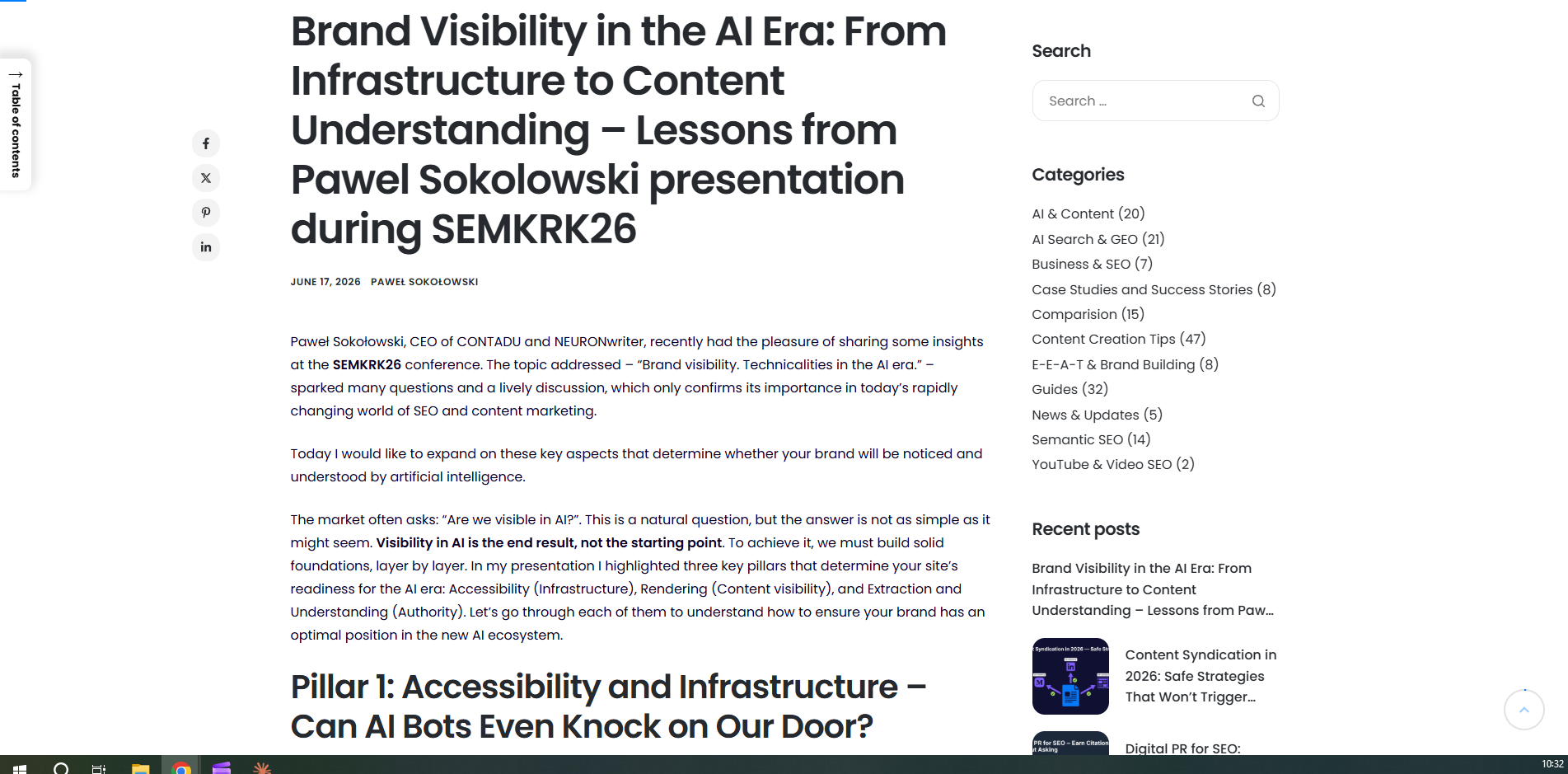
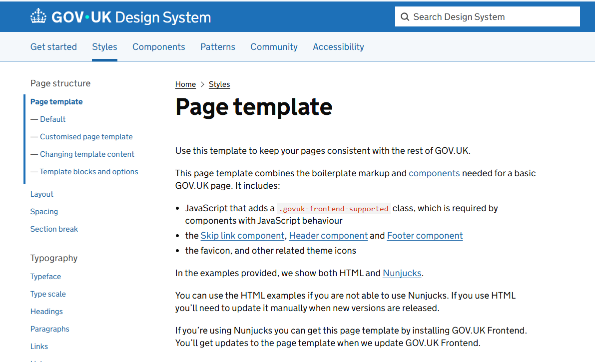
At its core, a website sidebar is a vertical column positioned to the left or right of the primary content area. Its function is to host secondary material—navigation menus, search bars, calls-to-action (CTAs), social proof, or widgets—without obstructing the main narrative or utility of the page.

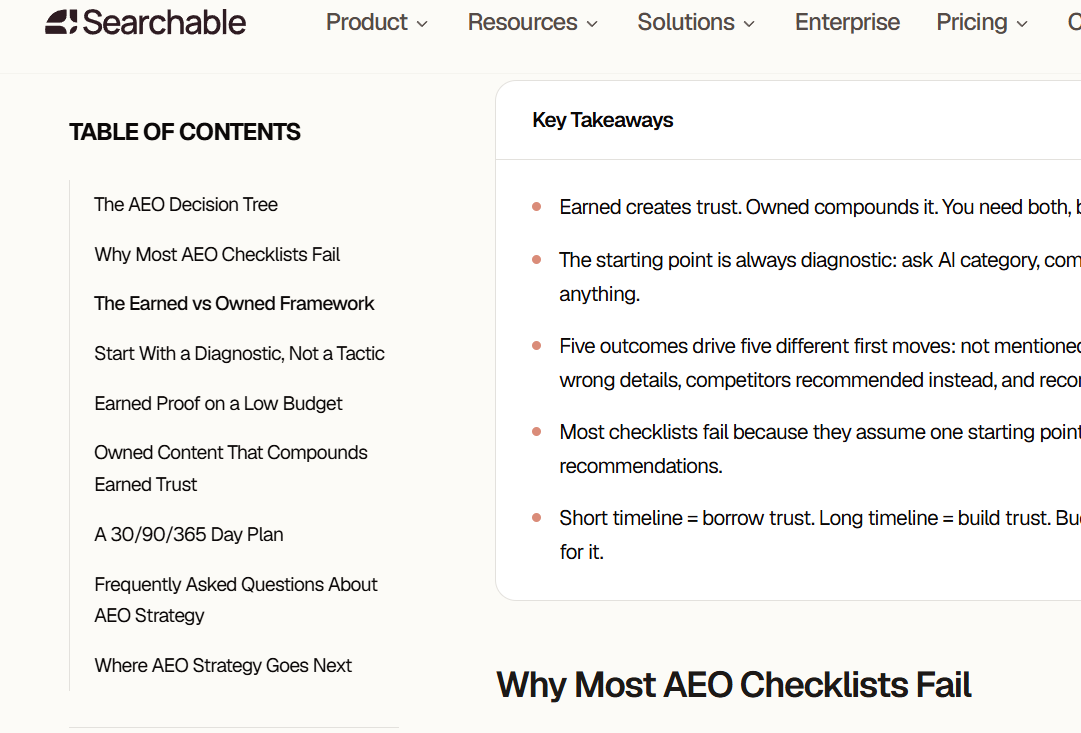
For content-heavy platforms, the sidebar is not just a design element; it is an organizational necessity. By providing a persistent navigational anchor, it allows users to jump between sections or categories without returning to the homepage. For e-commerce sites, it acts as a filter console, enabling users to narrow down thousands of products to the exact match for their needs.
Sidebar vs. Side Panel: Defining the Difference
There is often confusion between a "sidebar" and a "side panel." While the terms are frequently used interchangeably, their functional implementation differs:
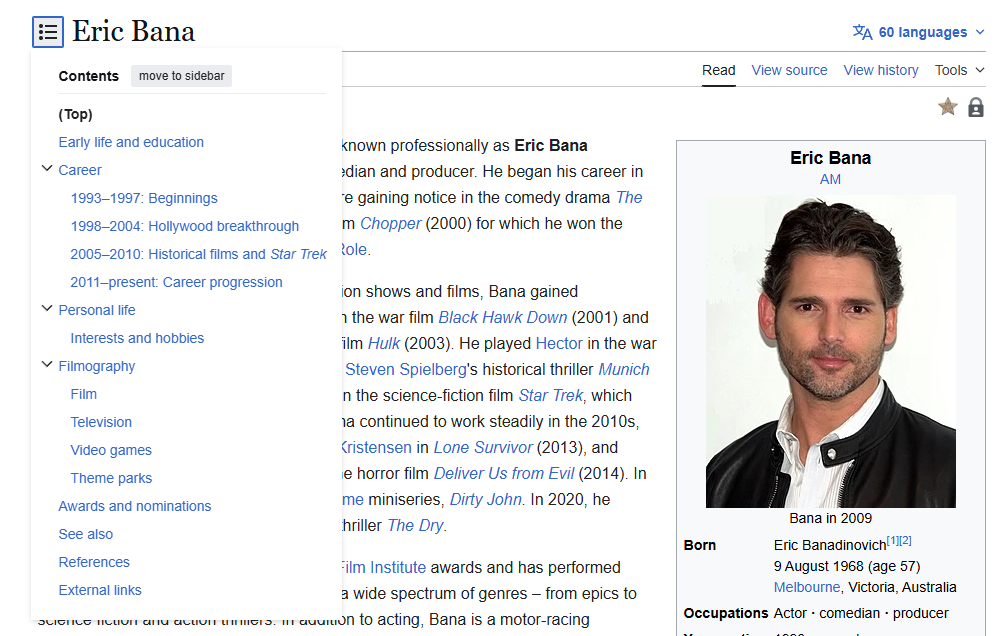
- Sidebar: A static, integrated part of the page layout. It is typically always visible and part of the overall page template.
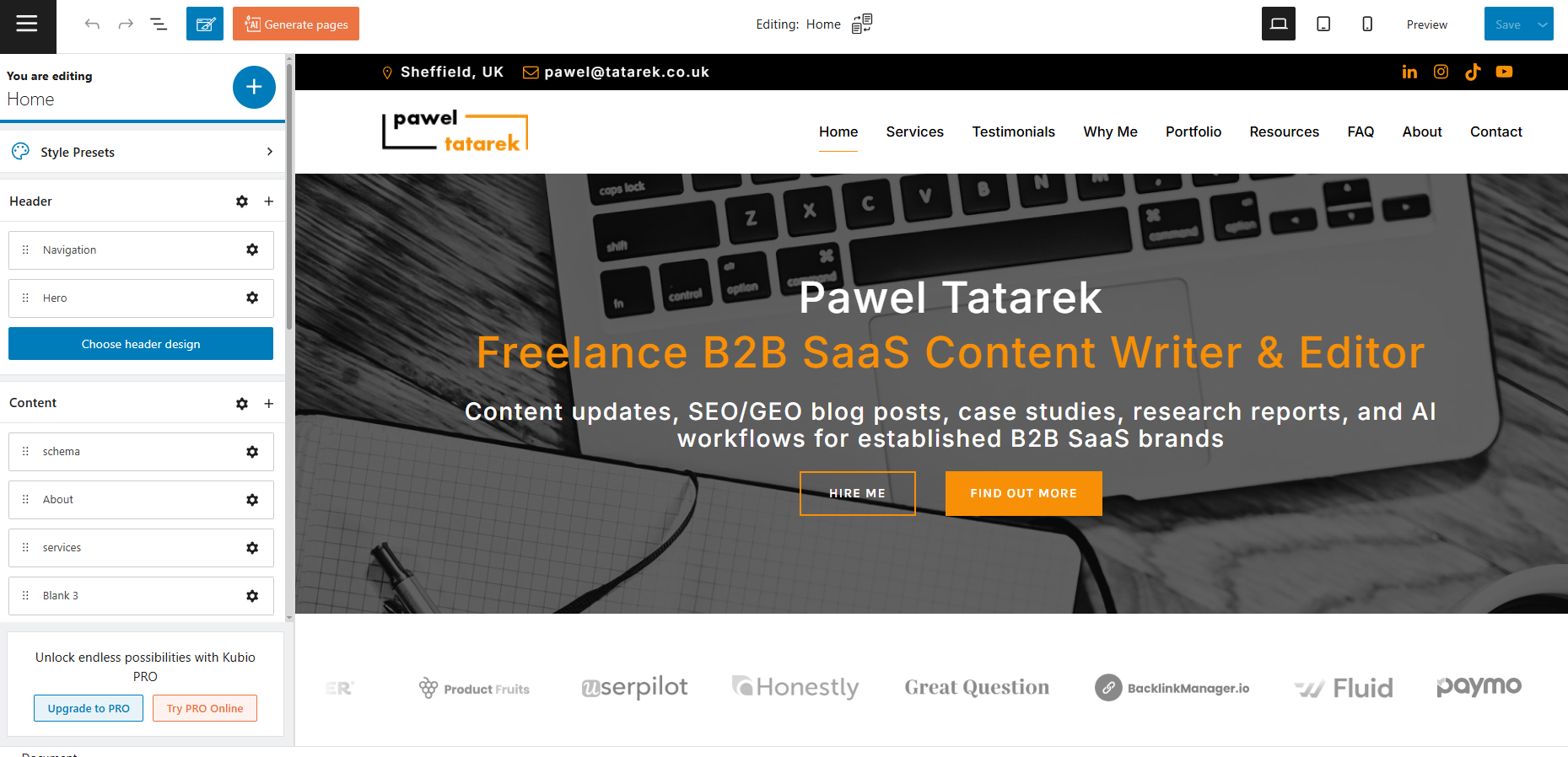
- Side Panel: An interactive interface element, often found in SaaS tools or web applications, that can be toggled open or closed. Examples include the configuration drawers in website builders like Kubio or the settings menus in productivity software.
When to Deploy (and When to Dismiss) the Sidebar
The decision to include a sidebar should be driven by the page’s objective, not by standard template settings.

The Case for Inclusion
Sidebars are most effective on pages with high information density. These include:
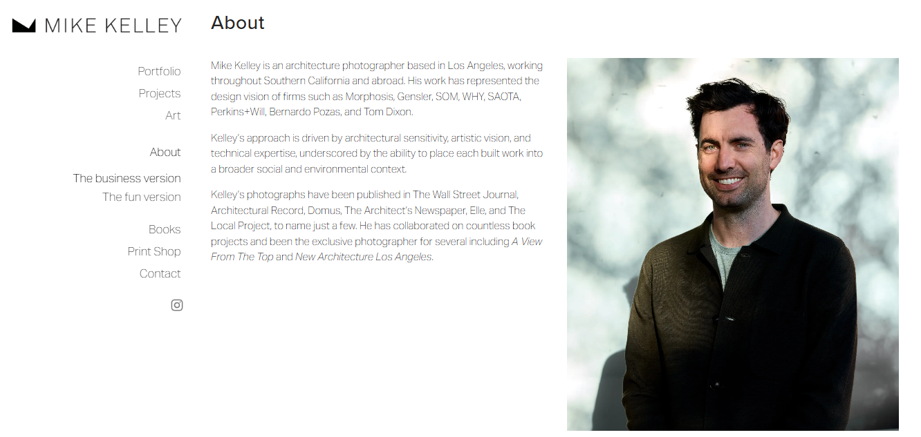
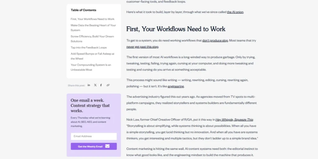
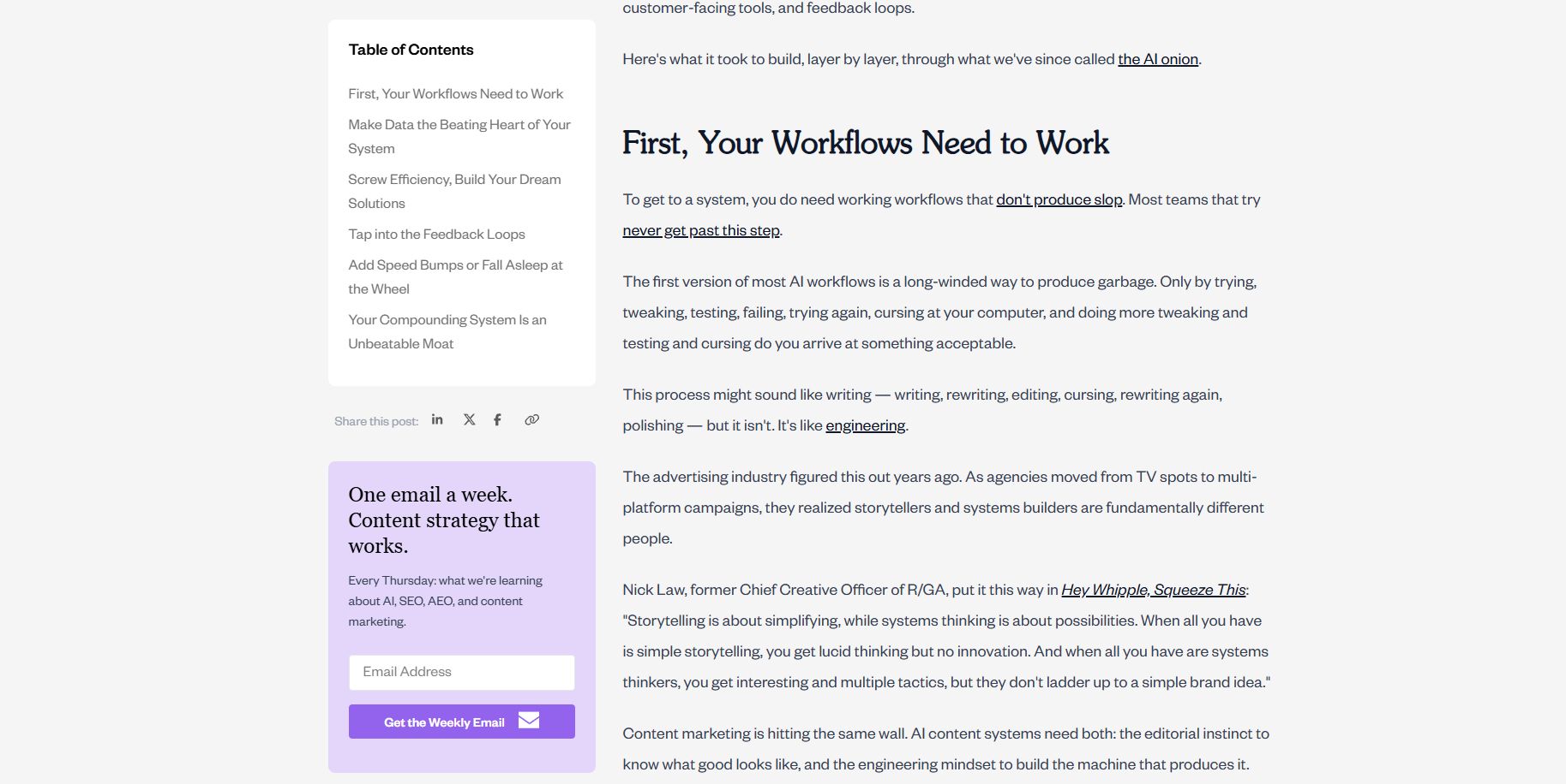
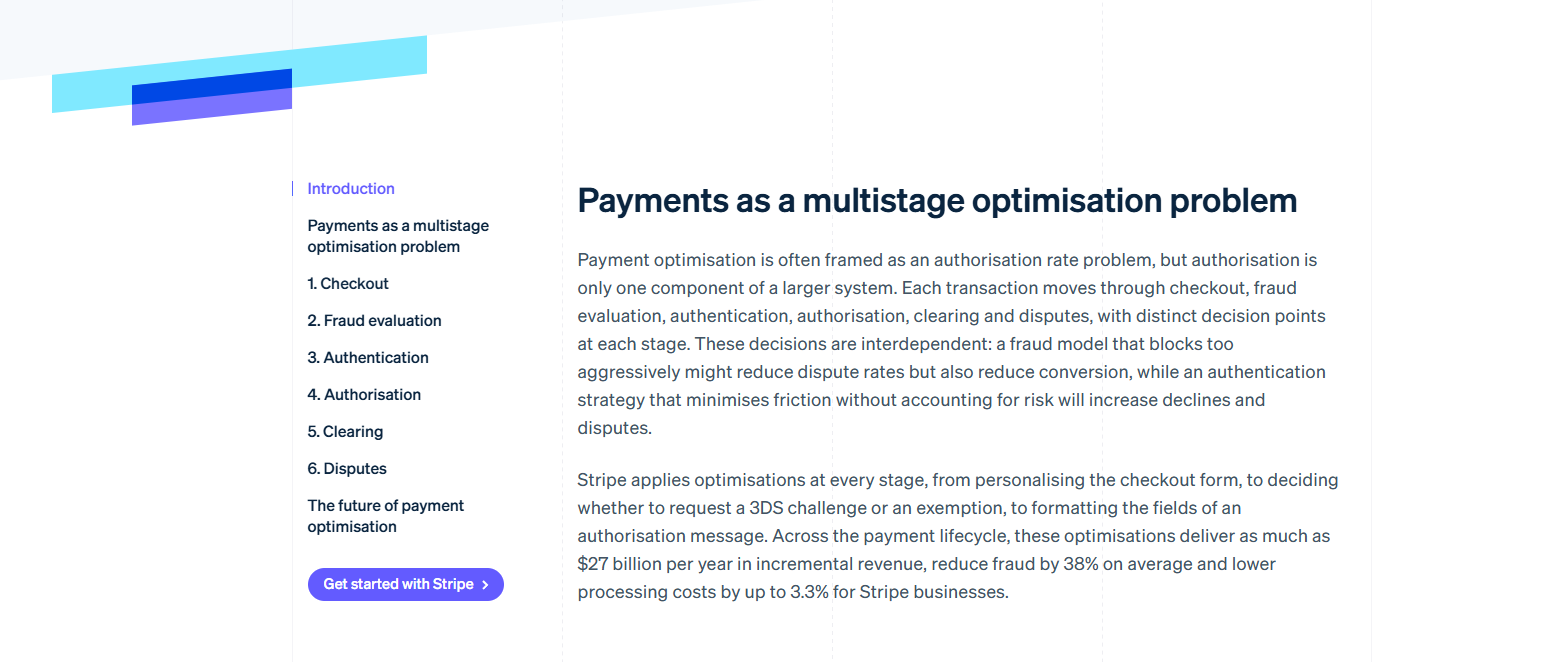
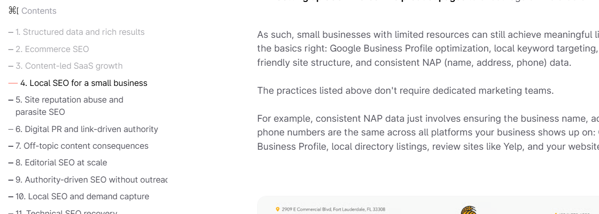
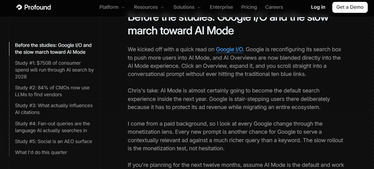
- Educational Blogs and Documentation: Sites that host long-form content or technical guides benefit from "sticky" tables of contents that help users track their progress and jump to relevant sections.
- E-commerce Category Pages: Filters for size, price, color, and brand are essential for the user experience, and they occupy the sidebar naturally.
- Resource Libraries: When a site houses hundreds of articles, a sidebar provides the necessary categorization to keep content discoverable.
The Case for Omission
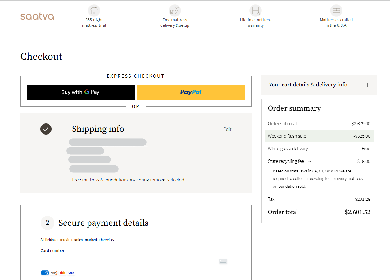
There are instances where a sidebar is a liability. On landing pages or checkout pages, the goal is singular: conversion. Introducing a sidebar on these pages creates "choice overload" and provides an escape hatch that distracts the user from completing the desired action. Similarly, on mobile devices, space is at a premium. A traditional desktop sidebar will often render as a clunky, long list of links before the actual content, frustrating mobile users. On small screens, it is almost always better to move essential sidebar links into a hamburger menu or a footer section.
Strategic Elements: What to Put in Your Sidebar
To maximize the value of your sidebar, you must curate its contents based on the primary goal of the page.
1. Navigational Elements
Navigation is the most common use of a sidebar. This includes:

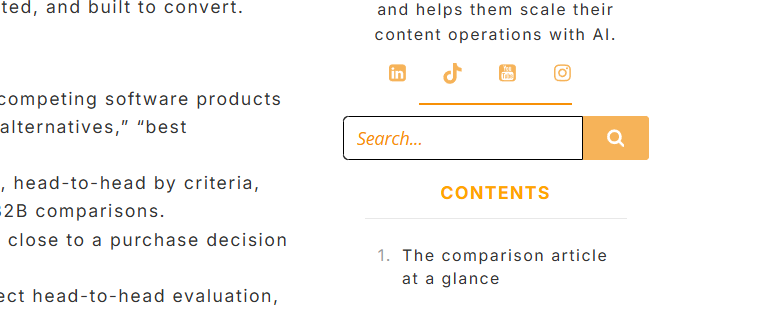
- Table of Contents (TOC): Essential for long-form articles, allowing readers to navigate complex topics easily.
- Category Menus: Helping users drill down into specific sub-topics.
- Search Functionality: Providing an immediate way for users to find what they are looking for when they don’t want to browse.
2. Conversion Drivers
A well-placed sidebar can act as a subtle yet effective conversion tool.

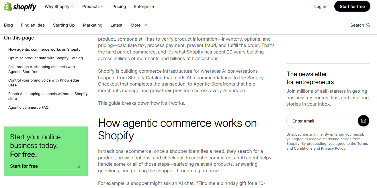
- Newsletter Sign-ups: A static or sticky form in the sidebar can capture leads without interrupting the reading flow.
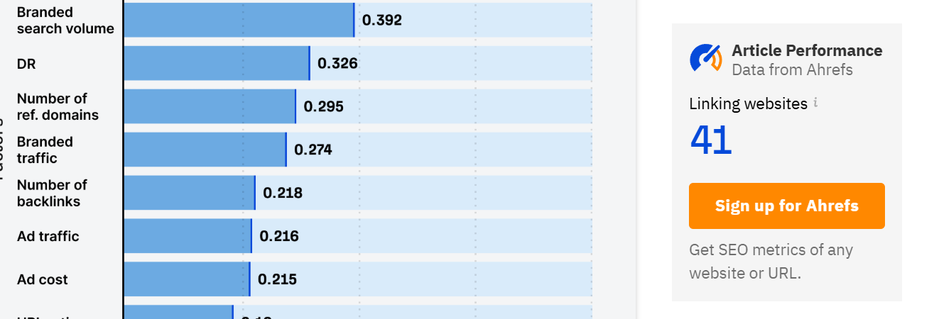
- Primary CTAs: For SaaS or service-based companies, a "Start Free Trial" or "Request a Quote" button placed in the sidebar ensures that the conversion trigger remains visible even as the user scrolls through the content.
- Resource Downloads: Offering a whitepaper or checklist relevant to the current article’s topic creates high-intent lead magnets.
3. Supplementary Content (Trust and Engagement)
These elements build authority and keep users on your site longer:

- Author Bios: Essential for building trust in the YMYL (Your Money, Your Life) SEO landscape.
- Most Viewed/Popular Posts: This encourages internal linking and keeps users engaged with your most high-performing content.
- Social Proof: Displaying badges, partner logos, or recent social media mentions can solidify your brand’s credibility.
Best Practices for Sidebar Design
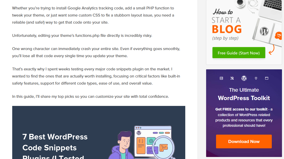
A sidebar should feel like an extension of the page, not a bolted-on advertisement. If it looks like an ad, users will treat it like one—leading to "banner blindness," where visitors subconsciously ignore the area entirely.
Typography and Visual Integration
Use the same typeface, color palette, and spacing as your main content. Avoid heavy borders or high-contrast backgrounds that make the sidebar pop out in a jarring way. The goal is for the sidebar to feel like a helpful, native part of the user’s reading experience.

The Power of the "Sticky" Sidebar
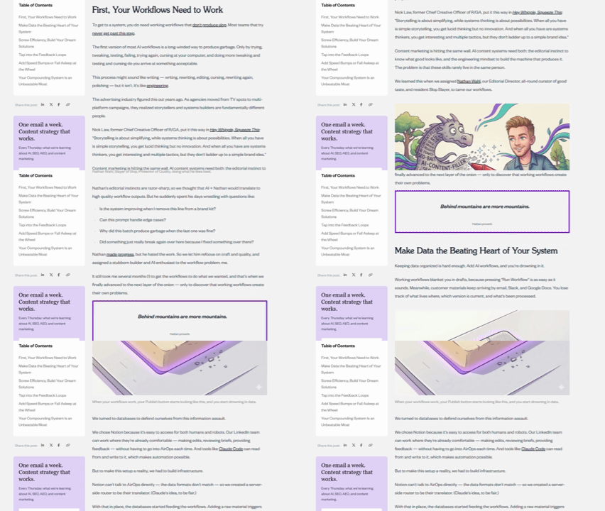
One of the most effective UX patterns is the "sticky" sidebar. By pinning key elements—such as the Table of Contents or a primary CTA—to the top of the browser window as the user scrolls, you ensure that the most important navigational and conversion points are always available. Research from platforms like GrowthRock and MoneyGeek has shown that sticky conversion elements can lift conversion rates by as much as 20% compared to static counterparts.

Optimal Width and Readability
According to design research, for a standard desktop view, your sidebar should fall between 240 and 320 pixels wide. This allows the main content area to occupy the "sweet spot" of 600 to 700 pixels, which is optimal for reading comfort (approximately 55–75 characters per line).
Left vs. Right: Where Does it Go?
- Left-hand side: Since Western reading patterns are F-shaped (starting from the top left and scanning across), the left side is where users pay the most attention. Place critical navigation or high-priority CTAs here.
- Right-hand side: Best for secondary, supplementary content that supports the reader but shouldn’t compete for their primary focus.
Data-Driven Optimization: Testing Your Layout
You should never assume your sidebar is perfect. The only way to validate its effectiveness is through behavioral data.

Leveraging Heatmaps and Scroll Maps
Heatmaps provide a visual representation of where users are clicking. If your sidebar has a "Related Posts" section that never gets a click, it is essentially dead weight. Similarly, scroll maps will show you exactly where users stop reading and abandon the page. If your sidebar content is significantly longer than your article, you are forcing the user to look at white space or footer content, which degrades the experience.

Session Recordings
While heatmaps show you what happened, session recordings show you why. By watching individual sessions, you can identify "rage clicks" on non-clickable elements or see users scrolling erratically in search of a menu. This qualitative data is invaluable for identifying points of friction.
The Role of A/B Testing
A/B testing is the ultimate arbiter of performance. Test variables such as:
- Presence vs. Absence: Does removing the sidebar increase conversion rates on your landing page?
- Placement: Does moving the navigation from the right to the left improve time-on-site?
- Content: Does a text-based newsletter signup outperform a branded graphic version?
The SEO and Technical Implications
A common question is whether sidebars negatively impact SEO. The short answer is no. Search engines are sophisticated enough to distinguish between main content and sidebar "chrome." However, there is an indirect impact. If your sidebar is filled with excessive links or content that slows down your page load speed (a core web vital), your rankings could suffer.
Furthermore, from an architectural standpoint, the sidebar should use logical HTML5 semantic tags (<aside>). This helps search engine crawlers understand that the content is supplementary to the main article (<main>).
Conclusion: The Strategic Sidebar
The website sidebar is a versatile, powerful tool, but it requires a disciplined approach. It should never be a repository for every link, widget, or ad you can think of. Instead, it should be a carefully curated space that serves the user’s needs. By focusing on consistent design, sticky navigation for deep content, and rigorous data-driven testing, you can transform your sidebar from a cluttered distraction into a primary driver of user engagement and business growth.
Frequently Asked Questions (FAQ)
How do I add a sidebar in WordPress?
In traditional themes, you can manage sidebars via Appearance > Widgets. For modern block-based themes, use the Site Editor to insert a "Sidebar" or "Group" block containing your widgets.
Should I use a sidebar menu or a top navigation bar?
Use a top navigation bar for primary, high-level pages. Use a sidebar for secondary, depth-oriented navigation—like resource centers or product catalogs. A hybrid approach is often the most effective.

What is the best way to handle sidebars on mobile?
Don’t use them. The screen real estate is too small. Instead, move essential sidebar content to the bottom of the page or into a mobile-specific navigation drawer.

Does a complex sidebar hurt my SEO?
It doesn’t hurt rankings directly, but if it causes a poor user experience (high bounce rates, slow load times), it will negatively impact your site’s overall performance in the eyes of search engines.
What is another name for a website sidebar?
Depending on the context, it is also referred to as a "side panel," "nav rail," or "site chrome." While these are often used as synonyms, "sidebar" remains the standard terminology in web development.
