

The Mobile Conversion Crisis: 11 Strategic Fixes to Eliminate Checkout Abandonment
In the modern digital economy, the smartphone has become the primary storefront. According to April 2026 benchmark data from DynamicYield, mobile devices now account for 74% of all e-commerce traffic. Yet, this surge in mobile browsing has revealed a glaring systemic failure: mobile cart abandonment. Currently, 81.72% of mobile shoppers abandon their carts—a figure roughly 11 percentage points higher than the desktop average.
This disparity suggests that the issue is not a lack of purchase intent, but a fundamental friction in the mobile user experience (UX). As retailers grapple with this "leakage," the need for a refined, mobile-first checkout strategy has never been more urgent.

The Anatomy of Abandonment: Why Mobile Shoppers Leave
To understand why mobile checkout conversion lags behind desktop, one must look at the psychological and technical hurdles inherent in the mobile experience. Mobile shoppers are often multitasking, browsing in fragmented time slots—on the train, during a break, or while watching television. When a checkout process is cumbersome, the "cost" of completion—measured in time, effort, and cognitive load—outweighs the desire for the product.
1. Thumb-First Design Architecture
Mobile checkout must be optimized for the "thumb-zone." Users rarely hold their phones with two hands during a casual shopping session. If essential buttons (like "Checkout" or "Place Order") are located in unreachable corners of the screen, or if navigation requires precise, small-target tapping, frustration sets in.
- The Fix: Implement "sticky" call-to-action (CTA) buttons that remain anchored at the bottom of the screen.
- Testing: Developers must test checkouts within social media in-app browsers (like TikTok or Instagram). These environments often render differently than Safari or Chrome, frequently causing UI elements to clip or break, which is a silent killer of conversion.
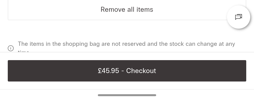
2. Debunking the Single-Page vs. Multi-Page Myth
There is a long-standing debate over whether single-page or multi-page checkouts perform better. Data suggests neither is a panacea. Single-page checkouts can feel overwhelming and lead to excessive scrolling. Multi-page checkouts provide a sense of progress but risk losing users at each transition.
- The Verdict: If you choose a single-page layout, use an "accordion" style to collapse sections, keeping the user focused on one task at a time. If you opt for multi-page, you gain the advantage of capturing an email address early in the flow, allowing for re-engagement if the user drops off. Always include a progress indicator bar to minimize the "unknown" factor.
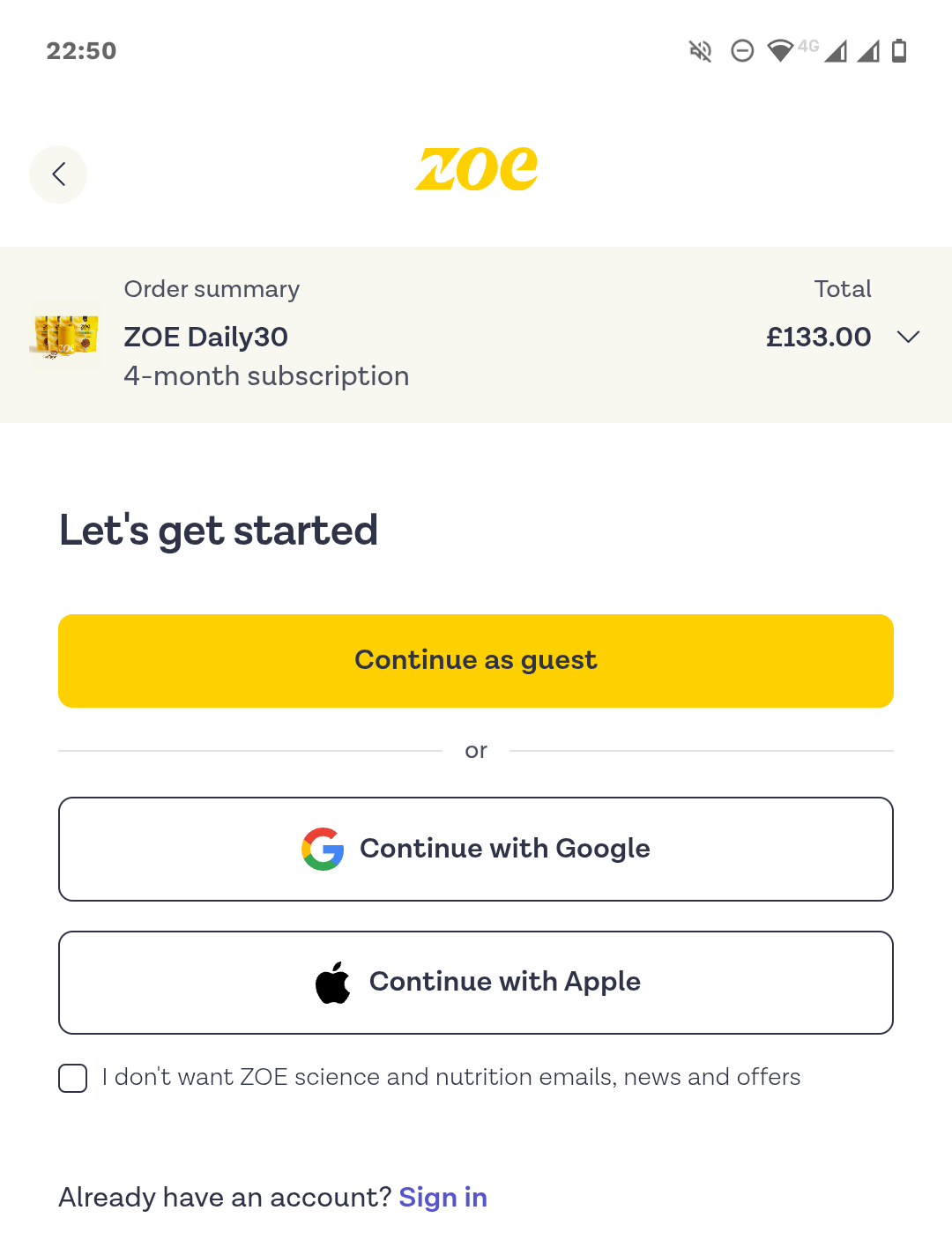
3. Frictionless Entry: Guest Checkout and SSO
Forcing account creation remains a primary driver of abandonment, accounting for 19% of drop-offs. Users value speed above all else.
- The Fix: Make "Guest Checkout" the primary, full-width button. Move account creation to the post-purchase confirmation screen, where the customer is already emotionally committed to the transaction.
- SSO Adoption: Single Sign-On (SSO) via Google, Apple, or Facebook is no longer optional; it is a baseline expectation. Implementing these can boost conversion rates by 20–40% by eliminating the need to type passwords or verify emails during the checkout flow.
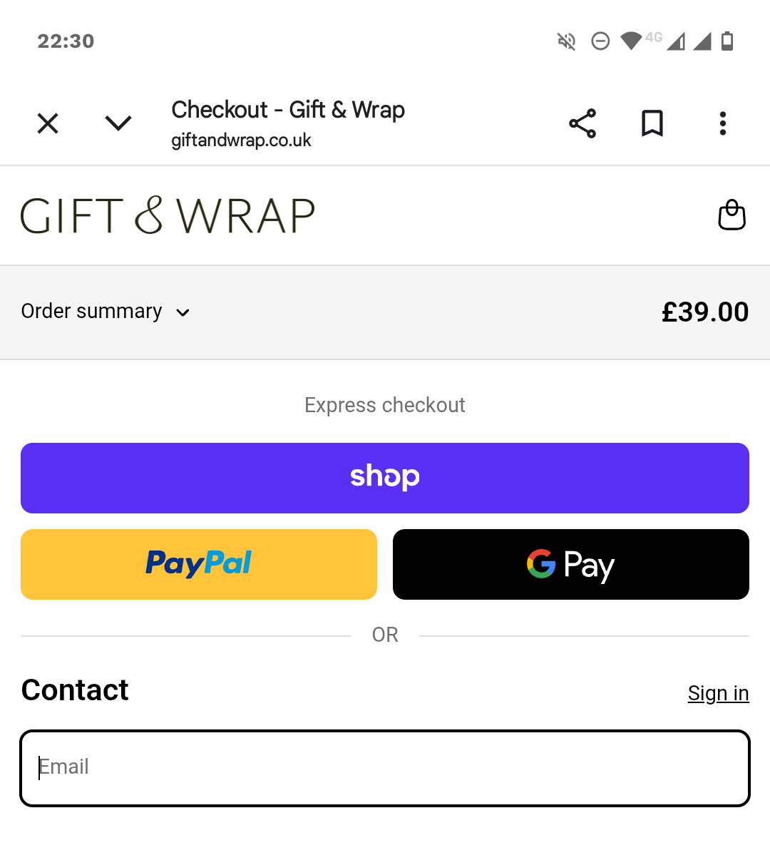
4. The Power of Digital Wallets
The integration of digital wallets—Apple Pay, Google Pay, PayPal, and Shop Pay—is arguably the highest-impact change a retailer can make. Stripe data from April 2025 indicated that adding Apple Pay boosted conversions by 22.3% and revenue by 22.5%.
- Why it works: It eliminates manual entry, reduces the risk of typos, and leverages biometric security (FaceID/TouchID), which increases consumer confidence. Localized wallets (e.g., iDEAL in the Netherlands or Alipay in China) are essential for cross-border e-commerce.
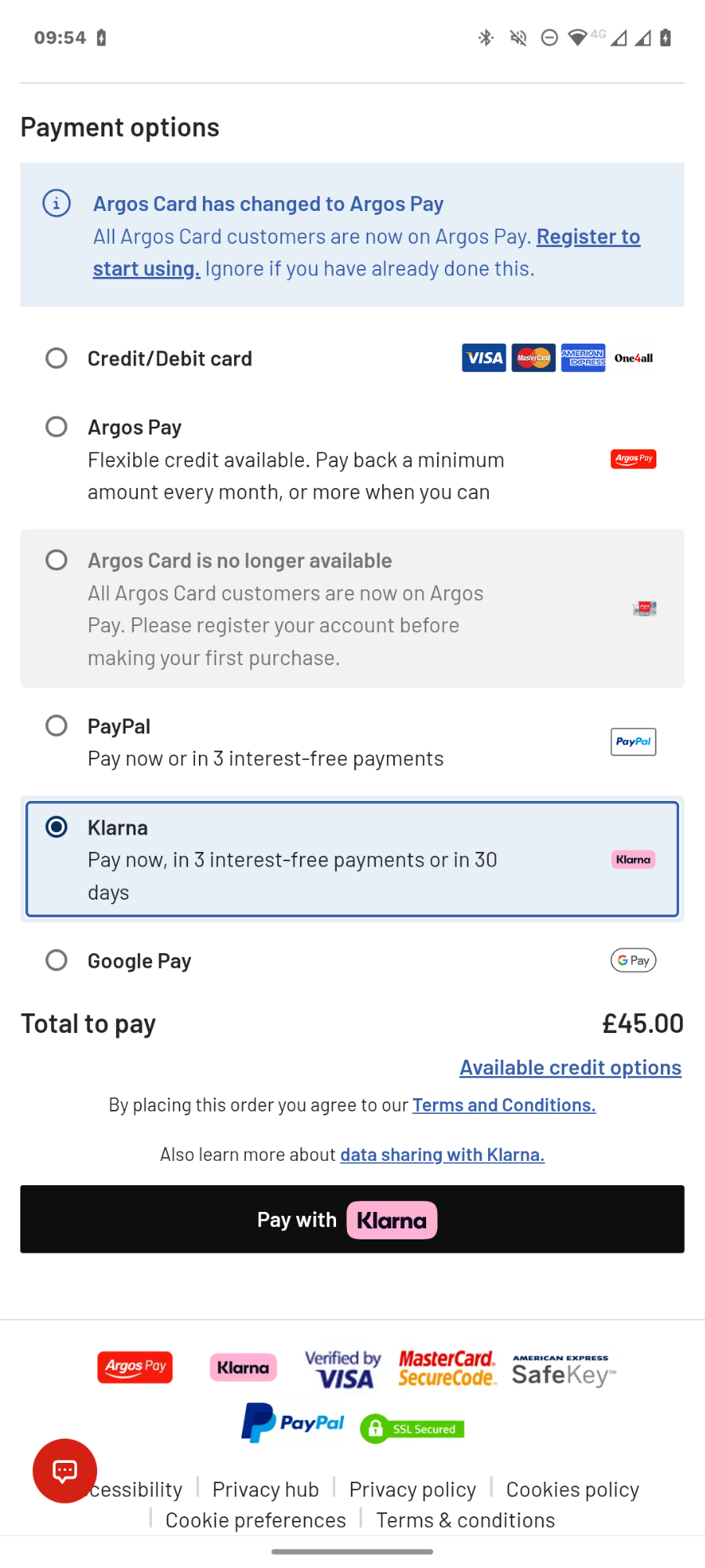
5. Buy Now, Pay Later (BNPL) for Mid-Value Goods
For products priced between $100 and $500, BNPL services like Klarna or AfterPay can be transformative. By breaking down the immediate financial impact, these services encourage users to commit to larger orders. According to Stripe’s June 2024 analysis, BNPL integration drives an average 14% revenue lift.
Technical Stability and Trust Signals
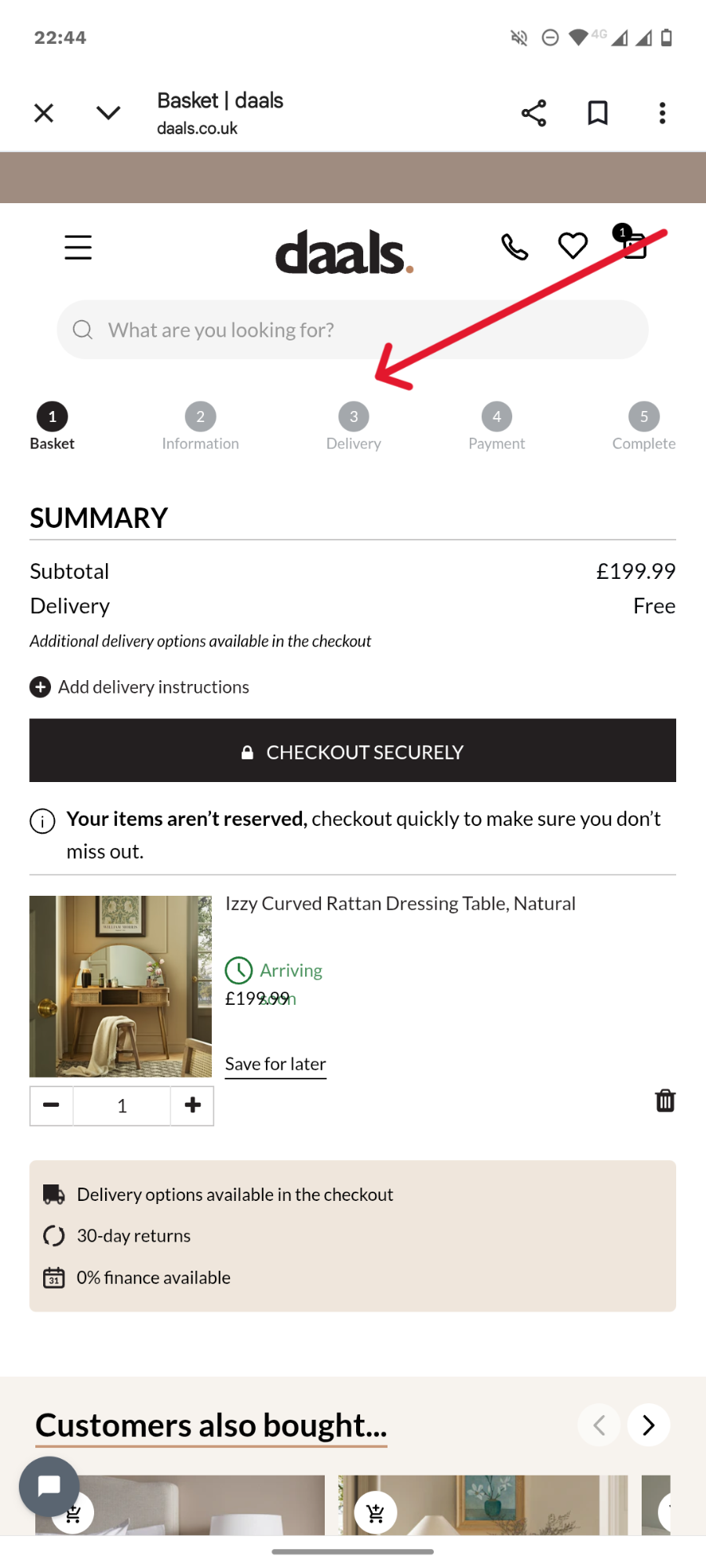
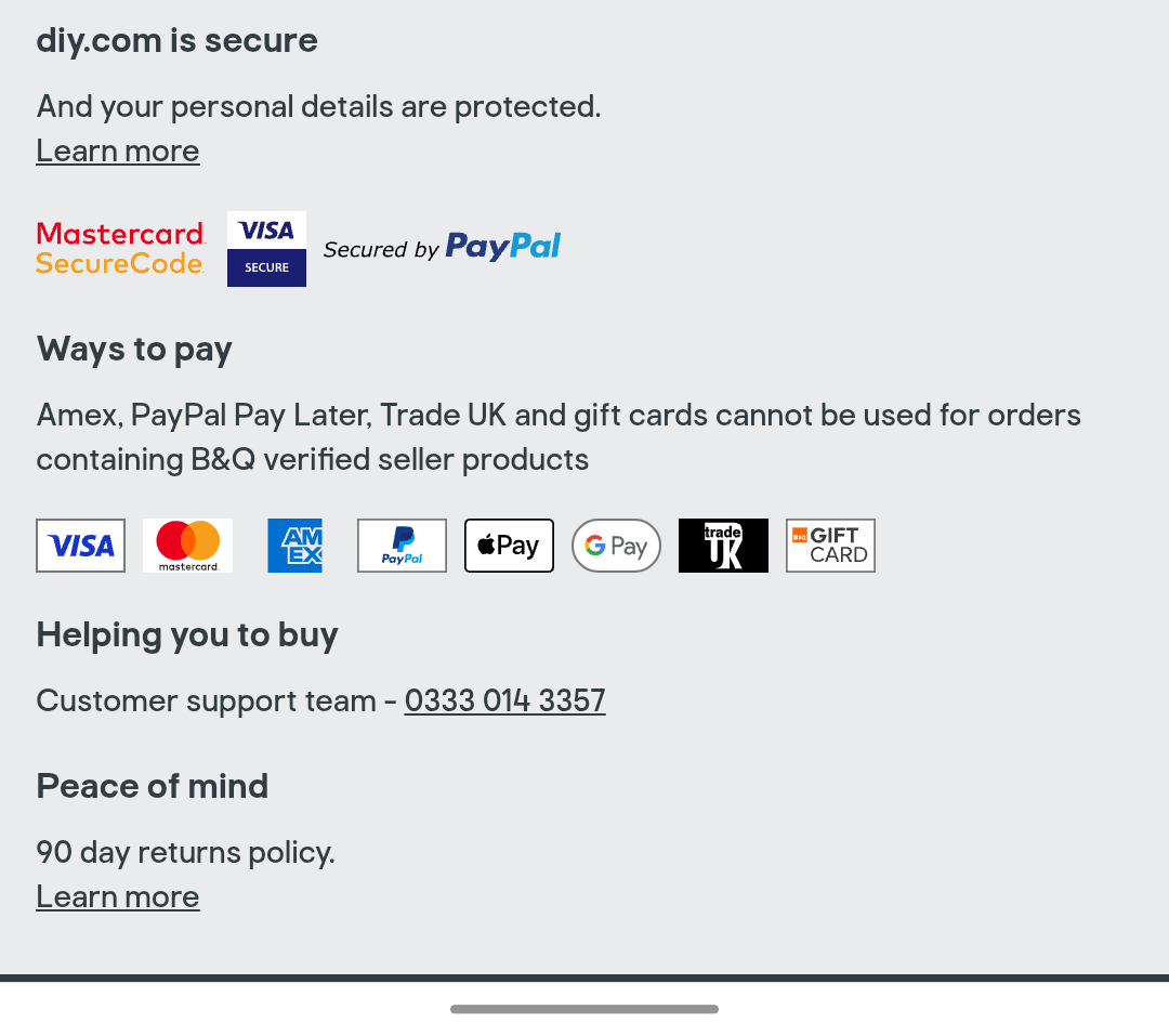
6. Strategic Placement of Trust Signals
Security concerns cause 19% of shoppers to abandon their carts. Trust signals—such as SSL badges, clear return policies, and recognized payment logos—should not be relegated to the footer. They must be placed in the immediate proximity of the "Pay" button to provide reassurance exactly when the user is most hesitant.
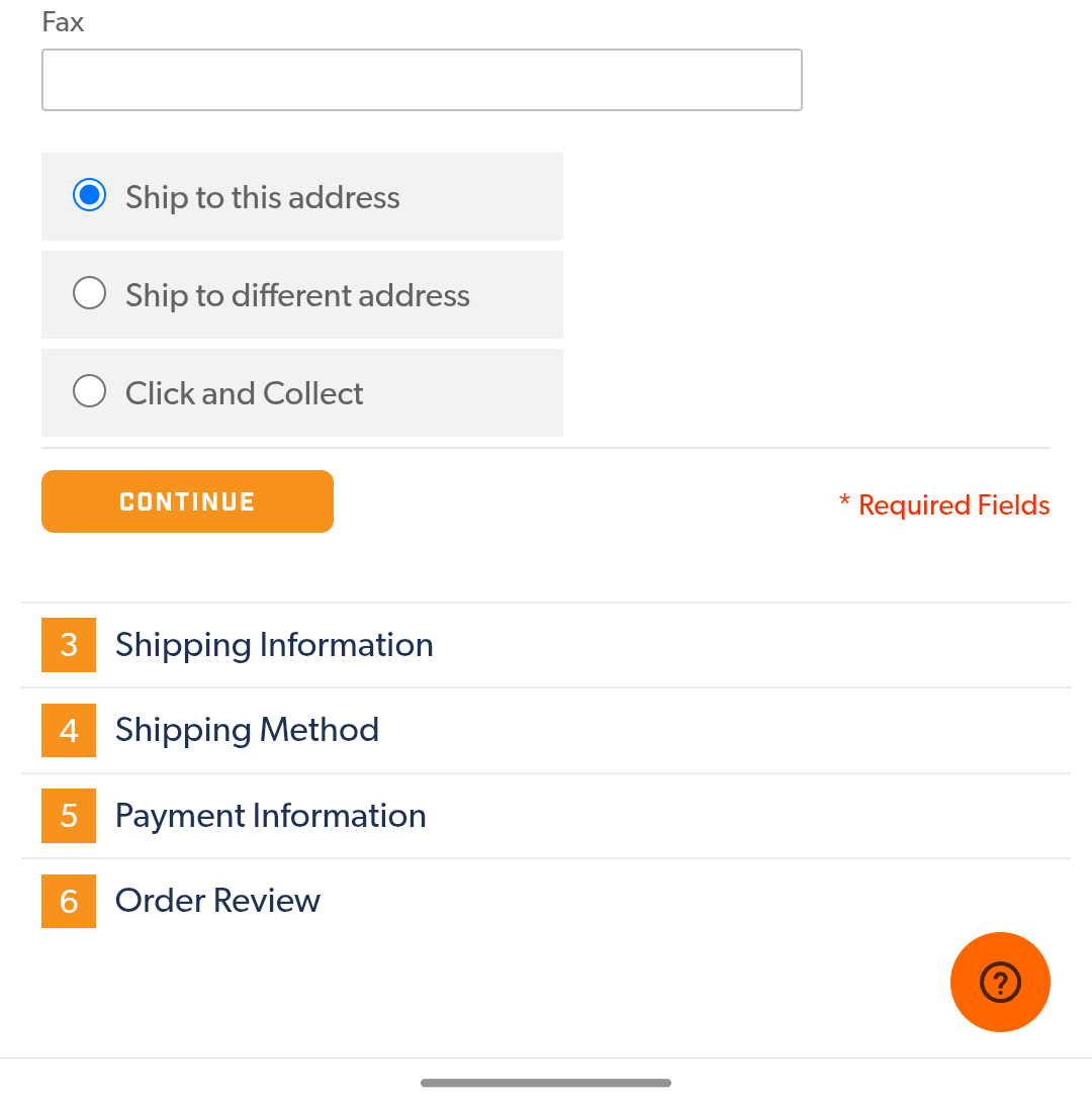
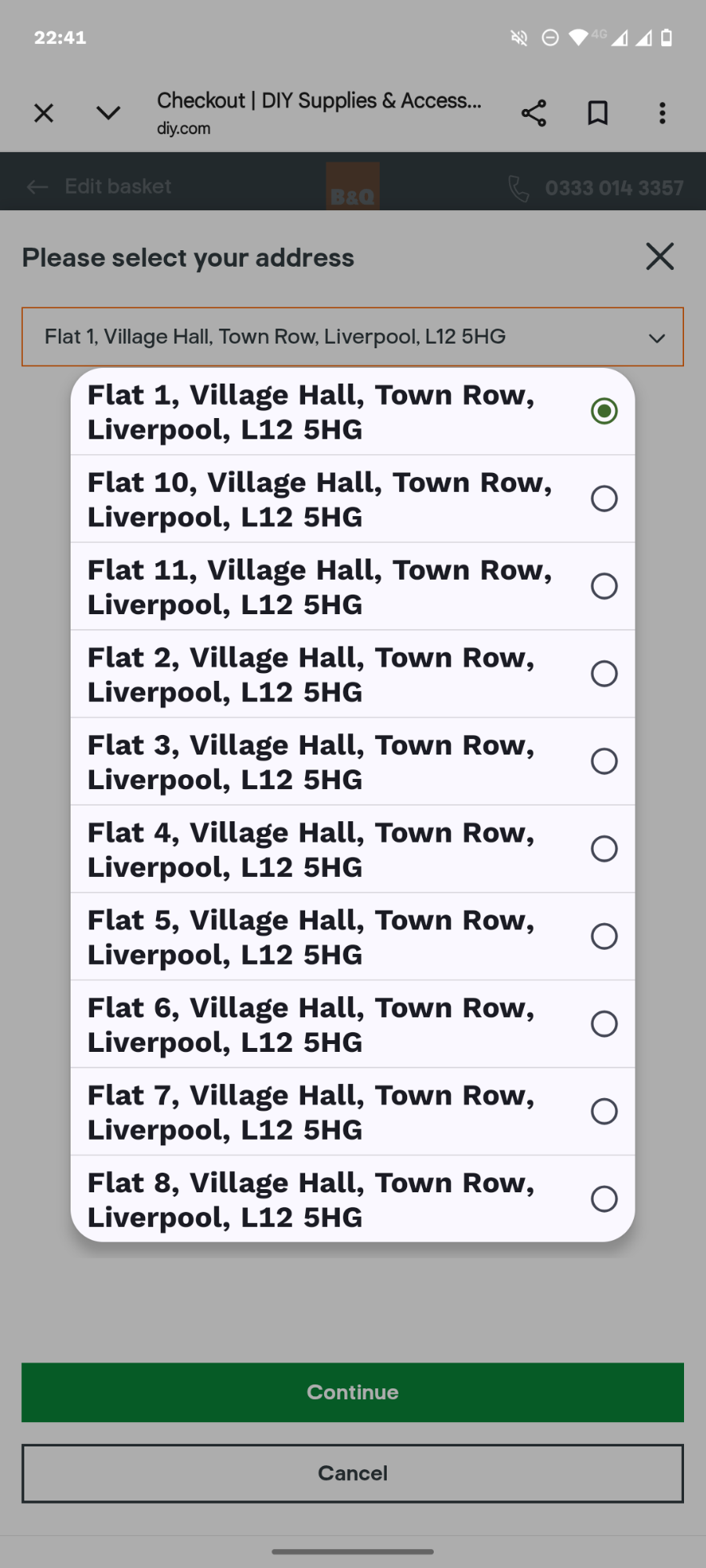
7. The Minimum Viable Form
The average checkout form contains 11.3 fields, yet the B2C ideal is closer to 6–8.
- Audit your fields: Can you eliminate the "Fax" number, the "Company" name, or the secondary address line?
- Autofill and Intelligence: Use Google Maps API for address lookup, real-time credit card validation, and numeric-only keypads for phone and zip code fields. As Baymard Institute notes, the effort of typing is more damaging than the number of fields.
8. Performance as a Conversion Metric
Mobile users are notoriously impatient. If a page takes longer than 2–3 seconds to load, bounce rates skyrocket.
- Optimization: Minify CSS/JavaScript, compress images, and leverage CDNs.
- Stability: 15% of shoppers abandon carts because of site crashes or errors. Technical stability is the foundation of commerce. Regular audits of Core Web Vitals are essential to ensure the checkout environment remains robust under high traffic.
9. Cross-Device Continuity
Many shoppers begin their research on a mobile device during a commute but finalize the purchase on a desktop at home. If the cart is empty when they log in on their second device, the sale is lost.
- The Solution: Identity-based persistence. By capturing an email or account ID early (via loyalty programs or newsletter signups), retailers can save the cart state to the server. If the user doesn’t return, automated "abandoned cart" emails can bridge the gap, bringing them back to the exact point of departure.
10. Pricing Transparency
The most common cause of abandonment is "sticker shock" from hidden shipping costs or taxes at the final step.
- The Fix: Display total costs, including shipping, as early as possible. If shipping is free, highlight it. If not, use a shipping calculator on the product page. Total transparency prevents the negative surprise that leads to immediate abandonment.
Implications for Future Growth
The mobile checkout environment is no longer just a technical utility; it is a critical marketing channel. Retailers who prioritize speed, security, and convenience are seeing higher lifetime value (LTV) from customers who find the purchase process enjoyable.
Diagnostic Tools: Using Crazy Egg
Optimization is not a "set it and forget it" task. Tools like Crazy Egg are essential for diagnosing the "why" behind the numbers.
- Heatmaps: Reveal exactly where users are clicking—and where they are ignoring—on your checkout page.
- Scroll Maps: Determine if users are missing your trust badges or shipping information.
- A/B Testing: Empirically validate whether a change to your form layout actually increases conversion or simply shifts the bottleneck elsewhere.
Frequently Asked Questions
What is a "good" mobile conversion rate?
It is highly industry-dependent. Beauty and Personal Care typically see rates near 4.24%, while high-consideration categories like Home and Furniture often hover around 1.07%. Always benchmark against your specific vertical rather than generic industry averages.
How does B2B differ from B2C?
B2B checkouts are inherently more complex. They often require PO numbers, multi-approval workflows, and contract-specific pricing. In these cases, guest checkout is often inappropriate, and the focus should shift toward a streamlined, role-based login experience.
What is the ideal abandoned cart recovery sequence?
A balanced approach is to send three emails over 48–72 hours. The goal is to provide value (e.g., "Need help with your order?") before offering a discount. Overusing discounts can train customers to abandon their carts intentionally to trigger a coupon.
Optimizing mobile checkout is a continuous process of refining the path to purchase. By focusing on these 11 pillars—ranging from thumb-friendly design to technical performance and transparent pricing—retailers can reclaim lost revenue and build a more resilient digital storefront.