
The Strategic Power of the Website Sidebar: Enhancing UX and Driving Conversions
In the ever-evolving landscape of web design, the humble sidebar remains one of the most debated elements. Once a staple of every blog, news site, and digital publication, the sidebar has faced scrutiny in the era of "minimalist" design. However, when implemented correctly, it serves as a critical bridge between content consumption and user action. A well-designed sidebar does more than fill empty space; it acts as an intuitive guide, a navigational anchor, and a silent salesperson.
Understanding the Website Sidebar: Core Functionality
A website sidebar is a vertical column positioned to the left or right of the primary content area. Its purpose is to house secondary information that supports the user’s journey without interrupting the main narrative. These elements typically include navigation menus, search functionality, calls to action (CTAs), social proof, or widgets that provide additional context.

The distinction between a sidebar and a "side panel" is frequently blurred in industry discourse. To clarify: a sidebar is a static, persistent layout element that remains visible as part of the page structure. In contrast, a side panel is typically an interactive interface component—often found in web applications or builders—that can be toggled on or off to reveal settings, tools, or deep-link navigation.

The Strategic Roles of the Sidebar
The sidebar serves three primary functions that, when optimized, significantly enhance the user experience:
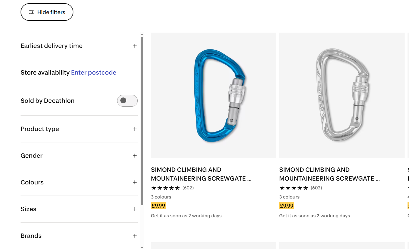
- Navigational Support: For content-heavy websites, documentation hubs, or large e-commerce catalogs, sidebars are essential. They provide a structural map, allowing users to jump between sections, filter products, or find related topics.
- Conversion Optimization: The sidebar is prime real estate for "nudges." By placing newsletter signup forms, lead magnets, or trial buttons in the periphery, businesses can capture interest without forcing a user to leave the page.
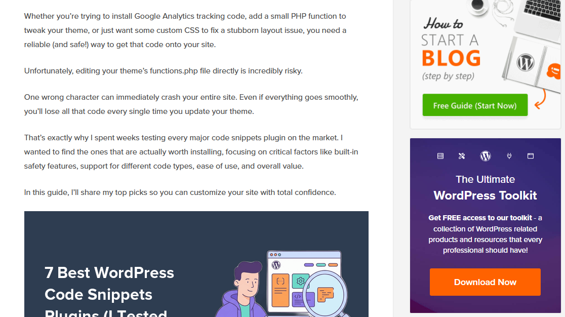
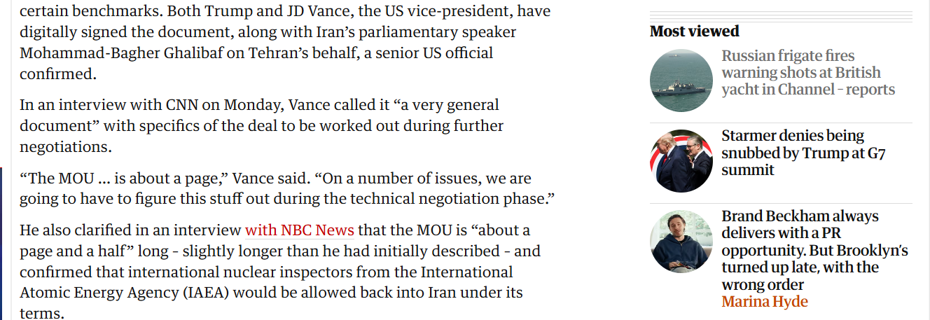
- Supplementary Content: Features like author bios, "most-viewed" articles, or social sharing buttons build trust and keep the user engaged within the site’s ecosystem, effectively reducing bounce rates.
Chronology of the Sidebar: From Clutter to Strategy
Historically, the web was dominated by "kitchen sink" sidebars. In the early 2000s, it was common to see sidebars crammed with tag clouds, blogrolls, visitor counters, and dozens of banner ads. This "everything-everywhere" approach led to the well-documented phenomenon of "banner blindness" (or "right-rail blindness"). Users learned to subconsciously ignore these areas because they were consistently cluttered with irrelevant, low-value information.
As responsive design and mobile-first indexing gained dominance, the industry underwent a correction. Designers began stripping away sidebars to favor full-width reading experiences. Today, we are in a period of "strategic restraint." Modern web design dictates that a sidebar should only exist if it serves a specific, measurable, and user-centric purpose. If a page’s goal is singular—such as a landing page or a checkout flow—the sidebar is rightfully removed to eliminate distractions.

Supporting Data: Why Placement Matters
The effectiveness of a sidebar is not just a matter of design preference; it is a matter of behavioral science. According to eye-tracking research conducted by the Nielsen Norman Group, human reading patterns on the web—often following an "F-pattern"—heavily favor the left side of the screen.

- The Left-Rail Advantage: Because users scan from the left, placing primary navigation or critical CTAs on the left ensures they are seen early. This is where users expect to find structural information.
- The Right-Rail Utility: The right side is better suited for supporting content that is helpful but not essential for the immediate comprehension of the main text. This includes secondary widgets, bios, and related reading links.
- Reading Length Constraints: Research from Baymard Institute (2022) suggests that an ideal line length for readability is between 55 and 75 characters. A sidebar helps enforce this constraint by preventing text from stretching too far across large desktop monitors, which can cause reader fatigue.
Designing for Success: Best Practices
To avoid the traps of the past, designers must treat the sidebar as a first-class citizen of their layout.
1. Maintain Visual Integration
A sidebar should never look like an advertisement. If a user identifies the sidebar as an "ad slot," they will ignore it. Use the same typography, spacing, and color palette as the main content area. The goal is for the sidebar to feel like an extension of the page, not a separate, intrusive element.
2. The Power of "Sticky" Elements
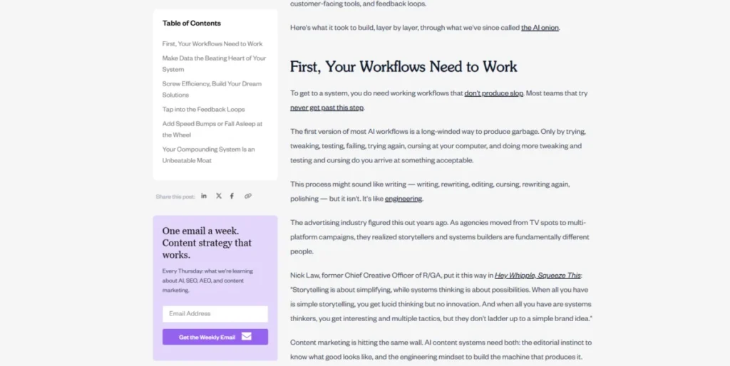
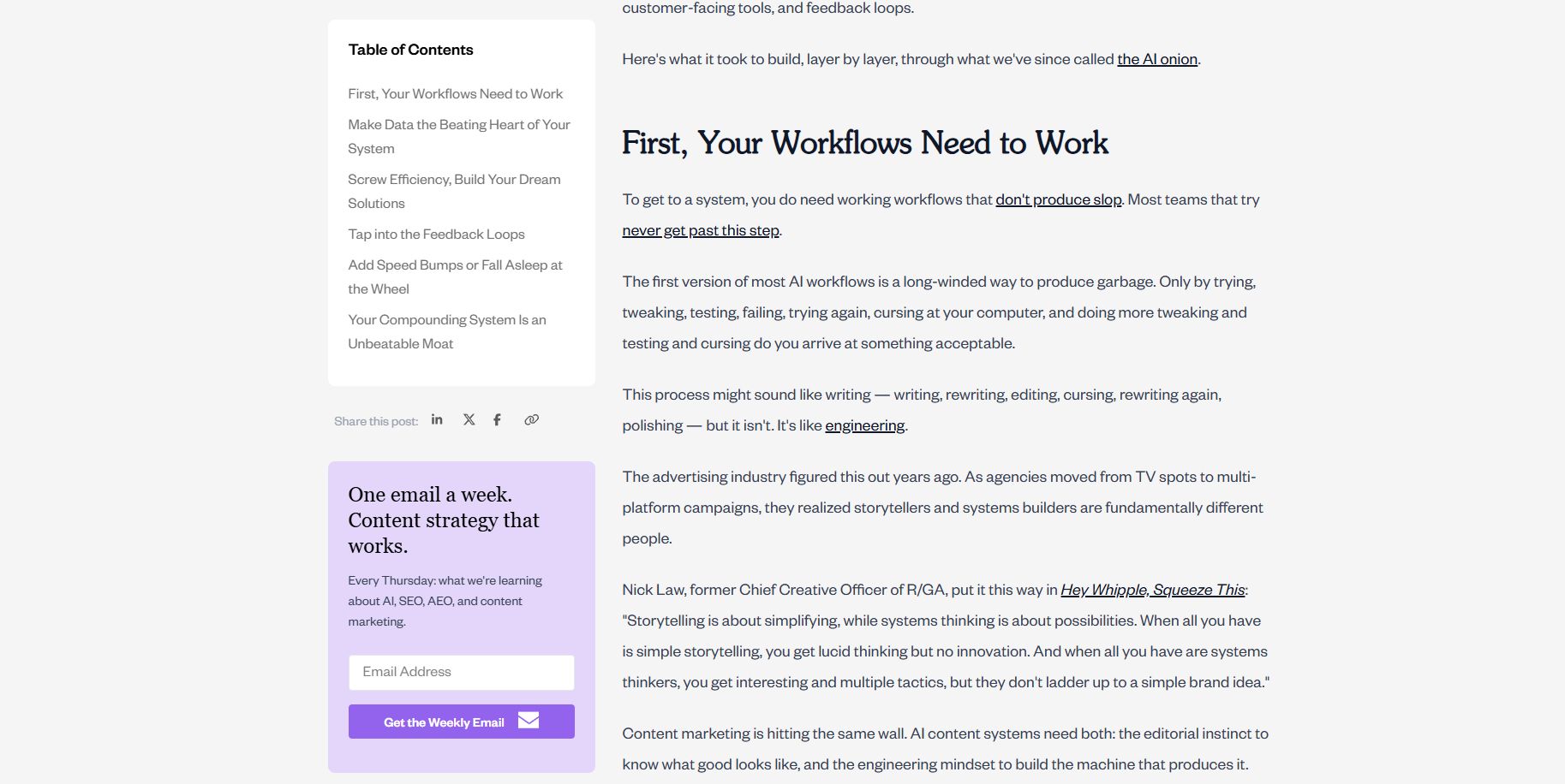
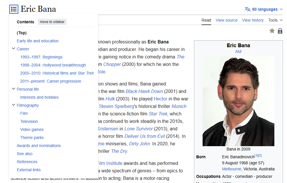
One of the most effective modern design techniques is the "sticky" or "persistent" sidebar. As a user scrolls down a long-form article, the main content moves, but key elements—like a Table of Contents or a primary CTA—stay locked in place. This ensures that the most important navigational tool is always available exactly when the user needs it.
3. Mobile Adaptation
On mobile devices, a standard sidebar is often a hindrance, pushing content off-screen. The industry standard is to eliminate the sidebar entirely or convert it into a collapsible, off-canvas menu. Alternatively, developers can move the most important sidebar widgets to the bottom of the page, ensuring that mobile users still have access to navigation or signups without a compromised layout.

4. Highlighting Context
When using a sidebar for navigation, it is vital to provide an "active state" indicator. If a reader is in a specific section, the corresponding link in the sidebar should be clearly highlighted (e.g., bolded or marked with a colored accent). Without this, users can quickly feel disoriented, leading to a negative experience.
Measuring Effectiveness: The Role of Analytics
Design is only as good as its performance. Using tools like heatmaps and session recordings allows site owners to transition from guessing to knowing.
- Heatmaps: These provide a visual representation of where users are clicking. If a "Newsletter" widget in your sidebar is receiving zero clicks, it is either poorly placed or irrelevant to the audience on that page.
- Session Recordings: These allow you to watch individual user journeys. If you notice users repeatedly scrolling back up to find a navigation link that they missed, or if they "rage-click" on a static element they thought was a button, you have identified a clear friction point that needs to be addressed.
- A/B Testing: Never assume a design is perfect. By splitting traffic between two variations—such as a left-aligned vs. right-aligned sidebar—you can use concrete data to make decisions that boost engagement and conversion rates.
Implications for Future Web Design
As AI and personalization technologies advance, the role of the sidebar will likely shift from a static column to a dynamic, personalized interface. We are already seeing "smart" sidebars that adjust their content based on the user’s past behavior, referral source, or position in the marketing funnel.
For example, a returning visitor might see a "Resume Reading" widget in their sidebar, while a first-time visitor sees an offer for a lead magnet. This shift from "one-size-fits-all" to "contextual relevance" will make the sidebar more valuable than ever.

Frequently Asked Questions (FAQ)
Q: Do sidebars negatively impact SEO?
A: No. Search engines like Google prioritize main content. However, if a sidebar is poorly designed and leads to a high bounce rate or a confusing user experience, those behavioral signals can indirectly affect how your site is perceived. Ensure your sidebar adds value rather than clutter.
Q: Should I use a top nav or a sidebar?
A: It is not an "either-or" scenario. The best designs use a hybrid approach. A top navigation bar is standard for primary, high-level pages (Home, About, Pricing). A sidebar is the preferred choice for deep-dive content, documentation, or category-specific navigation where the user needs to explore complex hierarchies.
Q: What is the ideal width for a sidebar?
A: Industry standards generally recommend a width between 240 and 320 pixels for desktop. This leaves enough room for the main content to occupy the remainder of the screen while adhering to optimal line-length guidelines for readability.

Q: Is it ever okay to have two sidebars?
A: Yes, but only for sites with extremely complex information architectures. For most blogs or e-commerce stores, a single sidebar is cleaner. If you must use two, ensure the "left" rail is reserved for primary navigation (the most important task) and the "right" rail for secondary, supplementary content.
Conclusion
The website sidebar is a powerful tool in the UX arsenal, provided it is treated with purpose. By focusing on relevance, visual integration, and data-driven testing, designers can transform the sidebar from a relic of the past into a highly effective component of a modern, conversion-focused digital strategy. Whether you are building a vast documentation library or a high-traffic blog, the secret to a successful sidebar is simple: make it useful, keep it clean, and let the data guide your design decisions.
