
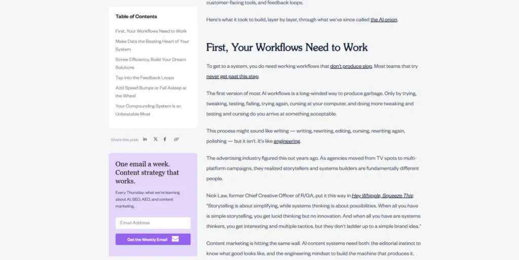
The Strategic Anatomy of the Website Sidebar: Enhancing UX and Conversion
In the intricate architecture of modern web design, few elements spark as much debate as the website sidebar. Often perceived as a mere secondary column, the sidebar is, in reality, a high-stakes interface component. When executed correctly, it serves as a powerful engine for navigation, content discovery, and conversion. When neglected, it becomes a source of cognitive friction, "banner blindness," and mobile-unfriendly clutter.
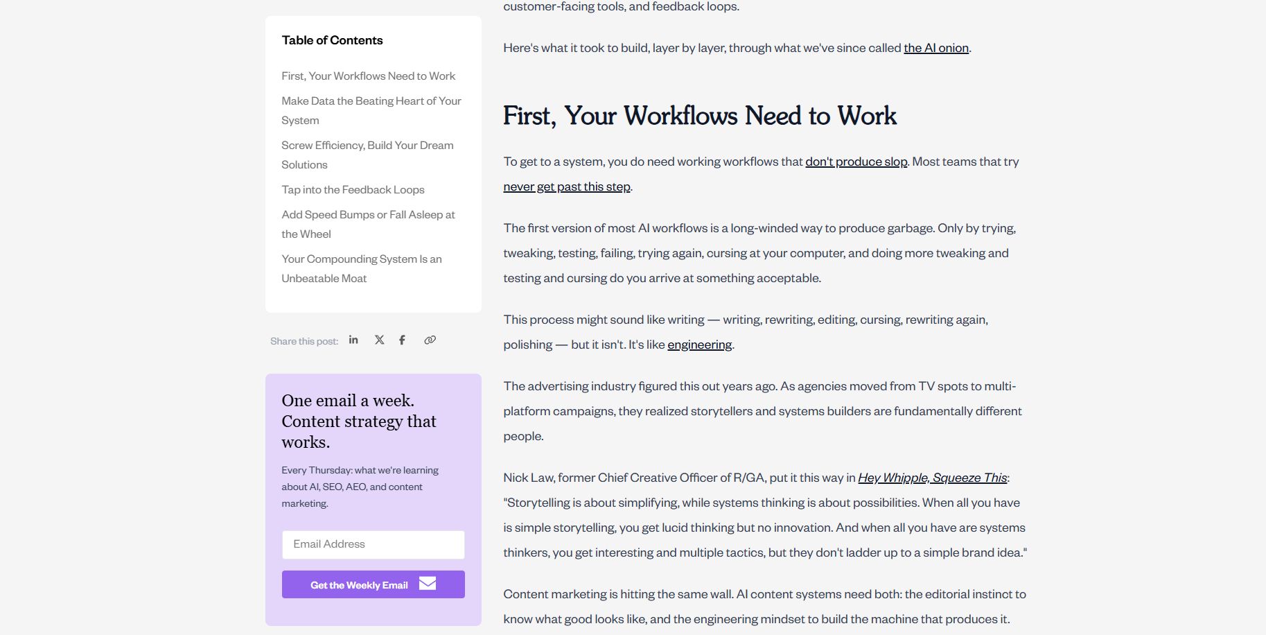
To understand the role of the sidebar, one must look beyond its aesthetic placement. Whether it sits on the left, right, or both sides of the main content, its purpose is to bridge the gap between what a user seeks and what a brand offers.

Defining the Sidebar: More Than Just a Column
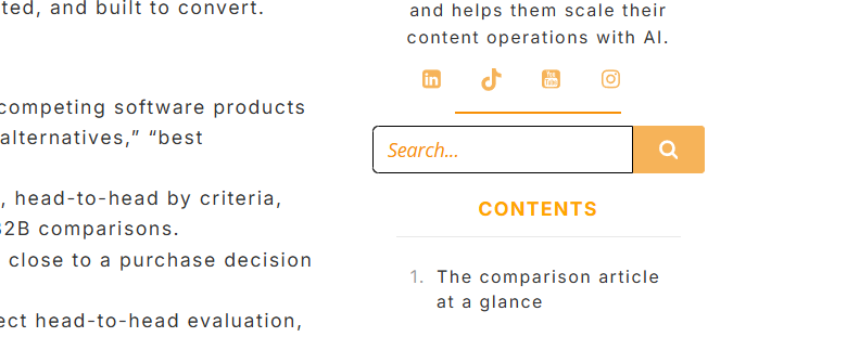
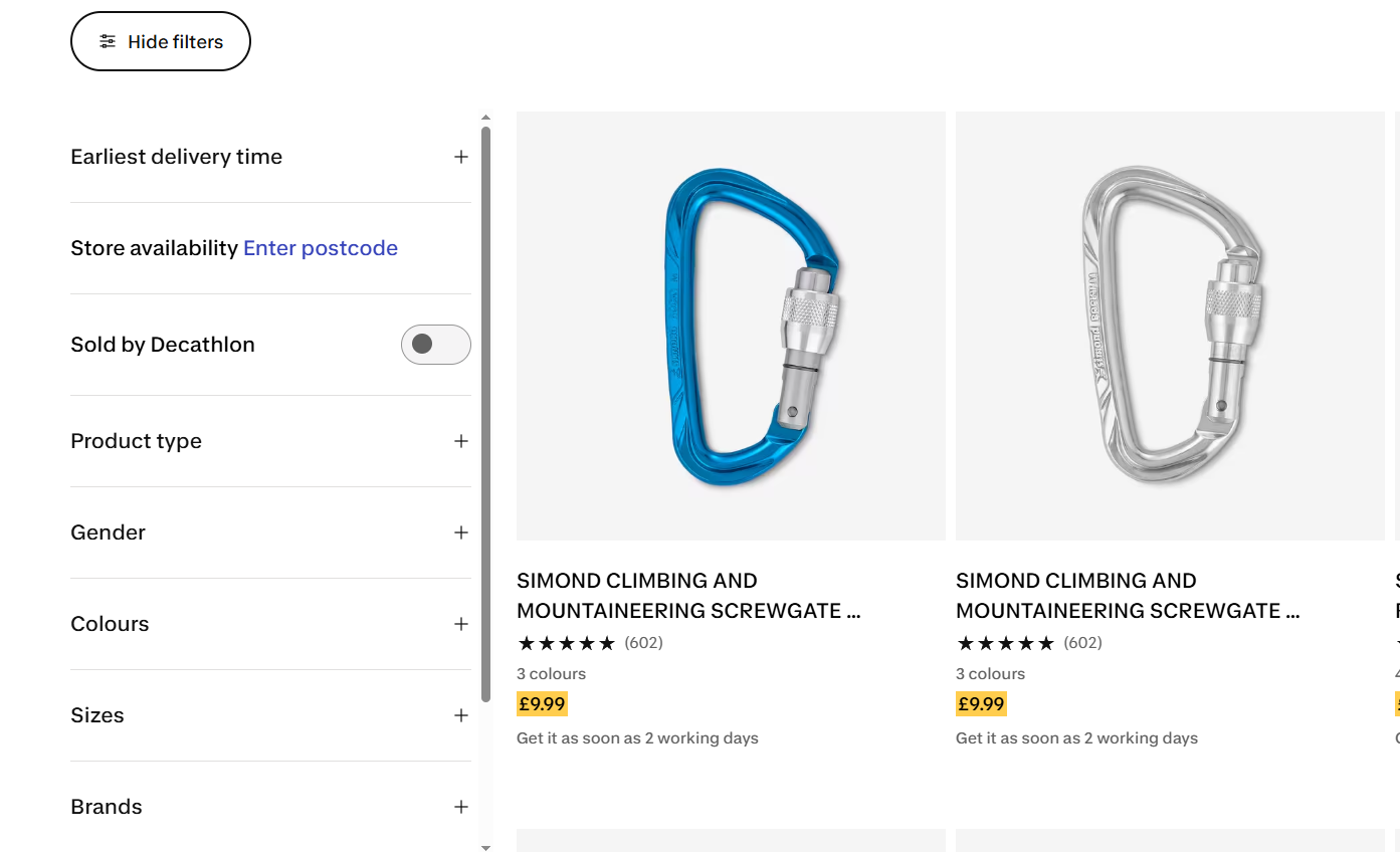
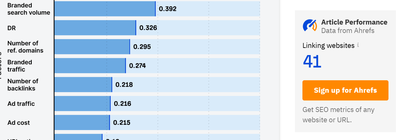
At its core, a website sidebar is a vertical column that resides adjacent to the primary content area. Unlike the main body of a page, which delivers the core value—be it a blog post, a product description, or a white paper—the sidebar provides the "contextual support." It houses navigation menus, internal search boxes, calls-to-action (CTAs), social proof, and widgets.

Sidebar vs. Side Panel: Clarifying the Terminology
A frequent point of confusion in UI/UX design is the distinction between a "sidebar" and a "side panel." A sidebar is a static, persistent feature of a page layout. It is an extension of the site’s architecture. A side panel, conversely, is an interactive interface element found within web applications or digital tools. It is often collapsible, togglable, or temporary—designed to appear only when the user requires specific controls or settings, such as the editor panels in a website builder like Kubio or WordPress. Understanding this distinction is vital; treating a static sidebar like a tool-based side panel often results in a disjointed user experience.
The Chronology of Sidebar Evolution
The history of the sidebar mirrors the evolution of the web itself. In the early 2000s, sidebars were the "everything drawer" of the internet. They were crowded with tag clouds, blogrolls, visitor counters, and dozens of disparate advertisements.
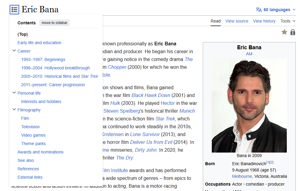
As web design matured, the focus shifted toward minimalism. The "Mobile-First" revolution of the mid-2010s acted as a great filter, forcing designers to reconcile the desktop-heavy sidebar with the limited real estate of smartphone screens. Today, we see a sophisticated hybrid approach: sidebars have become highly contextual. They are now dynamic, often disappearing on mobile, or transforming into "hamburger" menus or bottom-drawer interfaces. This transition represents a shift from "content display" to "conversion optimization."

Strategic Roles of the Modern Sidebar
A high-performing sidebar fulfills one of three distinct mandates: navigation, conversion, or engagement.

1. Enhancing Navigation
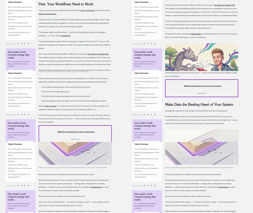
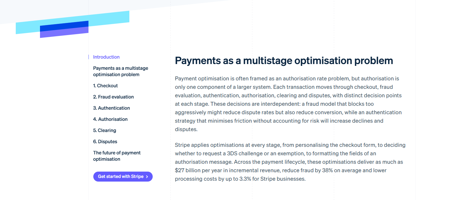
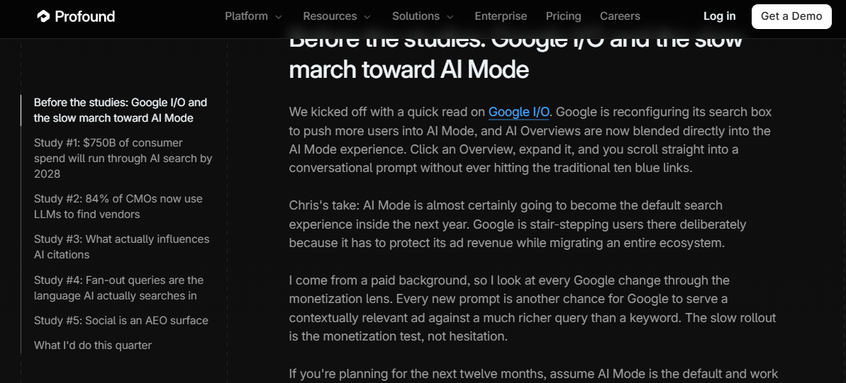
For content-heavy platforms, such as documentation hubs or extensive blogs, the sidebar is the map. It provides the "Table of Contents" (TOC) that allows users to jump between sections without losing their place. By providing a clear hierarchy, sidebars reduce the time to value, helping users find the specific information they need.

2. Driving Conversions
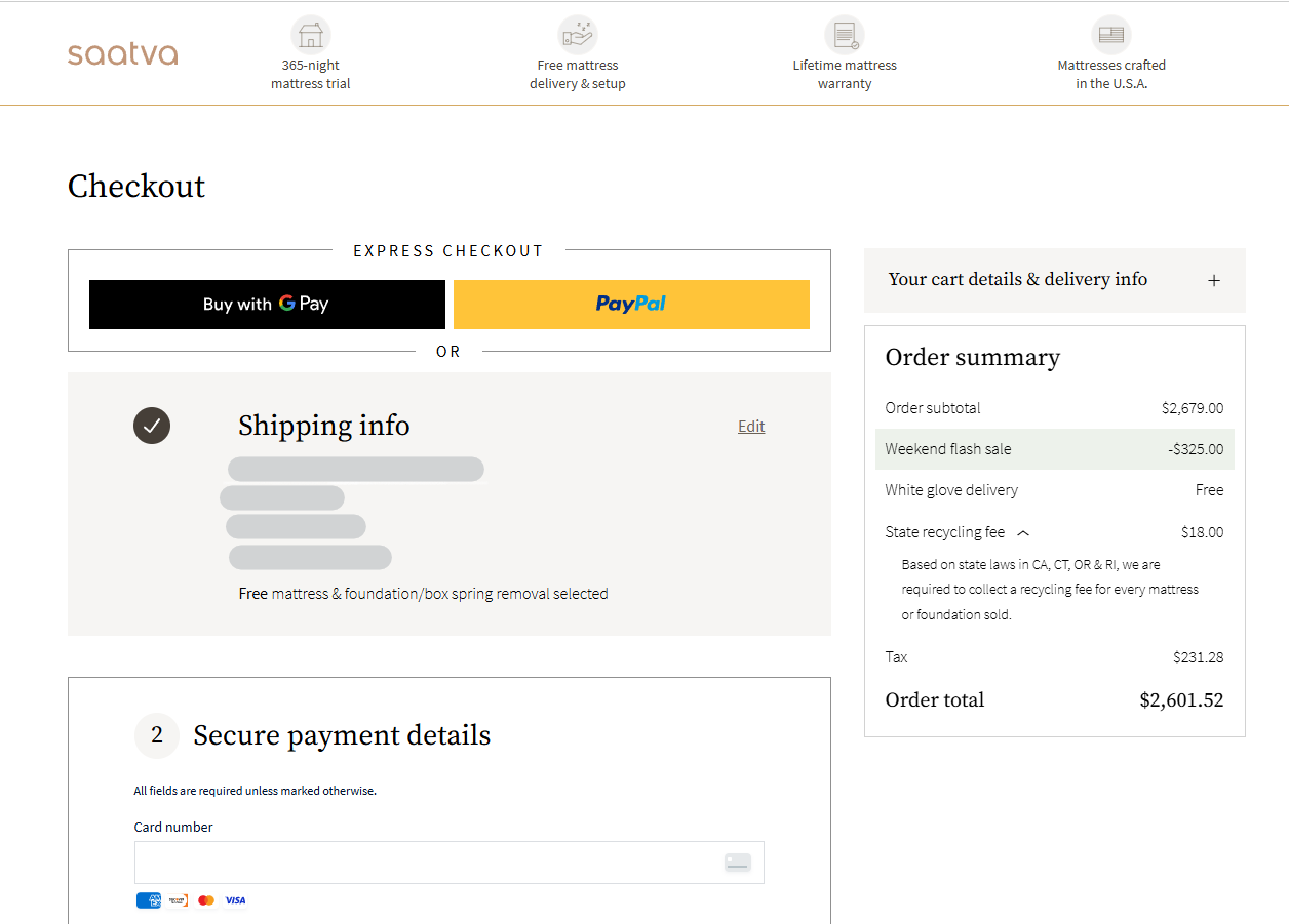
Sidebars are prime real estate for "micro-conversions." While a landing page should focus exclusively on a single primary goal, a blog post or article page can utilize the sidebar to capture leads. A well-placed newsletter signup or a "Start Your Free Trial" button can transform a passive reader into a qualified lead without interrupting the reading flow.
3. Supporting Content and Trust
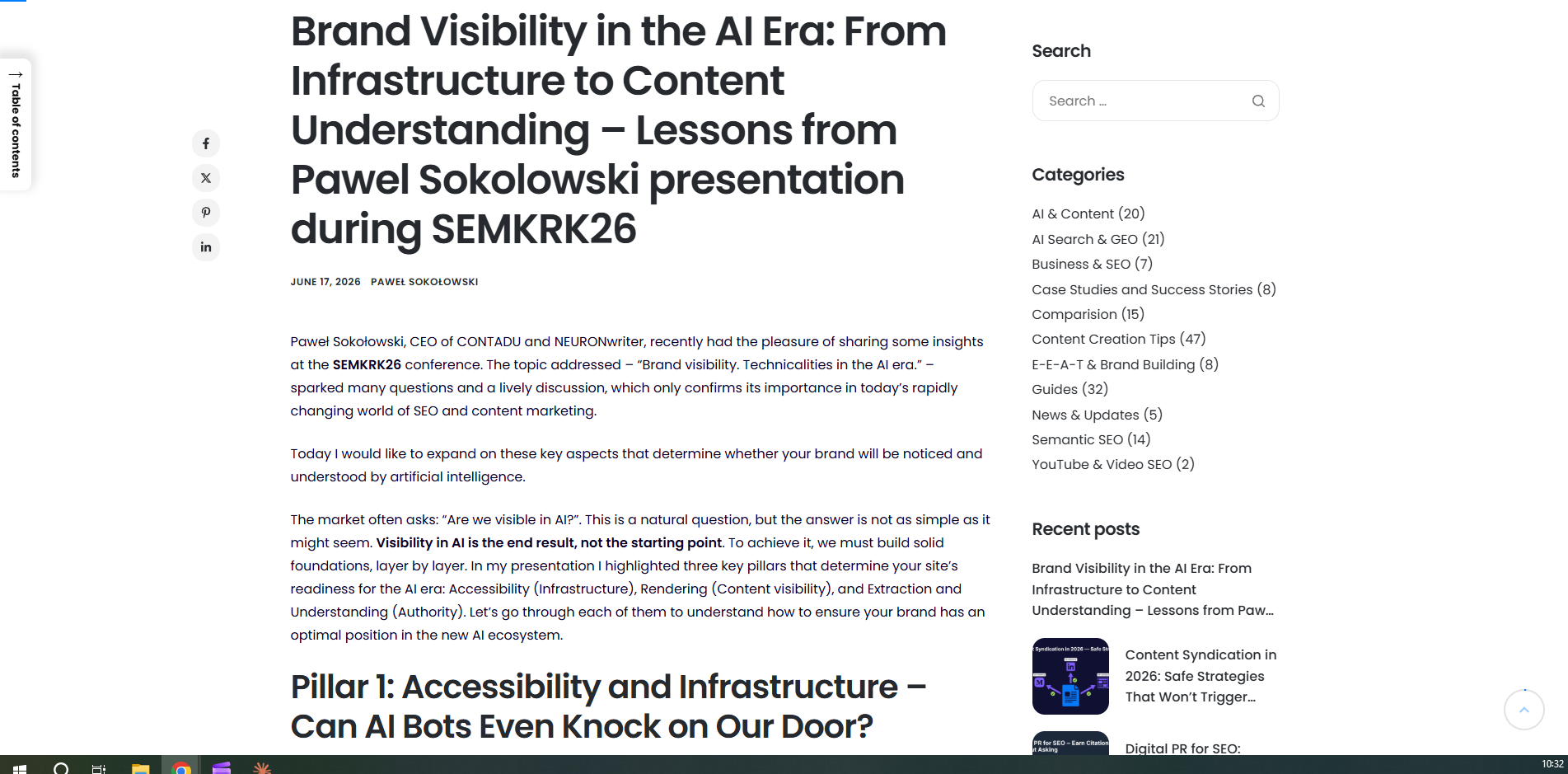
Finally, the sidebar acts as a trust-builder. By displaying an author’s bio, social proof, or "most-viewed" articles, you reinforce your brand’s authority. These elements keep visitors within your ecosystem, reducing bounce rates by suggesting relevant, high-value content.
Design Best Practices: The Science of Visibility
The effectiveness of a sidebar is not determined by its presence, but by its integration. If a visitor perceives your sidebar as a banner ad, they will subconsciously ignore it. This phenomenon is known as "banner blindness."

Aesthetic Integration
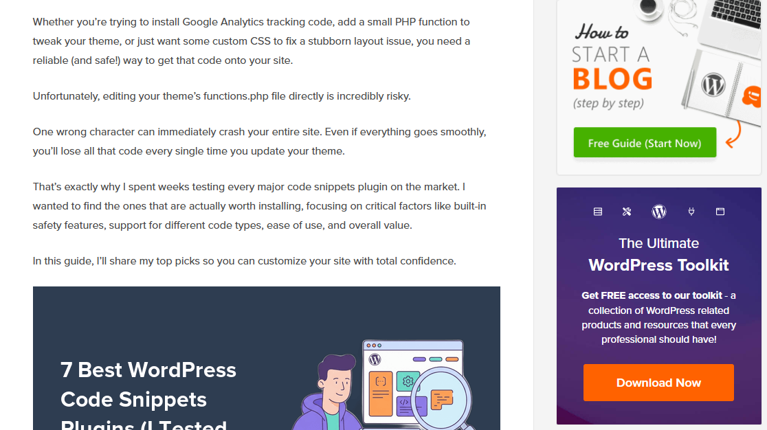
To combat ad blindness, the sidebar must match the typography, color palette, and white space of the main content. It should feel like a natural extension of the article, not an injected marketing block.

The Rule of Width and Readability
According to reading research from institutions like Baymard, the ideal line length for readability is between 55 and 75 characters per line. Consequently, your main content area should generally sit between 600 and 700 pixels wide. Your sidebar should be designed to support this, typically occupying 240–320 pixels on a desktop. Anything wider begins to crowd the content; anything narrower risks becoming illegible.
The Power of the "Left-Rail"
Eye-tracking research, famously documented by the Nielsen Norman Group, confirms that user attention is heavily biased toward the left side of the screen (in left-to-right languages). If you have a critical CTA—something you absolutely do not want the user to miss—the left rail is the most effective placement. The right rail, by contrast, is better suited for secondary content that supports the reader but does not demand immediate action.

When to Skip the Sidebar
There is a common misconception that every page needs a sidebar. In reality, some pages are better off without them.

- Landing Pages: On a page designed for a single conversion (e.g., a signup page), the sidebar is a distraction. If the goal is a purchase or a form submission, remove all navigational friction.
- Visual-Heavy Pages: Portfolios, image galleries, and immersive long-form storytelling suffer when forced into a multi-column layout. In these cases, full-width displays allow the user to focus entirely on the visual narrative.
- Mobile Devices: Mobile design dictates that you should prioritize the "single-column flow." A sidebar on mobile usually forces the content to shrink to an unreadable size. Instead, move sidebar elements to the bottom of the page or integrate them into a hidden menu.
Data-Driven Optimization: The Role of Analytics
Design intuition is a starting point, but data is the validator. To truly understand if your sidebar is working, you must move beyond standard page views and into behavioral analytics.
Heatmaps and Scroll Maps
Heatmaps provide a visual representation of where users are clicking. If you have a newsletter widget in your sidebar but your heatmap shows zero clicks, you are wasting space. Similarly, scroll maps reveal if users are actually reaching the part of the page where your sidebar content lives.

Session Recordings
While heatmaps show where users click, session recordings show how they behave. You may notice users scrolling up and down, frantically looking for a search bar that you have hidden, or "rage-clicking" on a static element. These qualitative insights are invaluable for identifying friction points.

The A/B Test Imperative
The only objective way to determine the success of a design change is through A/B testing. By splitting traffic between a version with a sidebar and one without, or between two different widget configurations, you can quantify the impact on conversion rates. Case studies have shown that making a CTA "sticky"—so it remains in view as the user scrolls—can lead to double-digit increases in conversion rates.
Implications for Future Web Design
As AI and personalization technologies advance, the "static" sidebar may soon become a relic of the past. Imagine a sidebar that dynamically changes its content based on the user’s previous visit, their referral source, or their position in the sales funnel.

For now, the focus must remain on the basics: clarity, relevance, and intentionality. A sidebar is not an excuse to dump content; it is a tool for guiding the user journey. By keeping key elements visible, grouping information logically, and testing your assumptions, you turn a simple design element into a robust engine for business growth.
Frequently Asked Questions
Q: Do sidebars negatively impact SEO?
A: Generally, no. Search engines are sophisticated enough to distinguish between primary content and sidebar widgets. However, if your sidebar creates a poor user experience—such as triggering high bounce rates due to excessive clutter—search engines may perceive your page as less relevant.

Q: Should I use a sticky sidebar?
A: Yes, for critical elements. A "sticky" table of contents or a primary CTA keeps the user engaged as they scroll. However, avoid making too many items sticky, as this can clutter the viewport.
Q: What if my CMS makes it difficult to have different sidebars for different pages?
A: If your theme lacks the ability to create unique sidebars, consider using plugins or custom post types to inject dynamic content. A "one-size-fits-all" sidebar is often a missed opportunity for context-specific engagement.
Q: Is there a perfect sidebar?
A: The perfect sidebar is one that the user barely notices because it makes their journey so intuitive. It is the one that disappears when it’s not needed and provides exactly the right link at the moment of decision.
