
The Art of the Conversion: Why E-commerce Landing Pages Are Your Most Powerful Sales Asset
In the high-stakes world of digital retail, the distance between a click and a purchase is often measured by the quality of a single web page. While homepages serve as digital storefronts and product detail pages (PDPs) act as comprehensive brochures, the e-commerce landing page is the surgical instrument of modern marketing. It is a standalone, purpose-built destination designed for one specific goal, one specific audience, and one definitive conversion.
As brands navigate an increasingly crowded digital landscape, the distinction between a "browse-friendly" site and a "conversion-optimized" landing page has never been more critical. By stripping away the distractions of global navigation and focusing the visitor’s intent, marketers can significantly increase their return on ad spend (ROAS) and drive revenue.
Defining the E-commerce Landing Page
An e-commerce landing page is a dedicated destination that a user reaches after clicking an external link—typically from a paid search advertisement, a social media campaign, or a targeted marketing email. Unlike a brand’s homepage, which offers a broad look at company culture and navigation, a landing page is laser-focused.

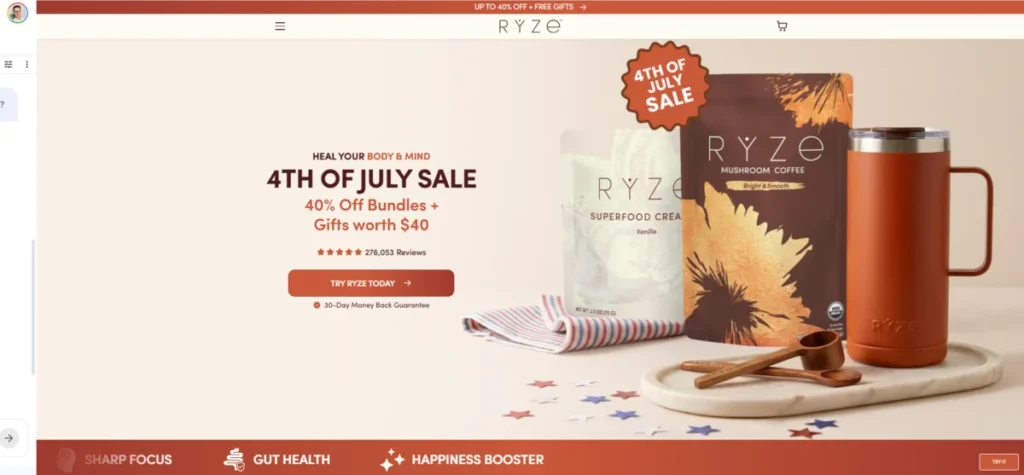
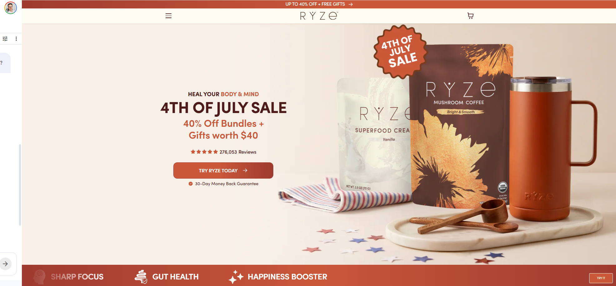
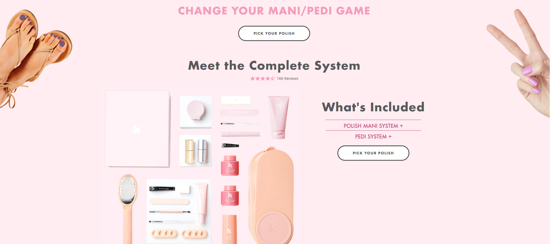
Its anatomy is distinct. It does not invite the user to wander; it invites them to act. Whether the goal is to drive a purchase, sign up for a newsletter, or participate in a seasonal promotion, the page is stripped of extraneous links that might lead a user off the path to conversion. For example, a campaign for a specific bundle promotion—like the Ryze mushroom coffee 4th of July sale—targets cold traffic that may be entirely unfamiliar with the brand. By providing an immediate, high-value offer, the landing page bridges the gap between curiosity and acquisition.
The Evolution of the Funnel: A Chronology of Intent
The effectiveness of a landing page is largely dictated by where the visitor sits in the marketing funnel. Understanding this chronology is key to matching content with user readiness:
- Top-of-Funnel (ToFu): These pages focus on awareness. They are educational and designed to bring potential customers into your ecosystem without being overly aggressive.
- Mid-Funnel (MoFu): At this stage, the visitor is considering their options. These pages offer comparisons, social proof, and deep-dive educational content to help the user choose your brand over a competitor.
- Bottom-of-Funnel (BoFu): These are the closer pages. They are optimized for immediate sales, often featuring high-pressure incentives, clear calls to action (CTAs), and risk-reversal tactics like money-back guarantees.
- Post-Purchase: Often overlooked, these pages are designed to nurture long-term relationships, driving cross-sells and upsells by providing value-add content that keeps the brand top-of-mind.
Anatomy of a High-Converting Page: Evidence and Best Practices
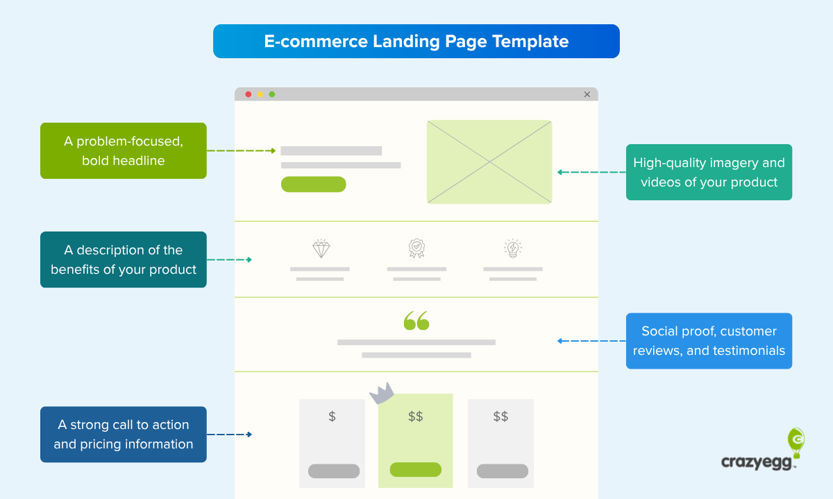
The most successful landing pages are not built on guesswork; they are built on a framework of psychological triggers and structural design. By analyzing successful examples like Myoovi, Magic Spoon, and Eight Sleep, we can distill the essential elements required for success.

1. The Hero Section and Value Proposition
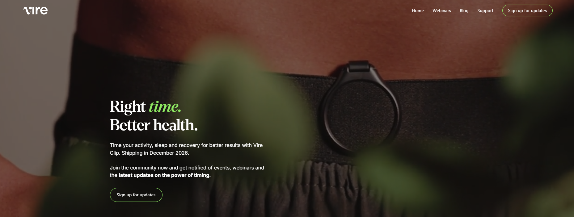
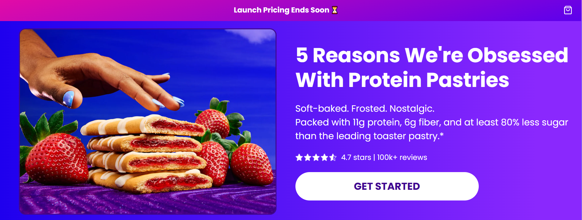
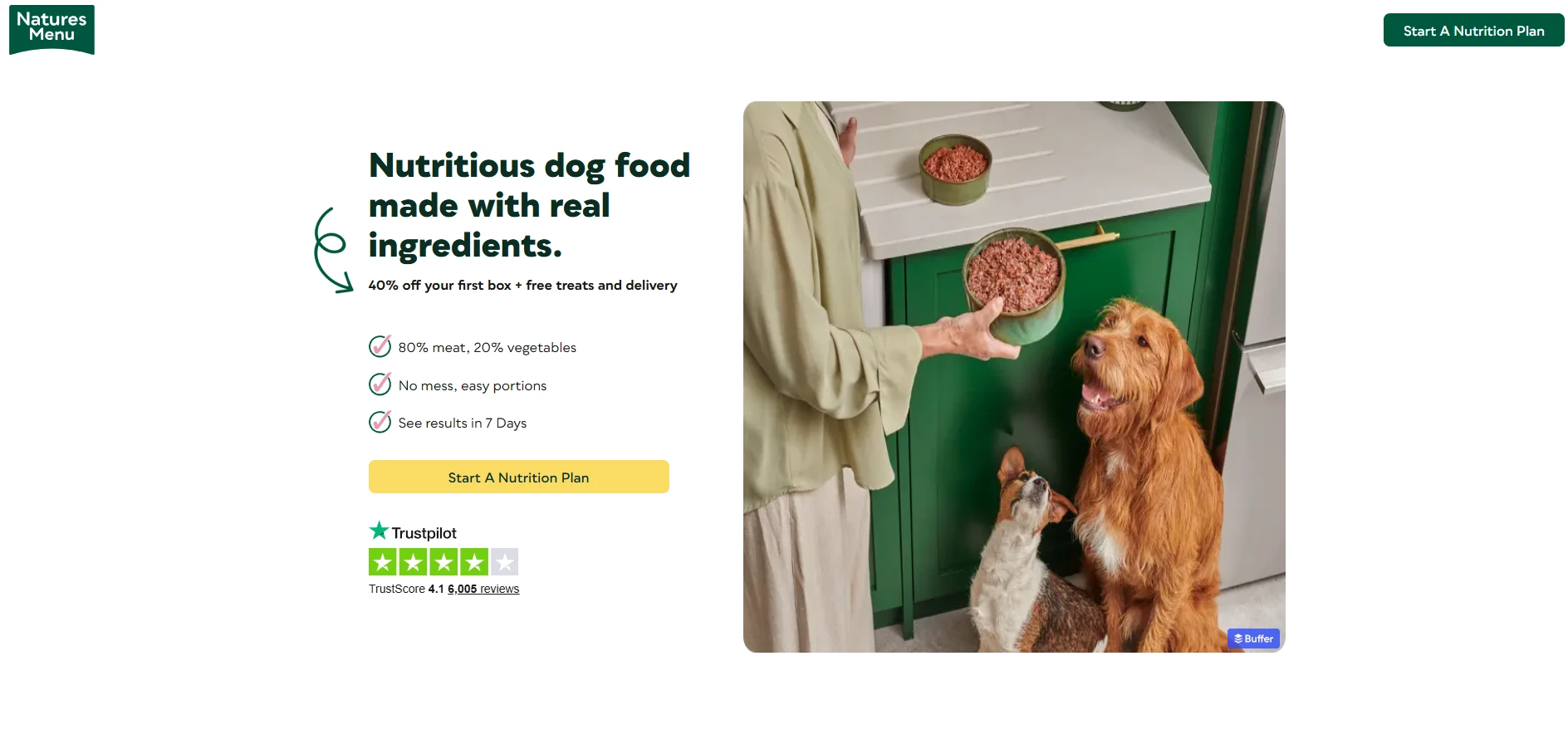
The "hero" area—the portion of the screen visible before scrolling—must communicate the core value proposition instantly. Visitors should know exactly what is being offered and why it matters within seconds.
2. Social Proof as a Trust Anchor
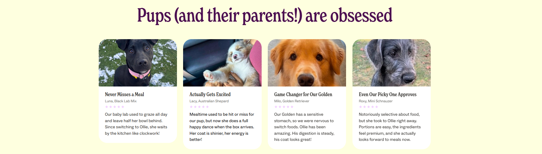
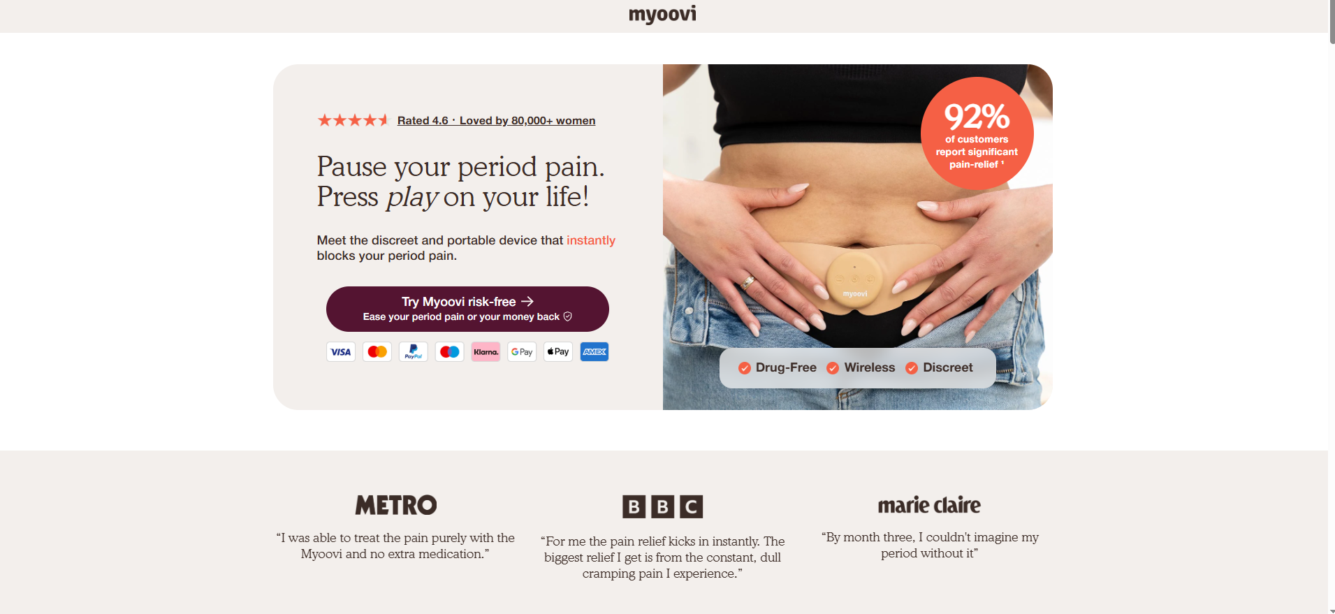
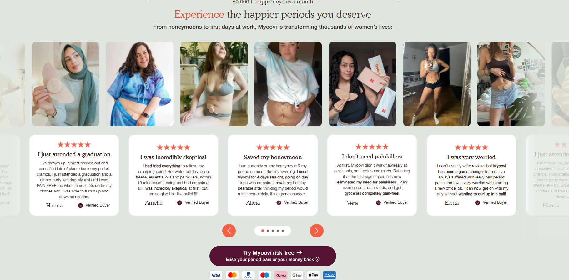
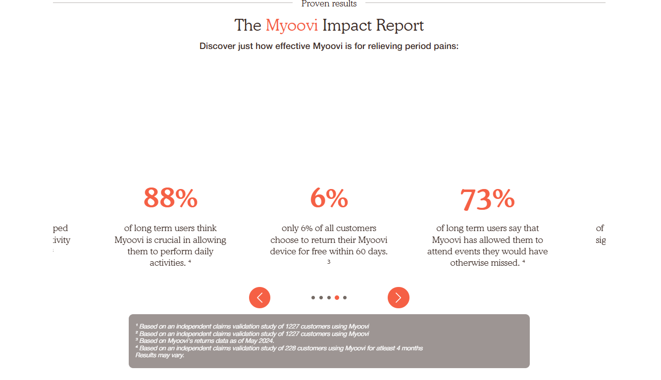
In an era of skepticism, trust is the currency of the web. High-converting pages don’t just show reviews; they display them strategically. Whether it’s an aggregated star rating in the header, logos of reputable publications, or detailed video testimonials from real users, social proof validates the decision to buy.
3. Comparison and Objection Handling
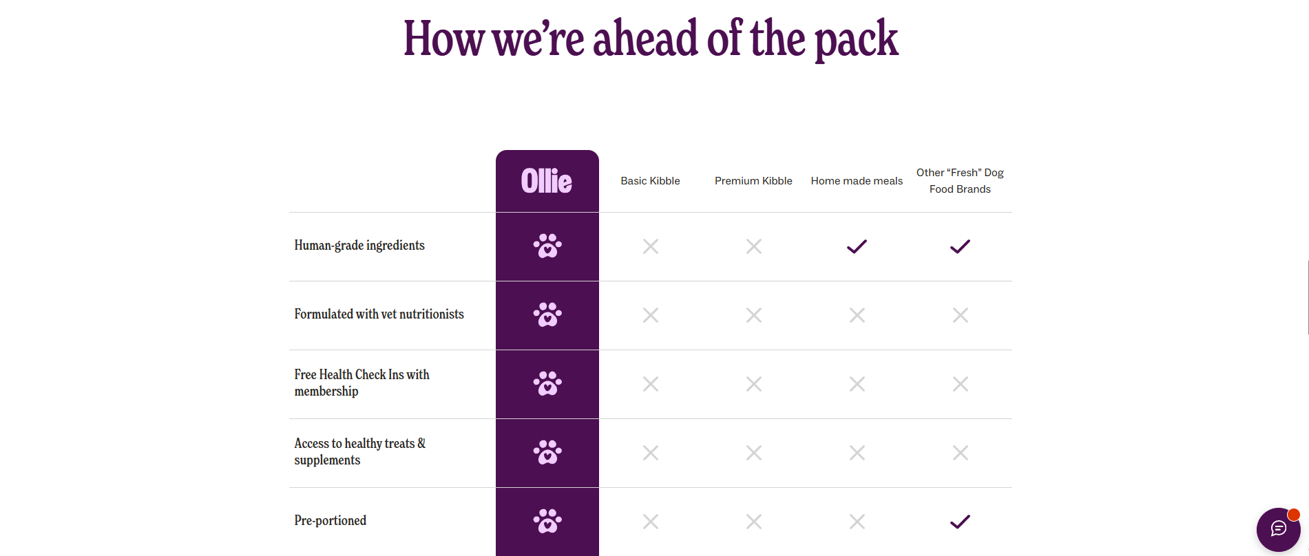
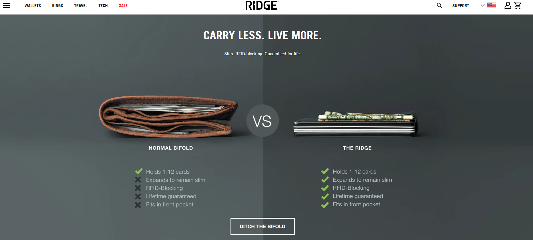
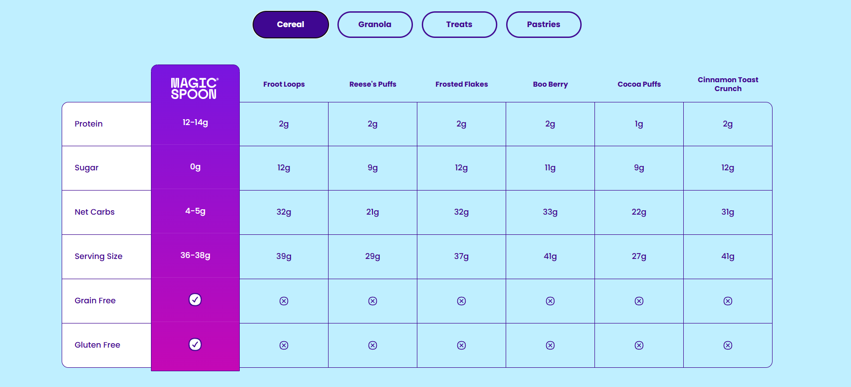
For products that are new or complex, the landing page must act as a salesperson. Comparison tables—like those used by Magic Spoon or The Ridge—are exceptionally effective. By naming specific competitors or comparing the new solution to the "traditional way" of doing things, the brand can neutralize consumer objections before they arise.
4. The Power of the CTA
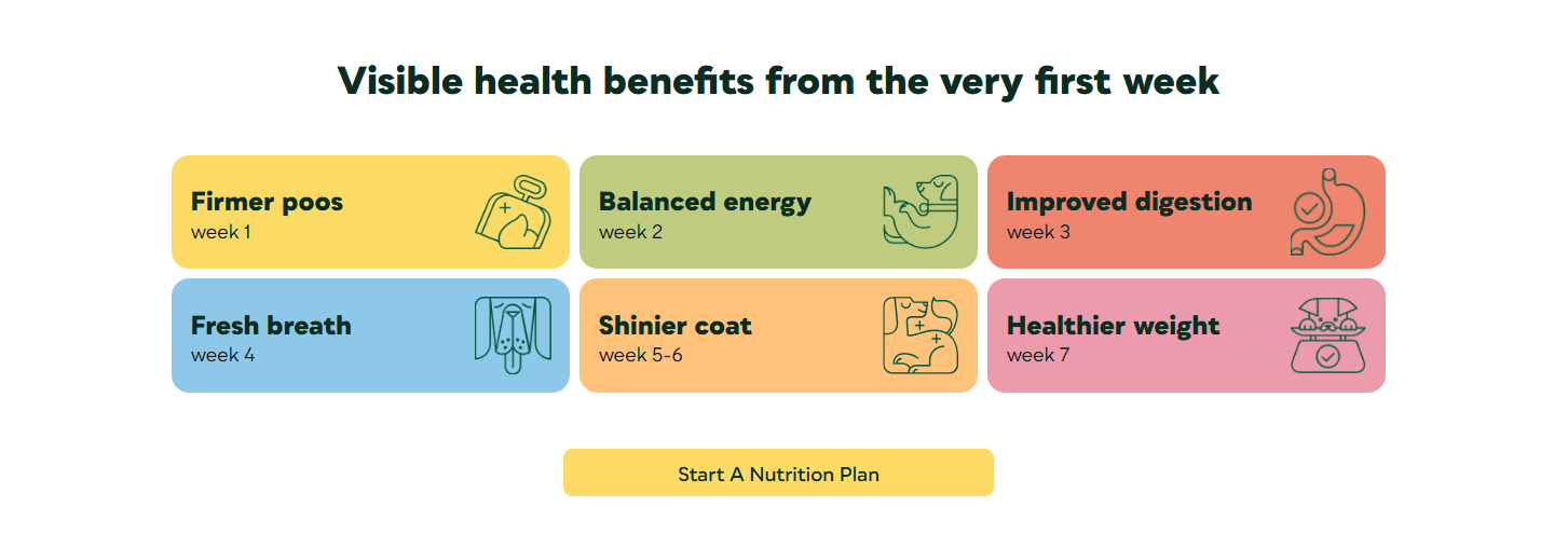
The call to action is the culmination of the landing page’s narrative. A generic "Submit" button is a wasted opportunity. High-converting CTAs use action-oriented, benefit-driven language such as "Claim My 30% Discount" or "Start My Risk-Free Trial." This links the action directly to the promise made in the headline.
Lessons from Industry Leaders
To understand what works in practice, one must look at how top brands optimize their layout:
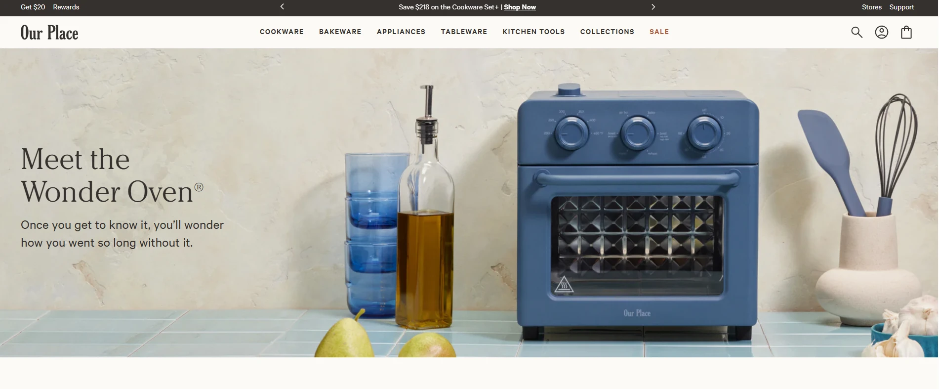
- Myoovi: By layering risk reversal (60-day money-back guarantees) with emotional, benefit-driven headlines like "Pause your period pain, press play on your life," they address both the technical need and the emotional desire of the user.
- Eight Sleep: This brand utilizes interactivity. By using a "hotspot explorer," they allow users to engage with product features at their own pace, which builds a deeper understanding of the product’s technology before the user is asked to commit to a purchase.
- Maëlys: Their use of a gamified, 5-step quiz serves two purposes: it creates a personalized recommendation that increases the likelihood of conversion, and it acts as an elegant, high-intent lead capture mechanism. By the time the user is asked for their email, they have already invested time in the process.
Strategic Implications: Building for Performance
To build a high-converting page, marketers must adhere to a strict set of design and content principles. The primary goal is to minimize friction.
Design for Mobile First: With the vast majority of e-commerce traffic now originating from mobile devices, a responsive design is not a luxury—it is a requirement. This means using large, legible fonts (16pt+), touch-friendly buttons (48×48 pixels), and single-column layouts that don’t require horizontal scrolling.
Remove Distractions: Strip the page of global navigation. If a user can click away to your "About Us" page or "Careers" page, you have lost control of the funnel. Keep the focus entirely on the offer.
Consistency is King: The landing page must be an extension of the advertisement. If your social media ad uses a specific color palette and a specific offer, the landing page must reflect those exact elements. Any disconnect—a different price, a different tone, or a different headline—will cause the visitor to doubt the credibility of the site and abandon the page.
Data-Driven Optimization: The Role of Analytics
Best practices are merely the starting line. The true optimization of a landing page occurs in the testing phase. Tools such as Crazy Egg provide essential insights that go beyond simple traffic counts.
- Heatmaps: These visual overlays show you exactly where users are clicking—and more importantly, where they are ignoring. If your primary CTA is in a "cold" zone, it needs to be moved.
- Session Recordings: By watching how users navigate your page, you can identify points of frustration. Are they getting stuck on a form? Are they scrolling past your social proof?
- A/B Testing: Never assume you have the "perfect" version. By testing two variations of a headline or two different button colors, you can use empirical data to drive incremental improvements in conversion rates.
Frequently Asked Questions
Do I need a landing page if I only sell one product?
Yes. The number of products is irrelevant; the number of marketing campaigns is what counts. Even with one product, you might target different segments (e.g., a "gift-giver" segment vs. a "personal use" segment). Each segment deserves a page that speaks specifically to their unique motivations.
Will a dedicated landing page hurt my SEO?
It only hurts your SEO if it causes "keyword cannibalization," where your landing page competes with your product page for the same search terms. The best practice is to set your paid landing pages to "noindex" and focus your SEO efforts on your permanent site structure.
How long should an e-commerce landing page be?
There is no "perfect" length. The page should be as long as it takes to answer the customer’s questions and overcome their objections. For simple, low-cost impulse buys, three screens may suffice. For complex, high-consideration purchases, 10 to 15 screens might be necessary to provide the required technical specs, comparisons, and social proof.
Conclusion
The e-commerce landing page is more than just a destination; it is the digital equivalent of a high-performing sales team. By aligning the content with the visitor’s stage in the funnel, reinforcing the message with credible social proof, and obsessively analyzing performance data, brands can transform their marketing spend into sustainable, scalable growth. In a world where attention is scarce, the landing page is the bridge that ensures that attention is converted into value.
