
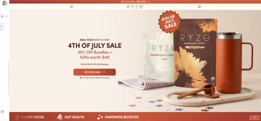
The Art of the Conversion: Mastering E-commerce Landing Pages to Drive Sales
In the high-stakes world of digital retail, your homepage is a digital storefront, but your landing page is a master salesperson. While a homepage serves as a broad introduction to a brand’s entire ecosystem, an e-commerce landing page is a surgical tool. It is a standalone, purpose-built destination designed for one specific goal: to convert a visitor—who arrived via a targeted ad, a social media post, or a promotional email—into a customer.
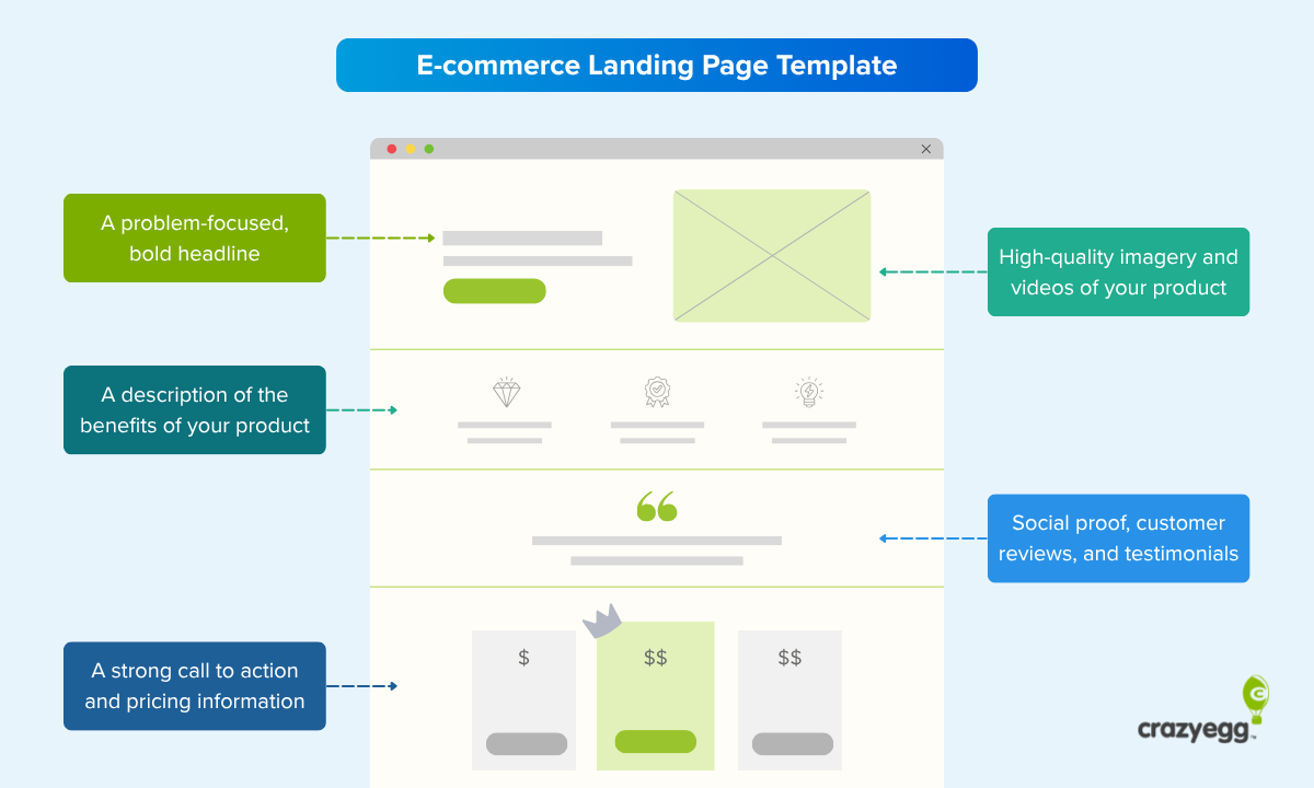
By stripping away the distractions of global navigation and extraneous links, brands can focus their messaging on a single offer, a single audience, and a single action. As competition for digital shelf space intensifies, understanding the architecture of high-converting landing pages has become a critical competency for growth-focused businesses.
The Anatomy of a High-Converting Landing Page
The most successful landing pages share a common DNA. They are not merely product pages; they are persuasive environments designed to alleviate friction and accelerate decision-making.

Core Elements of Success
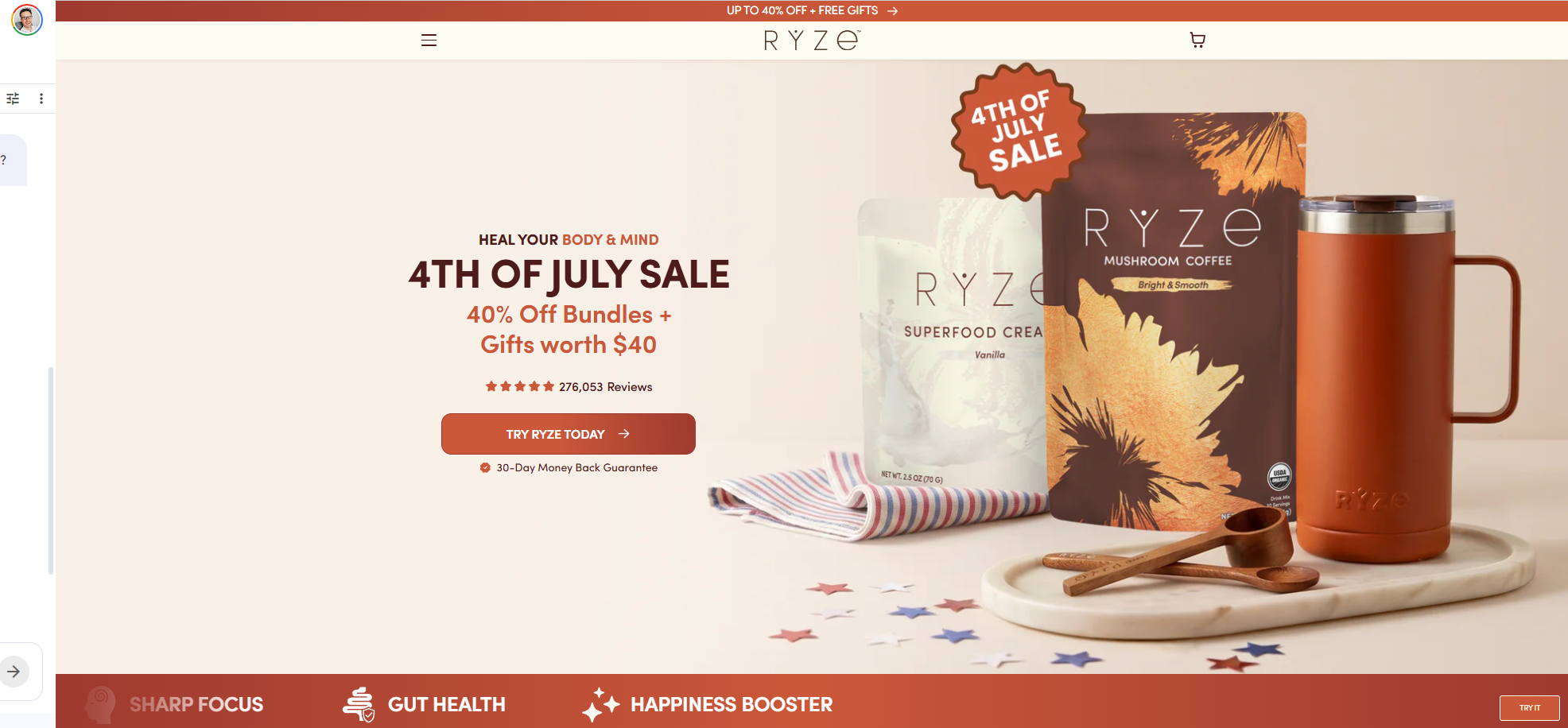
- Message Alignment: The most successful pages maintain absolute visual and textual consistency with the advertisement that preceded them. If an ad promises "30% off your first order," that exact promise must be the first thing a visitor sees upon arrival.
- The Single CTA: A focused page avoids the "paradox of choice." By limiting the user to one primary Call-to-Action (CTA), you guide them toward the conversion rather than letting them wander through your site.
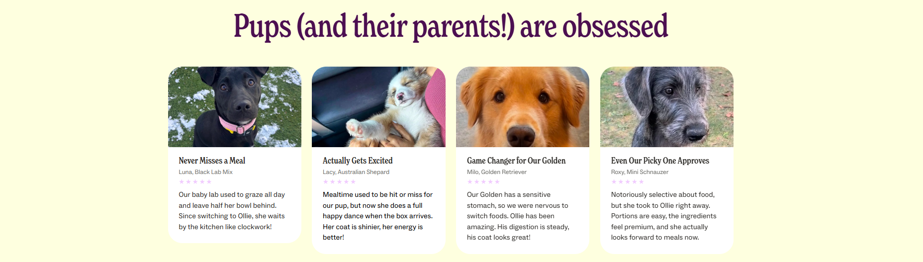
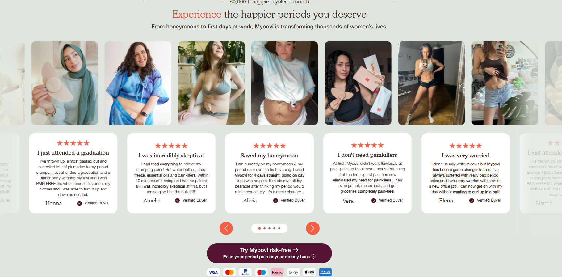
- Trust Signals: Whether through user-generated content, expert endorsements, or clinical data, building trust is the primary defense against buyer hesitation.
- Visual Narrative: Humans process visual information faster than text. Using high-fidelity product imagery that shows the item in a real-world context—rather than just on a white background—significantly improves engagement.
A Strategic Chronology: The Funnel-Based Approach
E-commerce brands rarely deploy a "one-size-fits-all" landing page. Instead, they tailor their approach based on where the visitor sits in the marketing funnel.
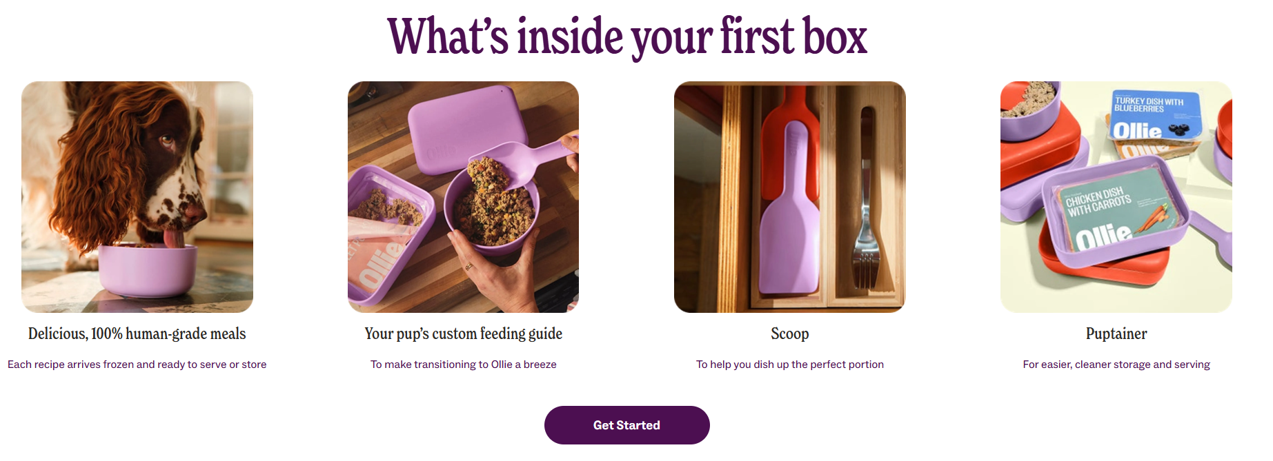
1. Top-of-Funnel (Awareness)
At this stage, visitors are often unaware of your specific solution. The goal here is education. These pages are typically content-heavy, focusing on the "problem" rather than the "product." They introduce the brand narrative and establish the need for a solution.
2. Mid-Funnel (Consideration)
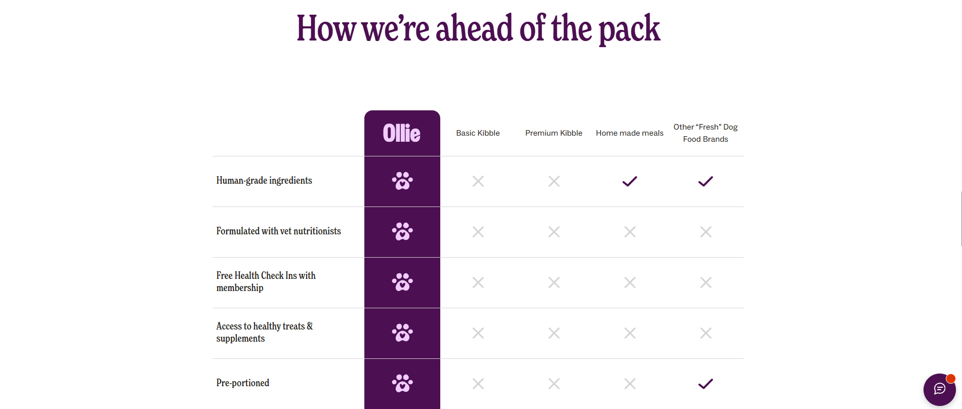
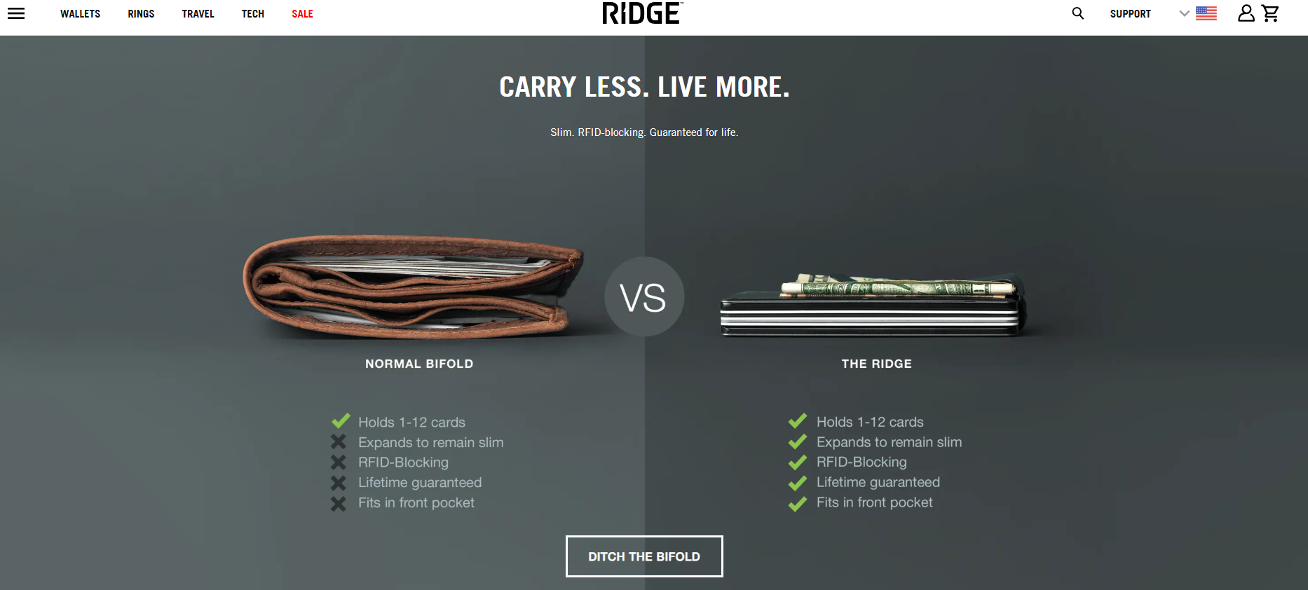
These visitors know they have a problem and are weighing options. A strong mid-funnel page uses comparisons—such as "Our Product vs. The Competitors"—to validate why your specific solution is the superior choice.

3. Bottom-of-Funnel (Conversion)
This is where the magic happens. These pages are designed to close the sale. They focus on risk reversal, such as money-back guarantees, limited-time scarcity, and seamless checkout modules that allow users to purchase without ever leaving the page.
4. Post-Purchase (Relationship)
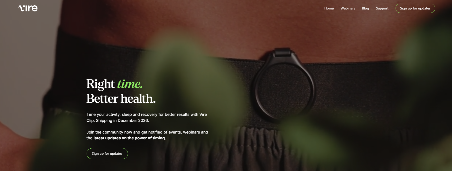
The journey doesn’t end at checkout. Effective post-purchase pages nurture long-term loyalty, offering upsells, cross-sells, or community engagement to turn a one-time buyer into a repeat customer.
Decoding Excellence: 8 Real-World Examples
To understand what works, we must examine the leaders. Below are eight brands that have mastered the art of the landing page.
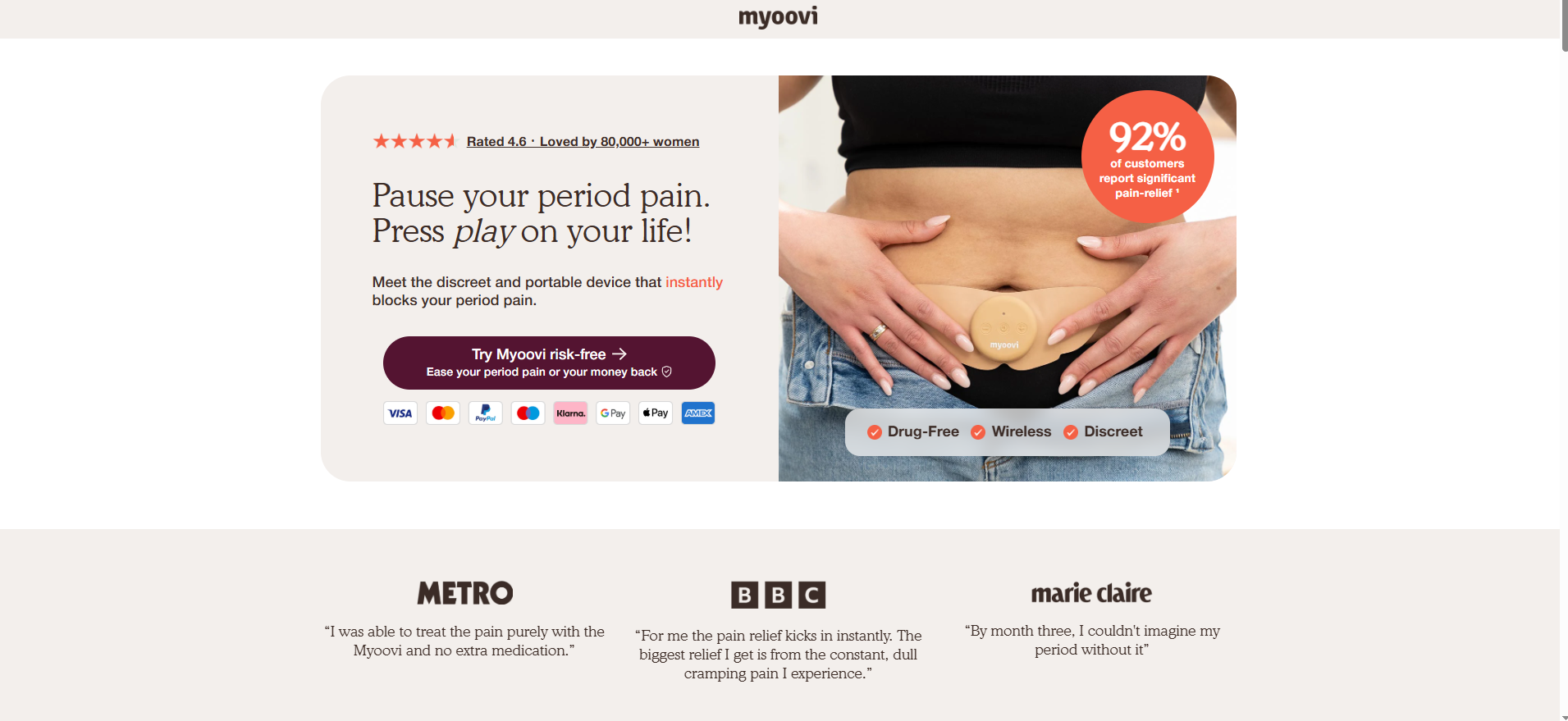
Myoovi: Leveraging Risk Reversal
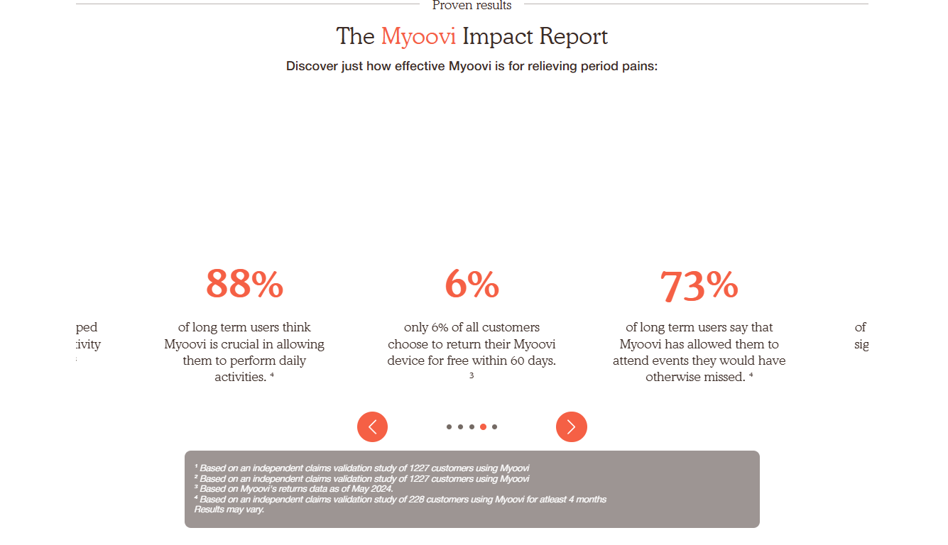
Myoovi, a provider of TENS devices for period pain, understands that skepticism is a high barrier to entry. They address this by embedding a 60-day money-back guarantee directly into their CTA. By pairing this risk reversal with data-backed statistics (e.g., "92% pain relief"), they effectively lower the barrier to purchase.
Magic Spoon: Data-Driven Trust
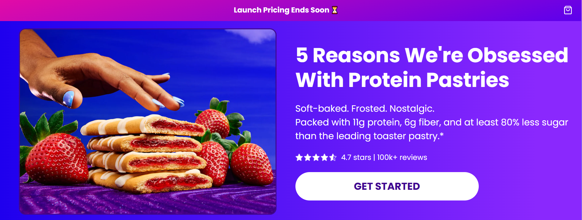
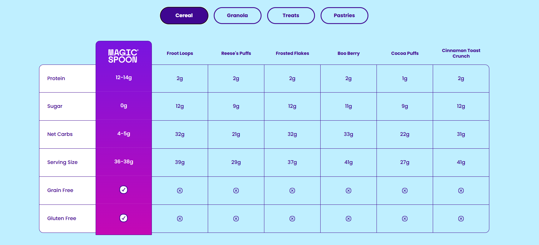
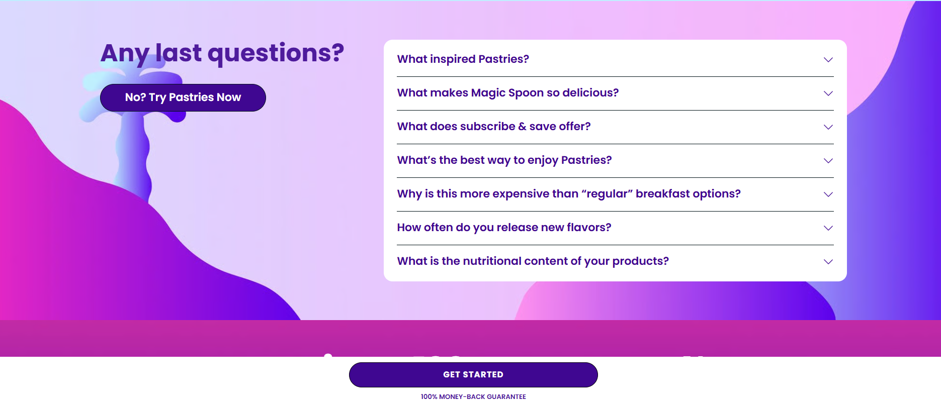
Magic Spoon uses a listicle format ("5 Reasons We’re Obsessed…") to educate users. Their most potent tactic is a transparent comparison table, naming competitors directly. By pitting their nutritional profile against mainstream brands, they transform a shopping page into an educational resource.
Nature’s Menu: The Power of Authority
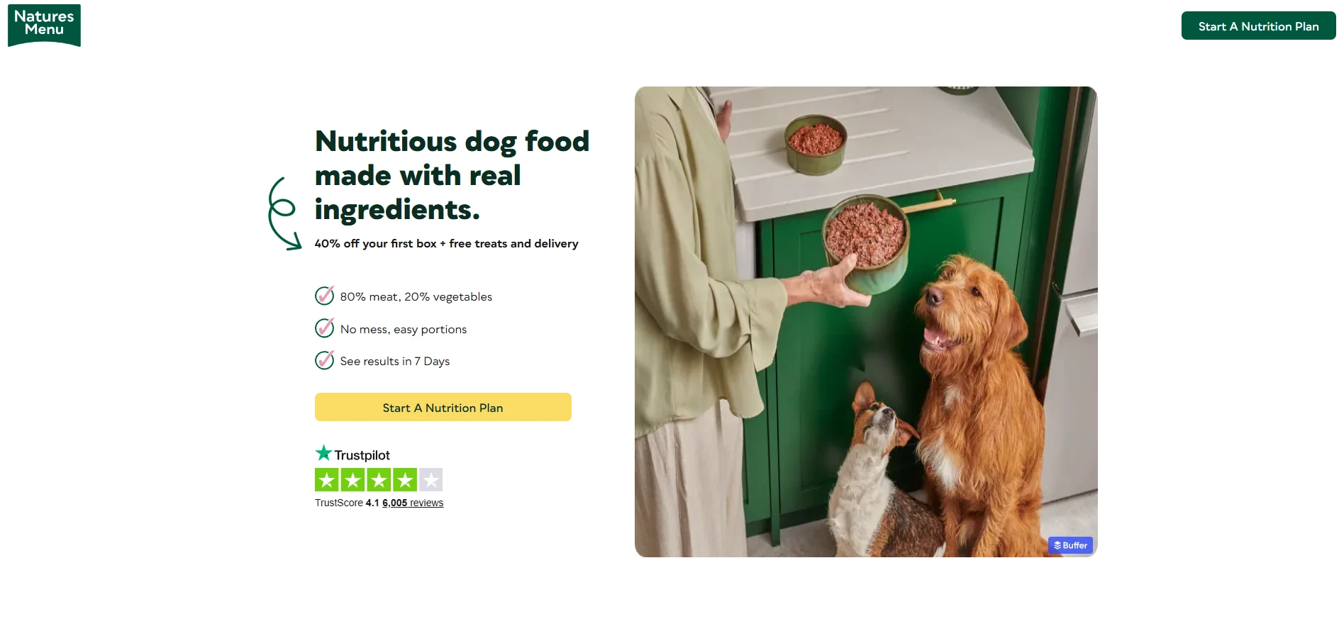
Nature’s Menu utilizes a "results-oriented" strategy. By featuring a timeline of health benefits (e.g., "week one: firmer poops") and supplementing customer testimonials with a formal endorsement from a registered veterinary nurse, they provide the professional credibility necessary for a health-focused product.
Ergonomist: Answering the Search Query
Ergonomist wins by mirroring the user’s intent. Their landing page opens with the exact question a user might type into a search engine: "Electric Standing Desk vs. Normal Desk, which is actually better?" By answering this question first, they gain the authority to pivot to their specific product as the answer.
Eight Sleep: Interactive Credibility
Eight Sleep utilizes interactive "hotspots" on their product imagery, allowing users to explore features on their own terms. This gamification keeps users on the page longer and builds a deeper connection with the product.
Flex: Visual Storytelling
Flex’s approach to their modular tool storage system is to frame the product through the lens of the job site. By using annotated images and clear use-case sections (Shop, Transit, Jobsite), they help the buyer visualize exactly how the product fits into their life.
Bachan’s: Building the "Flavortribe"
Bachan’s focuses on the post-purchase, recipe-focused experience. By leading with high-quality food photography and culinary inspiration, they turn a simple bottle of sauce into a lifestyle choice, successfully cross-selling their various "flavorites."
Maëlys: Gamified Conversion
Maëlys uses a 5-step quiz to drive engagement. By gamifying the experience and using a progress bar, they create a "sunk-cost" psychological effect—the user has already invested time in answering the questions, making them more likely to complete the journey and enter their email to receive their personalized results.
Analytical Implications: How to Improve Your Performance
Data is the only cure for conjecture. If you aren’t tracking how users interact with your page, you are essentially flying blind. Using behavioral analytics tools like Crazy Egg is standard practice for top-tier e-commerce teams.
- Heatmaps: These reveal exactly where users are clicking and how far they are scrolling. If your primary CTA is sitting in a "dead zone" where no one scrolls, you know exactly where to move it.
- Session Recordings: These allow you to watch real users navigate your site. Where do they hesitate? Where do they rage-click? These recordings often reveal UX friction points that standard analytics miss.
- A/B Testing: Never guess what works. Test two versions of a headline, a button color, or an offer against each other. The data will tell you which version earns more revenue.
Best Practices: The Blueprint for Success
- Mobile-First Construction: With the majority of e-commerce traffic originating on mobile, ensure your font size is at least 16px and your tap targets are at least 48x48px.
- Scarcity and Urgency: Use genuine, specific deadlines. "Ends July 6th" is infinitely more effective than a vague "Ends Soon."
- Remove Navigation: If your landing page has a header full of links to other pages, you are inviting the user to leave. Strip the navigation to keep them focused on the conversion goal.
- Name the Outcome: Your CTA should promise a result. Instead of "Submit," use "Claim my 20% discount."
Conclusion: The Path Forward
An e-commerce landing page is a living, breathing entity. It should evolve alongside your marketing campaigns and customer feedback. By applying these structural principles—maintaining message alignment, prioritizing trust, and using data to refine the experience—you can turn a simple webpage into a powerful revenue engine. The goal is not just to get traffic, but to make that traffic count. Start by testing one element today, and let the data guide your journey to higher conversions.
