
Unlocking Deeper Insights: Crazy Egg Launches Granular Time-Series Visualizations for Web Analytics
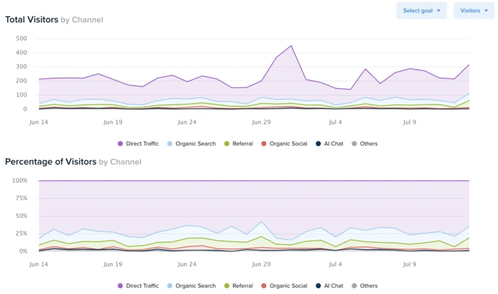
In the fast-paced world of digital marketing, data is the lifeblood of decision-making. However, raw data points—while essential—often fail to tell the full story of user behavior without the proper context of time. Today, Crazy Egg announced a significant expansion of its Web Analytics suite, introducing dynamic, time-series charting for every individual traffic segment. This update promises to transform how businesses visualize, analyze, and act upon their traffic data by bridging the gap between aggregate metrics and daily performance trends.
The Evolution of Web Analytics: Moving Beyond Static Tables
For years, web analytics platforms have provided users with detailed tables displaying traffic sources, campaign efficacy, and page-level performance. While these tables are excellent for comparing metrics side-by-side, they have historically suffered from a "snapshot" bias. A static table can tell a marketer that a specific campaign generated 500 clicks, but it struggles to articulate the rhythm of those clicks—whether they arrived in a steady stream, a sudden spike, or a gradual decline over the week.
The introduction of time-series charts represents a paradigm shift in how Crazy Egg users interact with their data. By mapping every traffic segment against a chronological axis, users can now identify patterns that were previously hidden in the noise of aggregate totals.
Core Functionality: How the New Visualizations Work
The implementation is designed for simplicity and accessibility. To access the new charts, users need only navigate to their Web Analytics dashboard and select a date range spanning at least two days. By clicking the ">" button adjacent to any audience segment, the interface expands to reveal a dual-chart visualization positioned directly above the existing data tables.
Key features of this update include:
- Multi-Metric Toggle: Users can switch between "Visitors," "Sessions," and "Pageviews" via a dedicated dropdown menu in the top-right corner, allowing for a customizable view of engagement intensity.
- Conversion Overlay: Perhaps the most powerful addition, users can now select specific Conversion Goals. The charts will automatically overlay the number of conversions per day, utilizing a secondary Y-axis to ensure that traffic trends and conversion outcomes remain readable in a single view.
- Seamless Data Portability: Recognizing that many analysts prefer working within spreadsheets for deep-dive reporting, Crazy Egg has integrated an "Export to spreadsheet (.xlsx)" function. This ensures that the granular, daily-level data is not locked within the dashboard but can be utilized for custom modeling and long-term trend analysis.
Chronology of a Feature Rollout: Addressing the Needs of Data-Driven Marketers
The path to this update reflects a broader industry trend toward "contextualized analytics." Over the past two years, feedback from the Crazy Egg user community consistently highlighted a frustration: the inability to correlate site changes or external marketing pushes with specific fluctuations in audience behavior over time.
"Our goal was to eliminate the guesswork," said a spokesperson for the development team. "Marketers shouldn’t have to export data into external tools just to see a basic trend line for a specific referral source. By bringing this visualization directly into the segment view, we are reducing the time-to-insight significantly."
The rollout began with a beta testing phase targeting power users who manage high-traffic e-commerce sites. These users reported that the ability to isolate specific traffic segments—such as "Social Media Referrals" or "Email Campaign Traffic"—and view their daily performance allowed them to identify "leakage points" in their funnels that were previously invisible.
Supporting Data: Why Time-Series Analysis Matters
To understand the implications of this update, one must look at the mechanics of digital traffic. Traffic is rarely linear; it is cyclical and reactive. A social media post may trigger a 24-hour surge, while an SEO-optimized blog post might show a slow, consistent climb over several weeks.
If a user relies solely on a 30-day aggregate table, a sudden, sharp decline in traffic during the last three days of the month might be masked by strong performance in the first week. This "averaging out" effect is the enemy of accurate optimization.
By introducing time-series charts, Crazy Egg is facilitating:
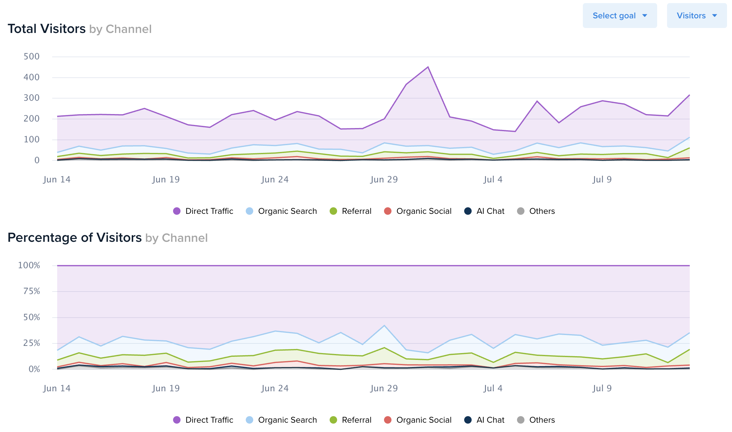
- Anomaly Detection: Quickly spotting days where traffic failed to materialize as expected.
- Campaign Correlation: Aligning the exact start date of a PPC campaign with a visible upward tick in the time-series line.
- Seasonality Mapping: Understanding how weekends versus weekdays influence specific audience segments, allowing for better budget allocation and ad scheduling.
Official Response and Platform Philosophy
The team behind Crazy Egg has positioned this update as part of a commitment to "accessible intelligence." Unlike enterprise-level analytics suites that often require a degree in data science to operate, the new time-series charts are designed to be intuitive for everyone, from small business owners to seasoned digital strategists.
"We believe that powerful insights shouldn’t be gated behind complex configuration screens," the company stated in their official release. "By making these charts available to every plan at no additional cost, we are democratizing the ability to perform high-level trend analysis."
This approach aligns with the company’s long-standing philosophy of providing visual feedback on website performance. By adding a temporal dimension to the visual data, the platform is reinforcing its position as a tool that prioritizes human behavior over cold, abstract numbers.
Implications for Digital Strategy and ROI
The implications of this update for the average marketing team are profound. Digital strategy is fundamentally about iteration. When a team launches a landing page, they rarely get it perfect on the first try. The new reporting tools provide a high-resolution lens through which to view these iterations.
Enhancing Conversion Rate Optimization (CRO)
CRO is a process of testing and refinement. With the new conversion overlays, a user can test a change to a call-to-action (CTA) button and immediately see how that change impacts the daily conversion rate of a specific traffic segment. If the conversion line trends upward following a site change, the user has empirical evidence of the change’s success. If it trends downward, they have the data needed to revert and pivot before significant ad spend is wasted.
Improving Channel Accountability
Marketers often struggle with the "attribution challenge." When multiple channels are driving traffic, it is difficult to determine which ones are truly contributing to the bottom line. By breaking these out into individual time-series charts, managers can clearly see if a channel is "high-volume, low-intent" (lots of sessions, few conversions) or "low-volume, high-intent" (fewer sessions, steady conversion rates).
Long-Term Planning and Forecasting
Beyond day-to-day management, this feature aids in long-term forecasting. By exporting the daily data via the spreadsheet feature, teams can build their own predictive models to estimate future traffic patterns based on historical data. This is invaluable for inventory management, staffing for customer support, and annual budget planning.
Conclusion: A New Standard for User Experience
The integration of time-series charts into Crazy Egg’s Web Analytics represents more than just a minor UI improvement; it is a fundamental enhancement of the user’s analytical toolkit. By transforming static data into a dynamic, historical narrative, the platform empowers users to look past the "what" and start answering the "when" and "why" of their website traffic.
As the digital landscape becomes increasingly competitive, the ability to act on accurate, time-sensitive data will continue to separate market leaders from the rest of the pack. With this update, Crazy Egg has ensured that its users are well-equipped to navigate the complexities of modern web traffic, one day at a time.
For current users, these features are already live across all plan tiers. The dashboard is ready to be explored, and the insights are waiting to be uncovered. By simply navigating to the Web Analytics section and selecting a segment, users can begin to visualize the rhythm of their traffic and, in turn, craft a more effective, data-backed digital strategy. As data visualization continues to evolve, the expectation remains that tools like this will become the baseline for any professional digital marketing endeavor.
