
The Strategic Role of the Website Sidebar: Enhancing User Experience and Driving Conversion
In the ever-evolving landscape of web design, the website sidebar remains one of the most debated elements of the user interface. Is it a cluttered relic of the early web, or an essential navigational compass that guides users through complex content? When deployed with precision, the sidebar is a powerhouse of utility, capable of streamlining navigation, fostering trust, and driving critical conversions. When implemented poorly, it becomes a source of distraction that compromises the user experience.
Understanding the balance between utility and clutter is essential for any digital strategist. By examining the anatomy of the sidebar, its functional purpose, and the data-driven methods used to optimize it, we can determine exactly when to utilize this element and when to abandon it in favor of a cleaner, focused layout.

Defining the Anatomy: What is a Website Sidebar?
At its core, a website sidebar is a vertical column positioned adjacent to the primary content area—typically to the left or right. Unlike the main body of a page, which serves as the primary vessel for information, the sidebar functions as a secondary hub. It acts as an anchor for auxiliary materials, including navigational menus, search functionality, calls to action (CTAs), social proof, and widgets.
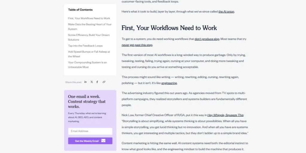
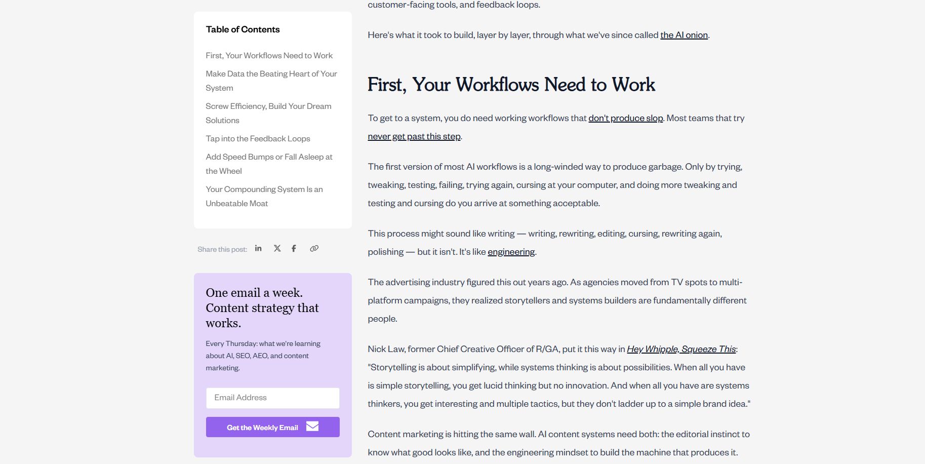
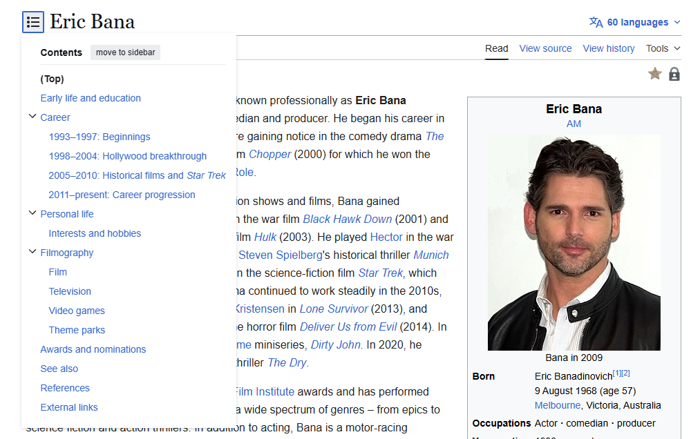
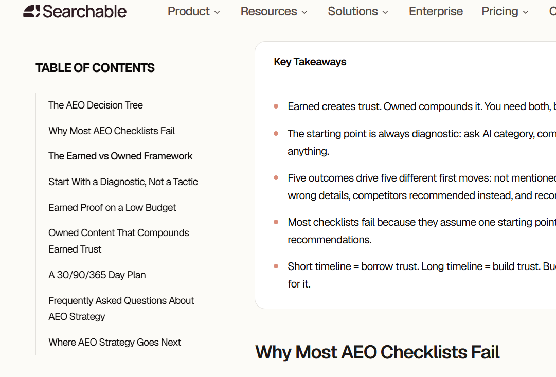
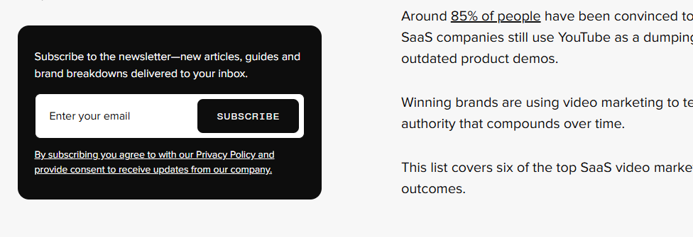
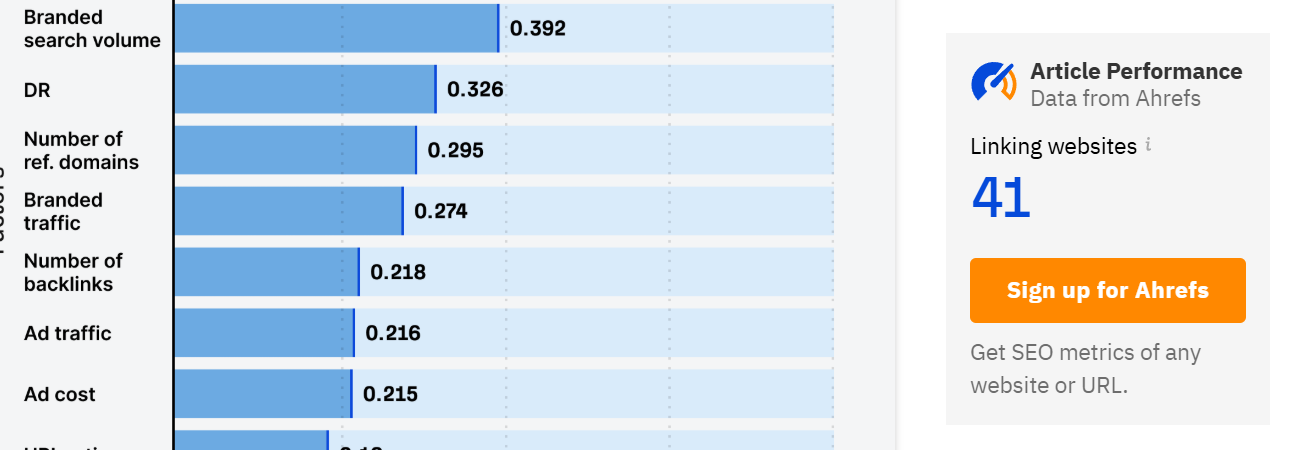
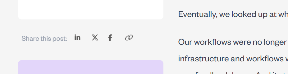
For content-heavy platforms—such as documentation hubs, news sites, or extensive blogs—the sidebar is indispensable. It provides a persistent map for the reader, ensuring they are never more than a click away from relevant topics. For instance, the Animalz blog famously utilizes its sidebar to house a table of contents, social sharing integration, and a newsletter sign-up form. This arrangement allows the reader to engage with the site’s ecosystem without interrupting the flow of the primary article.
Sidebar vs. Sidepanel: Clarifying the Terminology
A common point of confusion in web development is the distinction between a sidebar and a sidepanel. While often used interchangeably, they serve different UX roles:
- The Sidebar: A static, fixed component of the page layout. It is generally visible throughout the user’s journey on a specific page.
- The Sidepanel: An interface element within an application or digital tool that can be toggled open or closed by the user.
Recognizing this distinction is vital for designers. A sidebar should be designed for consistent, passive support, whereas a sidepanel is an interactive tool intended for task-specific actions.

The Three Pillars of Sidebar Functionality
A high-performing sidebar generally serves one of three primary business objectives: navigation, conversion, or supplementary value.
1. Navigational Excellence
The most frequent application of the sidebar is to simplify site architecture. When a website contains hundreds or thousands of pages, a standard top-bar menu cannot possibly house all relevant categories. A sidebar menu allows for a more hierarchical, organized, and scalable navigation structure. Common elements include category filters, search bars, and "sticky" tables of contents that track the reader’s progress through a long-form article.
2. Driving Strategic Conversions
Even when a page’s primary goal is informational, a well-placed sidebar acts as a subtle conversion engine. By placing newsletter sign-up forms, free trial CTAs, or resource downloads in the sidebar, businesses can capture leads without force-feeding them an intrusive pop-up. Because these elements are visible but not "in the way," they convert high-intent users who are looking for their next step.
3. Delivering Supplementary Content
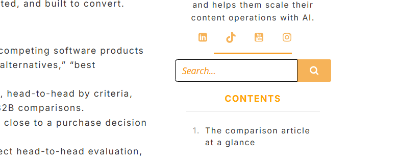
Supporting content—such as author biographies, "most viewed" article lists, or social proof metrics—builds authority and trust. These elements serve to keep the visitor on the site longer by providing context or suggesting related material that aligns with the reader’s current interests.
When to Use a Sidebar (and When to Eliminate It)
The decision to include a sidebar should be dictated by the page’s specific goal.
When to keep it:
- Content-Heavy Blogs: Helps readers navigate long articles or explore archives.
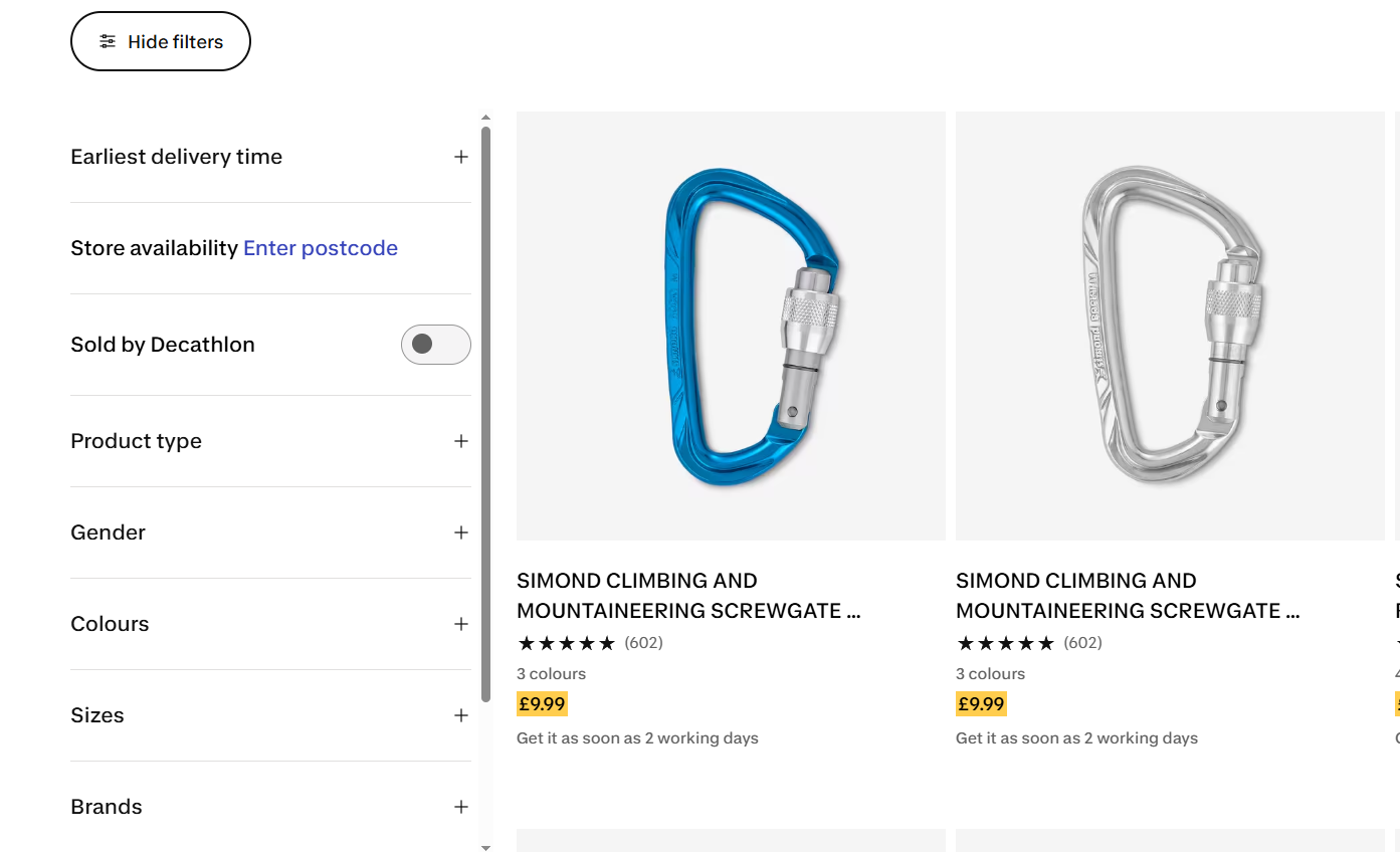
- E-commerce Catalogs: Essential for filtering products by size, price, or brand.
- Documentation: Provides a clear, persistent guide for technical users navigating complex manuals.
When to skip it:
- Landing Pages: The primary goal here is conversion. Any distraction, including a sidebar, creates friction and reduces the likelihood of a completed action.
- Portfolios and Galleries: When visual impact is the primary goal, a sidebar disrupts the aesthetic and encroaches on the "white space" necessary for visual storytelling.
- Mobile Devices: On screens under 600px wide, a sidebar often forces content to stack in an awkward, unreadable format. Best practice dictates that mobile users should see a clean, single-column layout, with navigation moved to a hamburger menu or a top-level drawer.
Design Best Practices: A Data-Driven Approach
Designing a sidebar is not about aesthetics alone; it is about psychological cues and behavioral alignment.

Fighting "Banner Blindness"
Users have developed a cognitive habit known as "banner blindness"—the subconscious tendency to ignore anything that looks like an advertisement. To ensure your sidebar elements are seen, they must be integrated into the site’s typography and color scheme. If a widget looks like a generic banner ad, it will be ignored. If it looks like a functional, helpful extension of the content, it will receive engagement.

The Power of the "Left-Rail"
Eye-tracking research conducted by the Nielsen Norman Group consistently confirms that human attention leans toward the left side of the screen (in left-to-right languages). Consequently, high-priority items—such as primary navigation or essential CTAs—should be placed on the left. Supplementary, secondary information that does not require immediate attention is better suited for the right side.
Sticky Elements and Constant Visibility
The "sticky" sidebar, which remains in view as the user scrolls, has proven to be a major conversion driver. For example, in an A/B test conducted by GrowthRock, implementing a sticky "add-to-cart" button on an e-commerce page resulted in a 7.9% increase in completed orders. By keeping critical actions in the viewport, you reduce the effort required for the user to convert.
Hierarchy and Depth
A cluttered sidebar is a useless one. Designers should limit nesting to two levels. If a menu requires a third level of nesting, it is a symptom of poor information architecture, not a failure of the sidebar itself. Only show links relevant to the current section to keep the cognitive load manageable.
Testing for Optimization: Heatmaps and A/B Testing
Designers should never guess what works; they should measure it. Using modern UX tools like heatmaps and session recordings allows for a clear view of how visitors interact with your sidebars.
- Heatmaps: These provide a visual representation of click density. If a button in your sidebar is not receiving clicks, the heatmap will show you immediately, allowing you to reposition or redesign it.
- Session Recordings: By watching real-time sessions, you can identify "rage clicks"—moments where a user clicks on an unclickable element or struggles to find the navigation. This is invaluable for identifying friction points.
- A/B Testing: The final arbiter of design success is the split test. By presenting two versions of a sidebar to different segments of traffic, you can statistically prove which layout, color, or CTA copy generates the highest engagement.
Conclusion: The Sidebar as a Strategic Asset
The website sidebar is not a static element; it is a dynamic participant in the user journey. By aligning its contents with user intent, matching its design to the surrounding content, and rigorously testing its performance with data, organizations can transform the sidebar from a source of clutter into a significant driver of engagement and conversion.
Ultimately, the best sidebar is the one that is invisible in its efficiency—helping the user find exactly what they need exactly when they need it, without distracting them from the value of your core content. Whether you are managing a high-traffic blog or a complex e-commerce store, the principles of strategic placement and data-driven design remain the same: serve the user first, and the conversions will follow.
Frequently Asked Questions
Q: How do you add a sidebar in WordPress?
A: For classic themes, this is handled through the "Widgets" section in the Appearance menu. For modern block-based themes, use the Site Editor to add a Navigation or Group block to the template.
Q: Should you use a sidebar menu or a top navigation bar?
A: Use a top bar for your "global" navigation (About, Contact, Pricing). Use a sidebar for "contextual" navigation (categories, related articles, table of contents). A hybrid approach is often the most effective.
Q: Do sidebars hurt SEO?
A: Not directly. However, if your sidebar contains irrelevant, spammy, or overly complex links, it can frustrate users, leading to higher bounce rates. Search engines monitor these user engagement signals, so a poor UX can indirectly impact your rankings.
Q: What is another word for a website sidebar?
A: Common alternatives include "nav rail," "side panel," "chrome," or "secondary navigation." While these terms are used interchangeably, "nav rail" is increasingly popular in modern design systems to describe a vertical, persistent navigation element.
